Channel elements
Channel-elements are elements that are specific to a channel. These elements are present in the Chatbot sends and Chatbot receives sections in the chatbot editor.
Each channel has a different set of elements. Some elements are available only in one channel. Example: Apple Pay (Apple Messages for Business) and Single Product Message (WhatsApp). Some elements, such as Carousel, are available in multiple channels. However, the features and specifications of these elements may be different in each channel.
For more information about the specifications of an element, refer to the Message Types sections in the channel documentation.
This page describes channel-specific elements. To view elements that are common to all channels, refer to the Core elements section.
File formats
The following table shows the file formats for some of the chatbot elements, based on the channel.
| Elements | Channels | ||||||||||||
|---|---|---|---|---|---|---|---|---|---|---|---|---|---|
| Apple Messages for Business | Instagram Messaging | Line | Live Chat | Messenger | RCS | SMS | Telegram | Viber Bots | Viber Business Messages | Open channel | |||
| Audio | X | X | X | X | ✓ | ✓ | X | ✓ | X | X | ✓ | X | |
| Button* | X | X | X | ✓ | ✓ | X | X | X | X | ✓ | X | X | |
| Carousel | X | ✓ | ✓ | ✓ | ✓ | ✓ | X | X | ✓ | X | X | X | |
| Document | X | X | X | X | X | X | X | ✓ | ✓ | X | X | X | |
| File | ✓ | X | X | ✓ | ✓ | X | X | X | X | X | ✓ | X | |
| Image | ✓ | ✓ | ✓ | ✓ | ✓ | ✓ | X | ✓ | ✓ | ✓ | ✓ | X | |
| JSON | X | X | X | X | X | X | X | X | X | X | X | ✓ | |
| List | X | X | X | X | X | X | X | X | X | X | ✓ | X | |
| Location | X | X | ✓ | X | ✓ | X | X | X | ✓ | ✓ | ✓ | X | |
| Quick Reply* | ✓ | X | X | X | X | X | X | X | X | X | X | X | |
| Reply button* | X | X | X | X | X | X | X | X | X | X | ✓ | X | |
| Rich Card | X | ✓ | ✓ | X | ✓ | ✓ | X | X | X | X | X | X | |
| Rich Link | ✓ | X | X | X | X | X | X | X | X | X | X | X | |
| Sticker | X | ✓ | X | X | X | X | X | X | ✓ | X | ✓ | X | |
| Text | ✓ | ✓ | ✓ | ✓ | ✓ | ✓ | ✓ | ✓ | ✓ | ✓ | ✓ | ✓ | |
| URL | X | X | X | X | X | X | X | X | ✓ | X | X | X | |
| URL button* | X | X | X | X | X | X | X | X | X | X | ✓ | X | |
| Video | X | X | X | ✓ | ✓ | ✓ | X | ✓ | ✓ | X | ✓ | X | |
| * There are different types of button elements. Example: Button, Quick reply, Reply button, and URL button. Use the element that is applicable to your channel and is relevant to the chatbot design. | |||||||||||||
How to use a channel in your chatbot
To use a channel in Answers, you must enable it first. View the instructions in the documentation for that channel.
For any channel, you can use only senders that are registered with Infobip.
WhatsApp is a secure and reliable communication channel that helps businesses communicate with end users. The channel uses end-to-end encryption. Use WhatsApp on Answers to provide real-time automated and personal customer support.
WhatsApp offers a variety of message types, as well as WhatsApp-specific message types such as single and multi-product messages. Refer to the messaging limitations for each message type.
To use WhatsApp in Answers, you must enable this channel in your Infobip account.
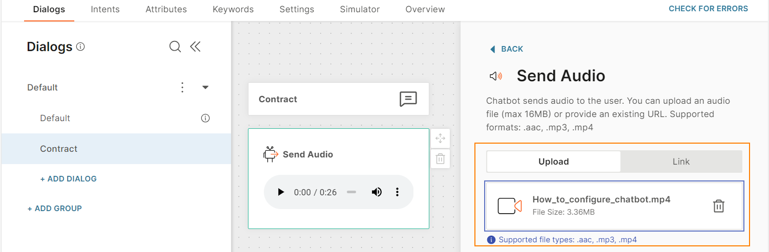
Audio
Use the Audio element to send pre-recorded messages as audio files.
To send voice messages, use the Voice element instead.
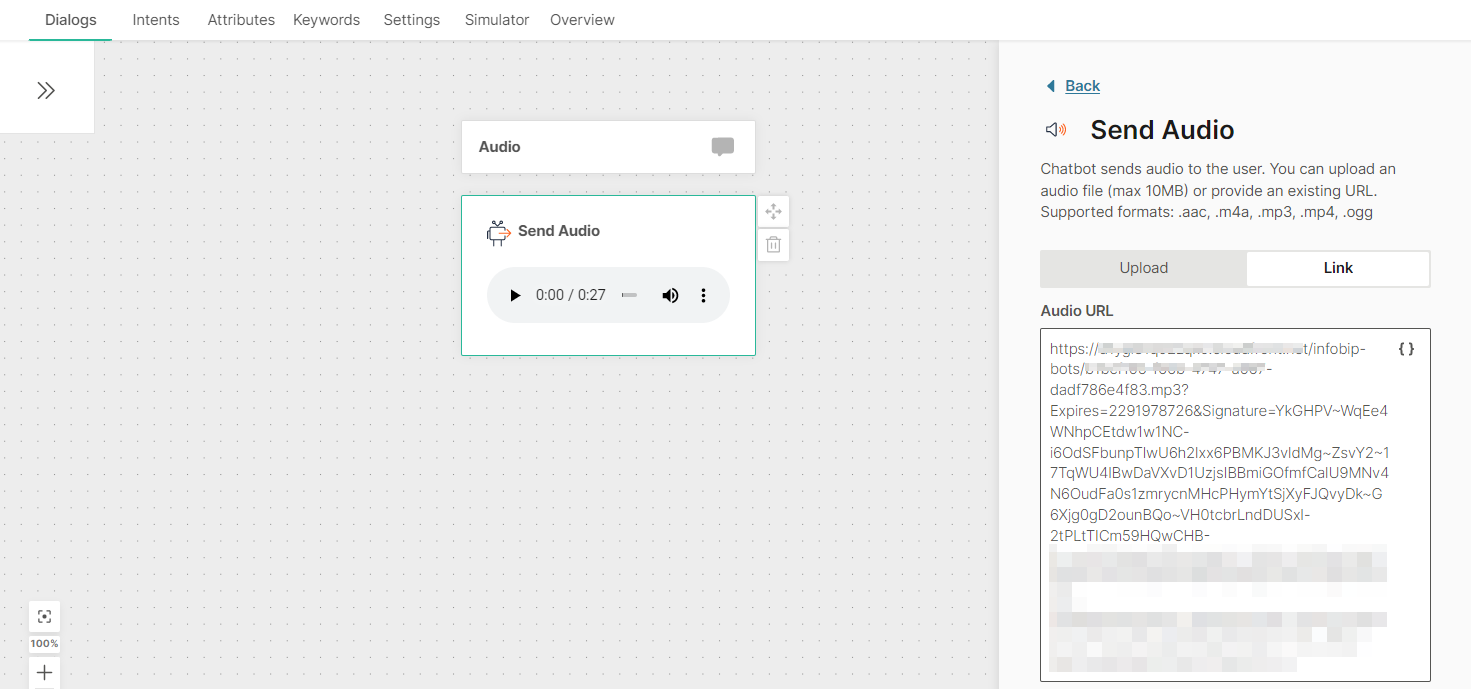
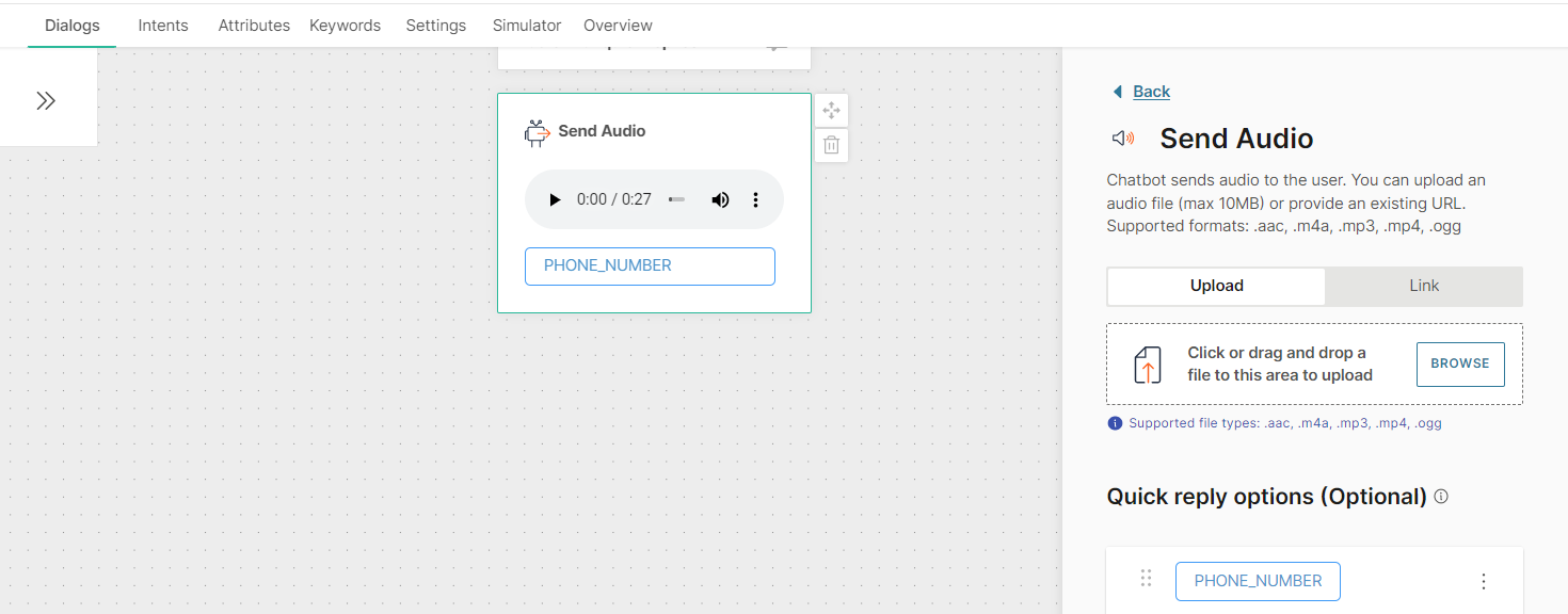
In the Audio element, you can send the audio files in one of the following ways.
- Upload the file to the Answers editor.
- Enter the public URL that contains the audio file. You can include attributes if you want to customize the URL.
Supported file formats are .aac, .mp3, and .mp4. Maximum file size is 16 MB.
File
Send files and documents directly to end users either by uploading the file in the Answers editor or by providing a link to the file.
Supported file formats depend on the channel that your chatbot uses. Refer to the Message types section for the relevant channel.
For WhatsApp, you can either define the individual file types that the chatbot should handle or you can set to all.
Image
Send images to end users by either uploading the image in the Answers editor or by providing a direct open URL to the image. The link option also supports attributes if you need to customize the URL. Add an optional caption to your image.
Supported image formats depend on the channel that your chatbot uses. Refer to the Message types section for the relevant channel.
List
Use lists to provide end users with a set of options from which they can select one. Example: Locations of your offices.
Lists contain text, a list button, and list items. When the end user clicks the list button, the list items are displayed. Each list item includes a checkbox. When the end user chooses an item from the list and clicks Send, the chatbot receives the postback value of that list item.
To add a list to your chatbot, in the chatbot editor, drag and drop the List element from Chatbot sends. Configure the following fields:
Header text (optional): Text that is displayed at the top of the list message. Can contain a maximum of 60 characters including spaces, special characters, emojis, and attributes. There can be only one line of text.
Body text: The message that you send to end users. Can contain a maximum of 1,024 characters including spaces, special characters, new line, emojis, and attributes.
Footer (optional): Additional text that you can send to end users. Can contain a maximum of 60 characters including spaces, special characters, emojis, and attributes. There can be only one line of text.
List button text: The text that is displayed on the button. When the end user clicks this button, the list items are displayed. Can contain a maximum of 20 characters including spaces, special characters, emojis, and attributes. There can be only one line of text.
List: You can add a maximum of 10 list sections and 10 buttons across all the sections.
Each list section contains the following fields:
- Section title: Can contain a maximum of 24 characters including spaces, special characters, emojis, and attributes. There can be only one line of text.
- List items: You can add a maximum of 10 list items across all list sections. You can add list items either manually or from a list attribute.
To add a list item manually, click Add item. Complete the following fields:
- Item title: Name of the list item that is visible to the end user. Can contain a maximum of 24 characters including spaces, special characters, emojis, and attributes. There can be only one line of text.
- Item description (optional): Details about the list item. Can contain a maximum of 72 characters including spaces, special characters, emojis, and attributes. There can be only one line of text.
- Postback: Custom data that is sent back to you when the end user chooses a list item. Can contain a maximum of 200 characters including spaces, special characters, and attributes. Example: If the Item title is 'Send me more information', you can specify the postback value as 'send_information'
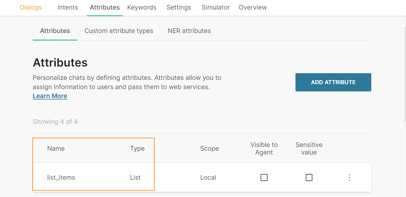
To add a list item from a list attribute, follow these steps:
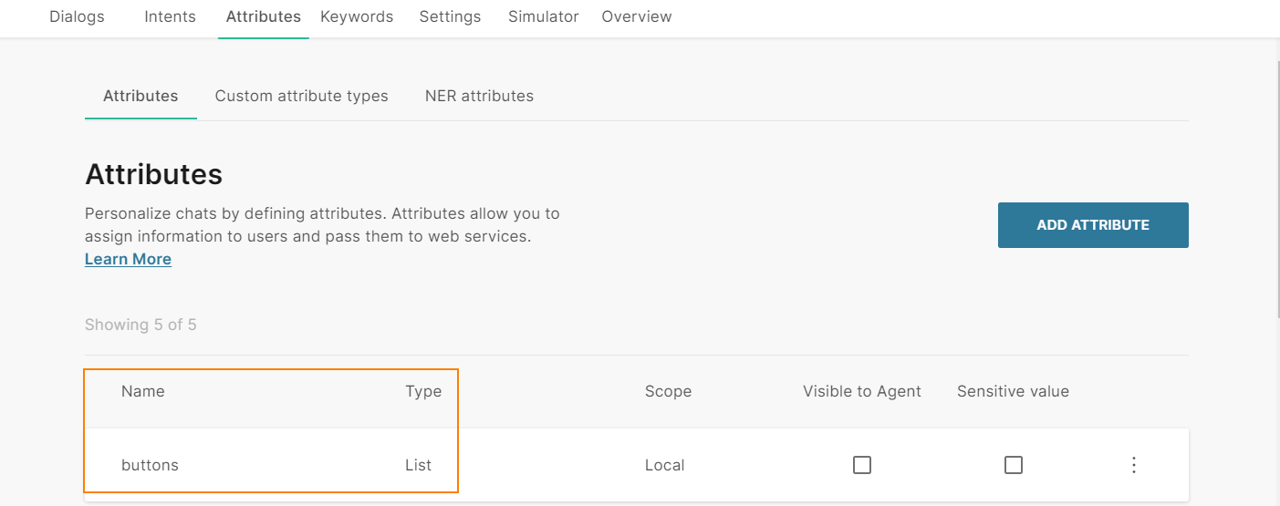
- In the Attributes tab > Attributes tab, click Add attribute.
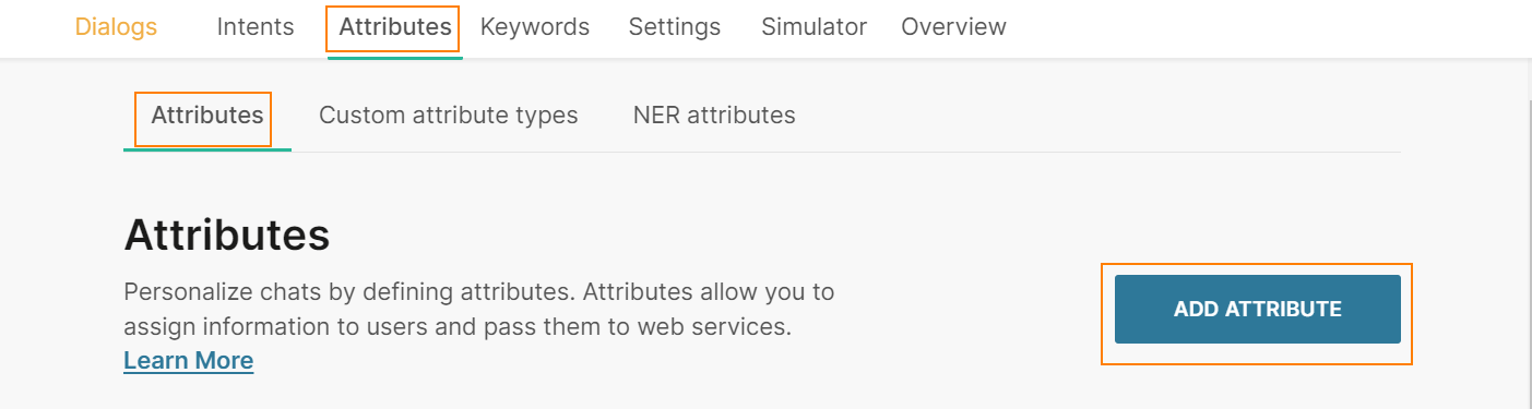
- In the Name field, enter a name. Example: list_items. In the Type field, choose List.
- In the Dialogs tab, go to the dialog that contains the List element that you created.
- From the Chatbot actions section, drag and drop the Code element. Add it before the List element in the editor.
- In the Code element, create a list of items and set it to the attribute that you created. Add the following information for each list item:
- Item title: Name of the list item that is visible to the end user. Can contain a maximum of 24 characters including spaces, special characters, emojis, and attributes. There can be only one line of text.
- Item description (optional): Details about the list item. Can contain a maximum of 72 characters including spaces, special characters, emojis, and attributes. There can be only one line of text.
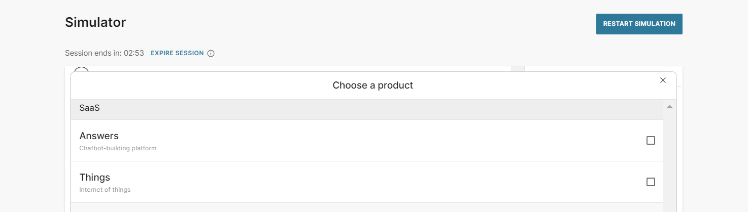
- Postback: Custom data that is sent back to you when the end user chooses a list item. Can contain a maximum of 200 characters including spaces, special characters, and attributes. Example: If the Item title is 'Send me more information', you can specify the postback value as 'send_information' The following example is for a list with two list items: const items = [ {"title":"Answers", "description":"Chatbot-building platform", "postback":"answers"}, {"title":"Things", "description":"Internet of things", "postback":"things"} ]; attributeApi.set('list_items', items); where items is the name of the list title, description, and postback are the field names that you need to use in the List element in later steps list_items is the attribute that you created
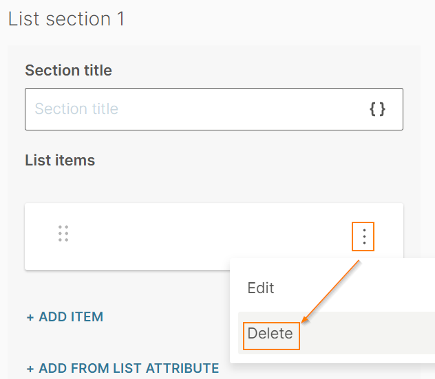
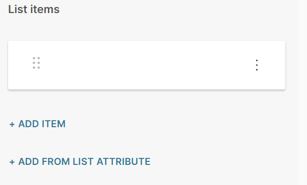
- In the List element that you created > List items section, delete the default list item that is present.
- Click Add from list attribute.
- Complete the following fields:
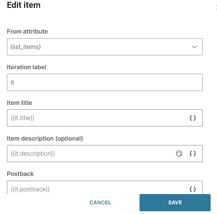
- From attribute: Choose the list attribute that you created. Example: list_items.
- Iteration label: Enter a label. Example: it_label. This value is available as a placeholder in the Item title, Description, and Postback fields.
- Item title: Add the iteration label and the relevant field name that you created in the Code element. Example: {{it_label.title}}
- Item description (optional): Add the iteration label and the relevant field name that you created in the Code element. Example: {{it_label.description}}. If you have not specified this field in the Code element, leave this field blank
- Postback: Add the iteration label and the relevant field name that you created in the Code element. Example: {{it_label.postback}}
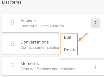
To edit or delete a list item, click the three dots against the item and choose an option. You can also edit the list item by clicking on it.
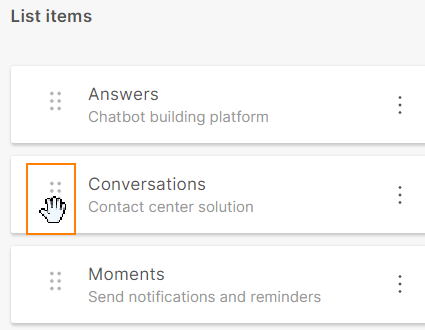
To reorder the list items, use the six dots against an item to drag and drop the list item.
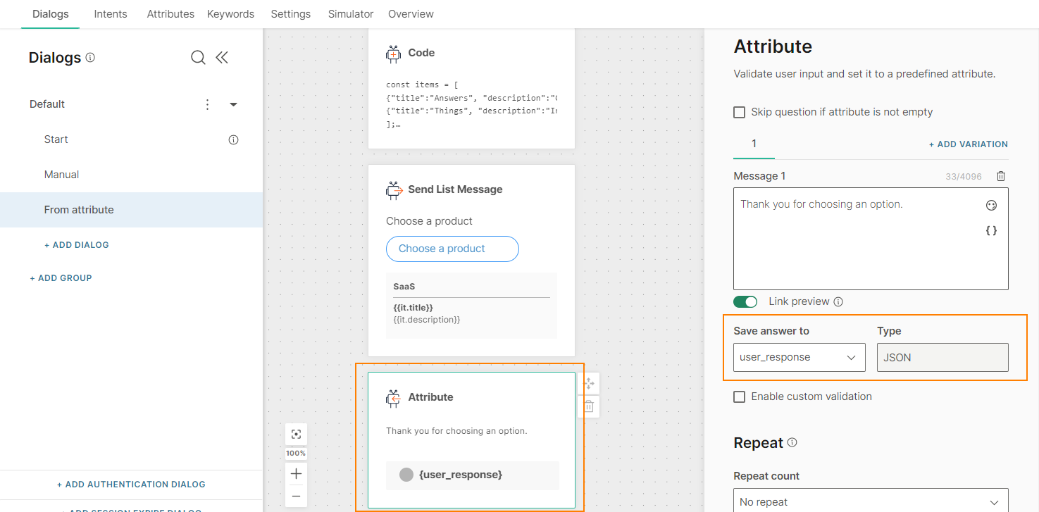
After you configure the List element, add an element, such as Attribute, to obtain the response from the end user. The attribute must be of type JSON.
After you configure the chatbot, run the simulator to test the chatbot flow,
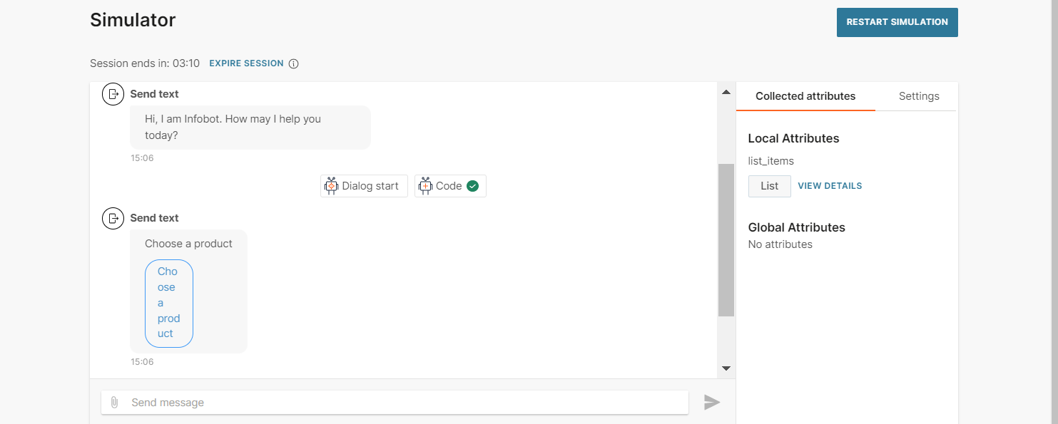
In the simulator, when you click the button, the list is displayed. You can choose only one item from the list.
For more information about List messages, refer to the WhatsApp documentation.
Location
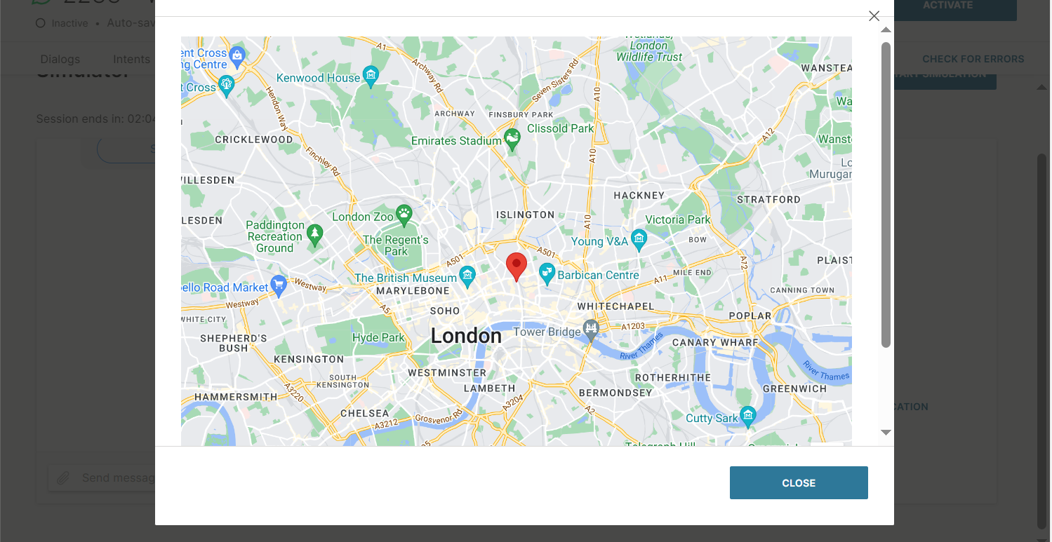
Use the Location element to send end users a static location. You can send only locations that are live in Google Maps.
In the chatbot editor, drag the Location element from Chatbot sends.
You can send the location in one of the following ways.
- Specify the location in the Location element.
- Use an attribute to specify the location.
Specify the location in the element
In the Select how to get location field, select Enter latitude and longitude.
Latitude: Enter the latitude. The range is -90 to 90. Example: 45.814911.
Longitude: Enter the longitude. The range is -180 to 180. Example: 15.978515.
Location name: Enter a name for the location. You can specify a maximum of 1,000 characters, including special characters. Example: Infobip, Zagreb.
Location address: Enter the address. You can specify a maximum of 1,000 characters.
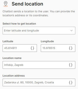
You can test the element in the simulator.
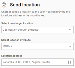
Use an attribute to specify the location
Create an attribute of type Receive location.
In the Location element, complete the following fields.
Select how to get location: Select Get location through attribute.
Select location attribute: Select the attribute that you created.
Location address: Enter the address.
Multi product
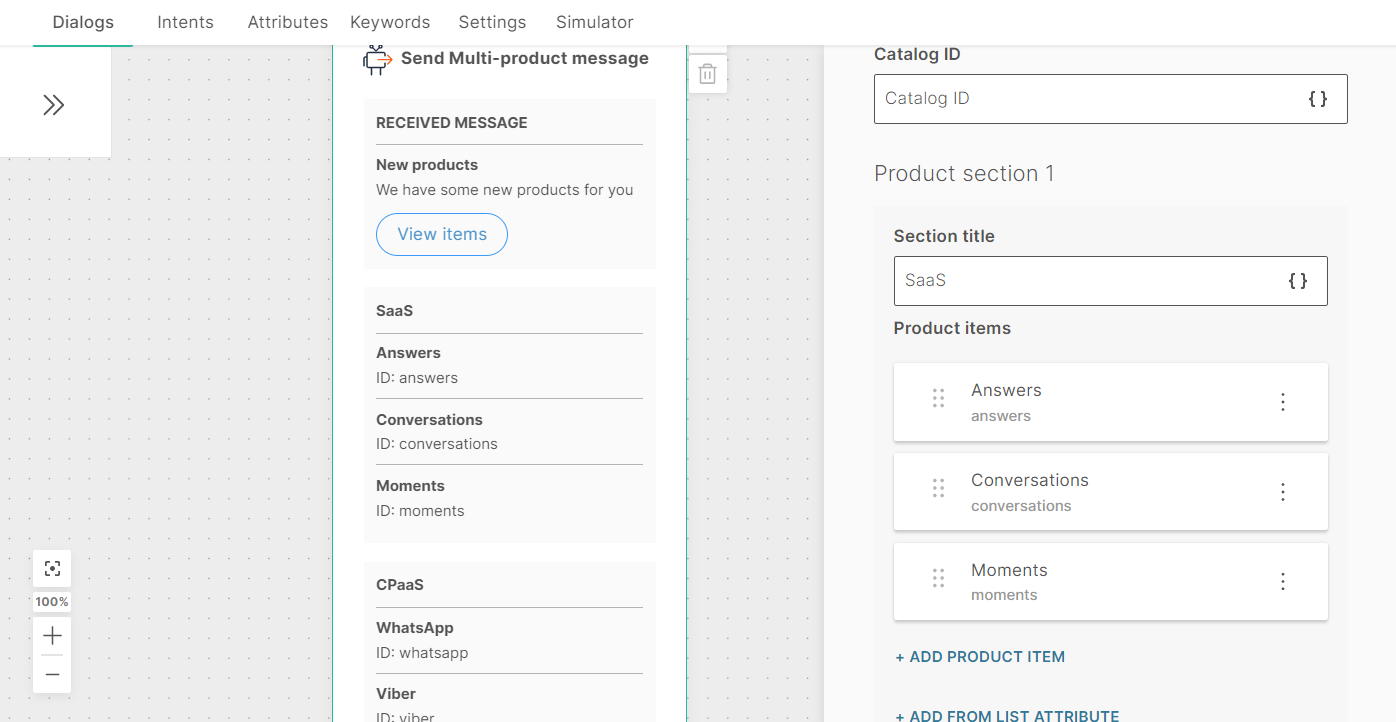
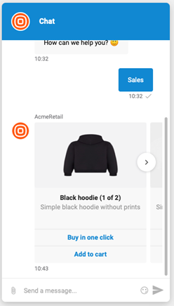
Send an interactive message about products or services that are present in your catalog. You can include a maximum of 30 products in the message. Customers can ask questions about the product, add the product to the cart, and submit the cart without leaving the chat.
To send a Multi-product message, you must have a Meta catalog that is connected to your WhatsApp Business Account. For more information, refer to the WhatsApp documentation.
To add a Multi-product message to your chatbot, in the chatbot editor, drag and drop the Multi-product element from Chatbot receives.
Multi-product messages contain the following:
- Received message: The message that you send to end users
- Product list: The product and its details
Received Message: Configure the message that you send to end users. This tab contains the following fields:
- Header text: The header for your message. Can contain a maximum of 60 characters including spaces, special characters, emojis, and attributes. There can be only one line of text.
- Body text: The message that you send to end users. Can contain a maximum of 1,024 characters including spaces, special characters, new line, emojis, and attributes.
- Footer text (optional): Additional text that you can send to end users. Can contain a maximum of 60 characters including spaces, special characters, emojis, and attributes. There can be only one line of text.
Product list: Configure the products that you send to end users. This tab contains the following fields:
-
Catalog ID: The ID of the Meta catalog. This value is not displayed to the end user
-
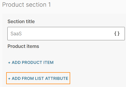
Product Section: You can create sections to categorize your products. Example: SaaS products, CPaaS products, and APIs. You can add a maximum of 10 sections. Each section contains the following fields:
- Section title: A title for the section. Can contain a maximum of 24 characters including spaces, special characters, and attributes. There can be only one line of text.
- Product items: Items from the Meta catalog. You can add a maximum of 30 products across all sections. You can either add the items manually or from a list attribute.
To add an item manually, click Product item. Complete the following fields:
- Product name (optional): The name of the product. Can contain spaces, special characters, and attributes. There can be only one line of text.
If you do not specify a name in this field, the Product ID is displayed in the simulator. The Product name field is used only in the Answers simulator and is not used in a live session. In a live session, the product name from the Meta catalog is displayed. - Product ID: The ID of the product that is present in the Meta catalog
To add items from a list attribute, follow these steps:
-
In the Attributes tab > Attributes tab, click Add attribute.
-
In the Name field, enter a name. Example: list_items. In the Type field, choose List.
-
In the Dialogs tab, go to the dialog that contains the Multi-product element that you created.
-
From the Chatbot actions section, drag and drop the Code element. Add it before the Multi-product element in the editor.
-
In the Code element, create a list of items and set it to the attribute that you created. Add the following information for each list item:
-
Product name (optional): The name of the product. Can contain spaces, special characters, and attributes. There can be only one line of text.
This field is used only in the Answers simulator and is not used in a live session. In a live session, the product name from the Meta catalog is displayed. If you do not specify a name in this field, the Product ID is displayed in the simulator. -
Product ID: The ID of the product that is present in the Meta catalog
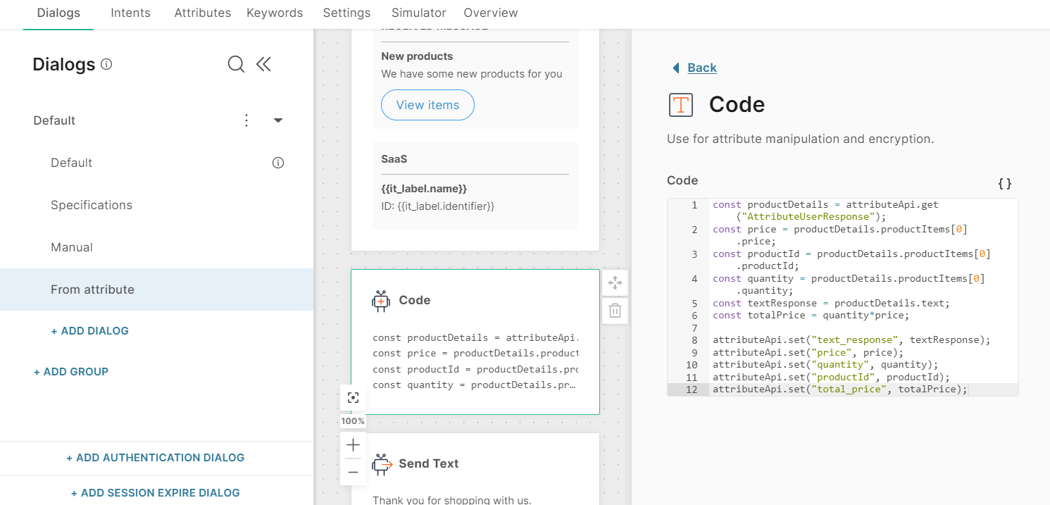
The following example is for a list with two list items:
const items = [
{"name":"Answers", "identifier":"answers"},
{"name":"Things", "identifier":"things"}
];attributeApi.set('list_items', items);
where
items is the name of the list
name and identifier are the field names that you need to use in the Multi-product element in later steps
list_items is the attribute that you created
-
-
In the Multi-product element that you created > Product List tab, click Add from list attribute.
-
Complete the following fields:
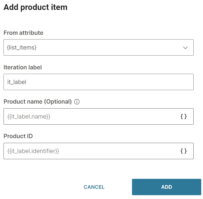
- From attribute: Choose the list attribute that you created. Example: list_items.
- Iteration label: Enter a label. Example: it_label. This value is available as a placeholder in the Product name and Product ID fields.
- Product name (optional): Add the iteration label and the relevant field name that you created in the Code element. Example: {{it_label.name}}. If you have not specified this field in the Code element, leave this field blank
- Product ID: Add the iteration label and the relevant field name that you created in the Code element. Example: {{it_label.identifier}}
-
Click Add.
-
Save user choice to: The attribute in which you want to save the end user's selection. You can either choose an existing attribute from the list or create a new one. To create a new attribute, click Create New Attribute. The response from the end user is in JSON format. Use the Code element from Chatbot actions to extract the attribute value
-
Repeat count: Choose the number of times you want to repeat the message in case you do not receive a valid response from the end user. You can repeat the message a maximum of 3 times
-
Fallback: The action to take if the end user enters an invalid response or performs an unknown action. The Fallback section contains the following fields:
- Fallback action: You can either transfer the chat to an agent (Connect to agent) or send the end user to another dialog (Go to dialog).
- Dialog: If the Fallback action is Go to dialog, choose the relevant dialog. Example: You can go back to the default dialog or to the closing dialog.
- Fallback message (optional): The message to send to the end user. Can contain a maximum of 4,096 characters including spaces, special characters, new line, emojis, and attributes. You can add a maximum of 5 variations of the message. The end user receives one of these messages. To add a variation, click Add variation.
-
Timeout: Specify the time limit that the chatbot waits for the end user to respond. If there is no response within this time, the chatbot takes the action that you specify.
You can set a minimum timeout of 15 seconds and a maximum of 14400 seconds (240 minutes).
NoteThe timeout duration must be less than the session timeout duration.
For more information, refer to the Timeout section.
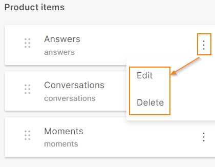
To edit or delete a product item, click the three dots against the item and choose an option. You can also edit the product item by clicking on it.
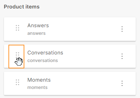
To reorder the product items, use the six dots against an item to drag and drop the item.
After you configure the Multi-product element, add an element, such as Code, to process the response from the end user.
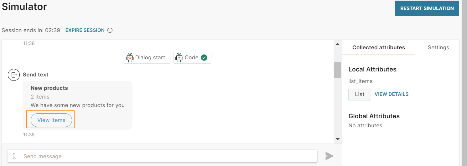
After you configure the chatbot, run the simulator to test the chatbot flow.
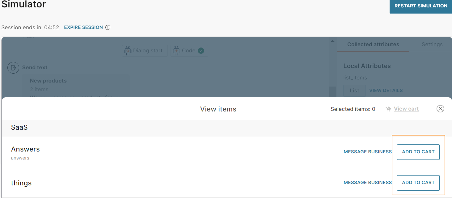
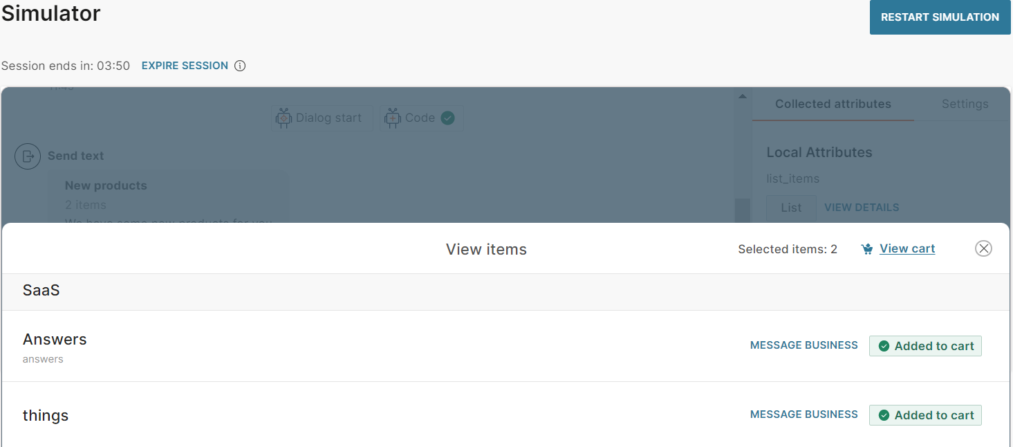
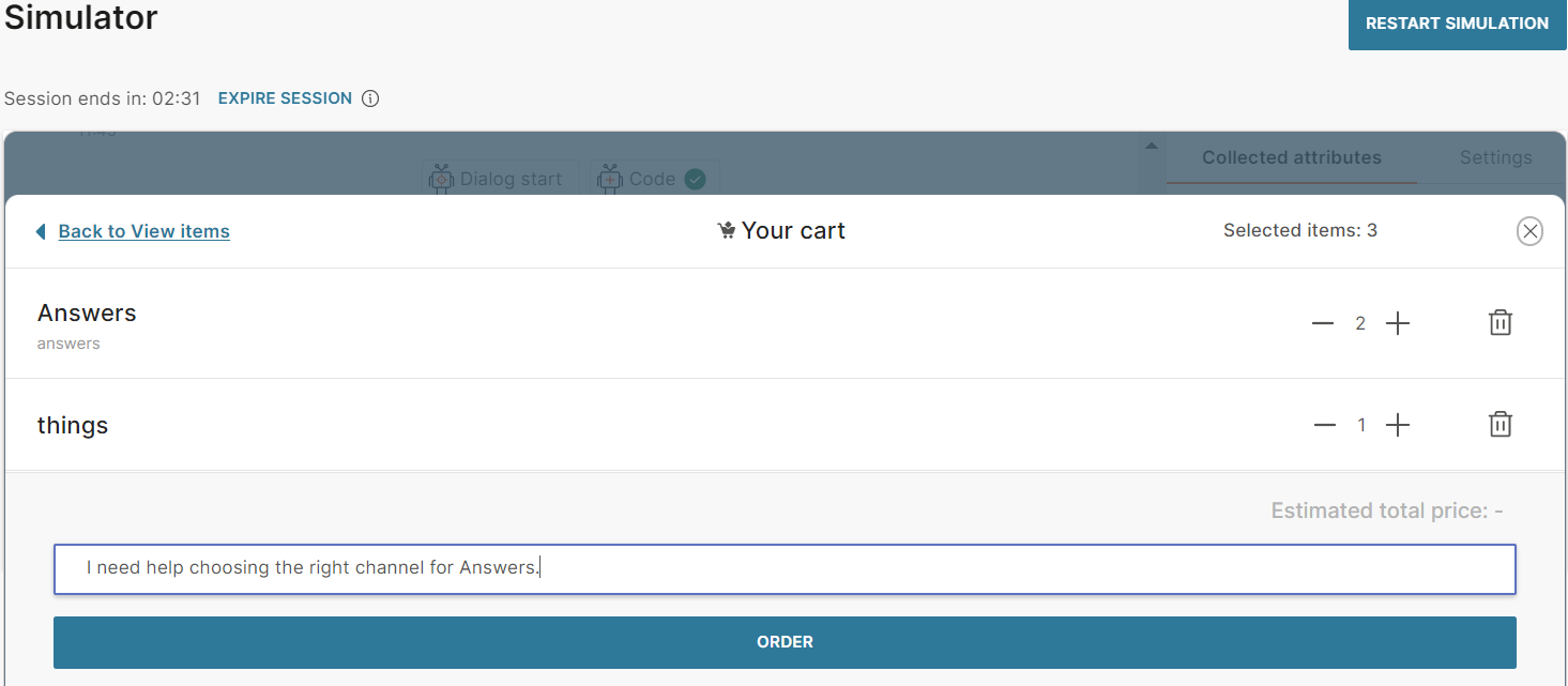
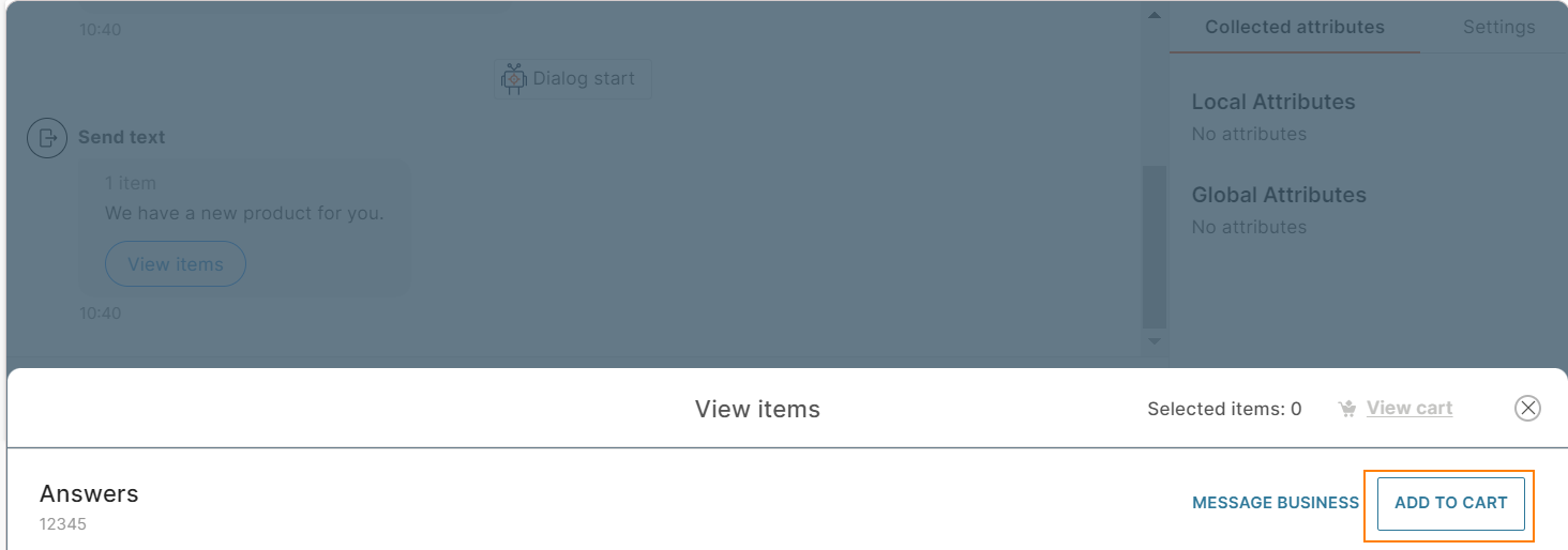
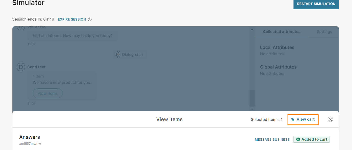
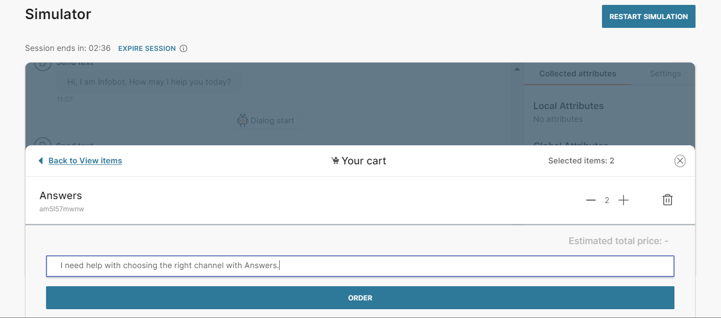
In the simulator, do the following:
- Click View items to view the product.
- Click Add to Cart for the required items.
- Click View Cart.
- Choose the quantity for each product and enter an order message. Click Order.
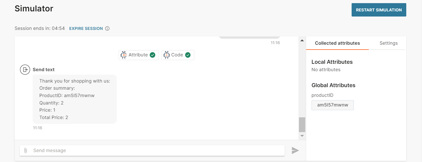
When you use the Answers simulator to test the chatbot flow, the simulator does not connect to the Meta catalog but uses the values that you specify in the chatbot elements. Only the live session connects to the Meta catalog and obtains information from the catalog.
In a live session, the Multi-product message includes the number of items in the message and a View items button. When the end user clicks this button, they can view the names and IDs of the products. They can do the following:
- Message business: Send a message to your business
- Add to cart: Add an item to the cart
- View cart: View items in the cart
- View the estimated total price
- Remove items from the cart
- Order the items
- Send a message along with the order
For more information about Multi-product messages, refer to the WhatsApp documentation.
Reply button
Send a set of reply buttons to obtain information from the end user. Instead of typing a reply to your message, the end user can click one of these buttons to send you a predefined reply. The chatbot receives the postback value of that button. This enables you to capture a specific response from the end user.
Reply buttons contain text and buttons. They can also contain an image, a video, or a document.
To add a reply button to your chatbot, in the chatbot editor, drag and drop the Reply Button element from Chatbot sends. Configure the following fields:
Header type (optional): Choose the type of message. You can choose one of the following:
- None
- Text: Add the Header text. Can contain a maximum of 60 characters including spaces, special characters, emojis, and attributes. There can be only one line of text.
- Image: Either upload an image or add the link to the image. Supported file types are .jpg and .png. To add the link to an image, in the Link tab, enter the public URL that contains the image. The image is displayed before the Body text.
- Video: Either upload a video or add the link to the video. Supported file type is .mp4. To add the link to a video, in the Link tab, enter the public URL that contains the video. The video is displayed before the Body text.
- Document: Either upload a document or add the link to the document. Supported file types are .doc, .docx, .pdf, .ppt, .pptx, .xls, and .xlsx. To add the link to the document, in the Link tab, enter the public URL that contains the document. The URL of the document is displayed before the Body text.
Body text: The message that you send to end users. Can contain a maximum of 1,024 characters including spaces, special characters, new line, emojis, and attributes.
Footer (optional): Additional text. Can contain a maximum of 60 characters including spaces, special characters, emojis, and attributes. There can be only one line of text.
Buttons: You can add a maximum of 3 buttons. You can add buttons either manually or from a list attribute.
To add a button manually, click Add button. Complete the following fields:
- Button title: Text that is displayed on the button and is visible to the end user. Can contain a maximum of 20 characters including special characters, spaces, and attributes. There can be only one line of text.
- Postback: Custom data that is sent back to you when the end user clicks the button. Can contain a maximum of 256 characters including special characters, spaces, and attributes. Example: If the Button title is 'Send me more information', you can specify the postback value as 'send_information'
To add a button from a list attribute, follow these steps:
- In the Attributes tab > Attributes tab, click Add attribute.
- In the Name field, enter a name. Example: buttons. In the Type field, choose List.
- In the Dialogs tab, go to the dialog that contains the reply button element that you created.
- From the Chatbot actions section, drag and drop the Code element. Add it before the Reply button element in the editor.
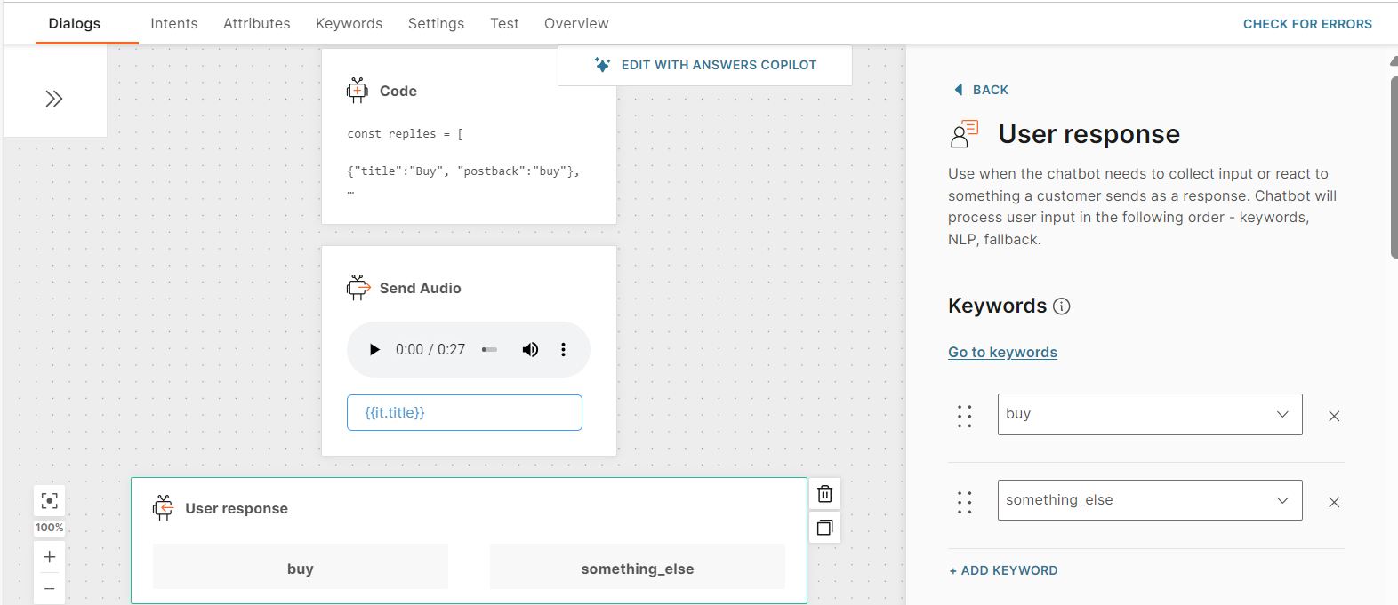
- In the Code element, create a list of reply buttons and set it to the attribute that you created. Add the following information for each reply button:
- Button title: Text that is displayed on the button and is visible to the end user. Can contain a maximum of 20 characters including special characters, spaces, and attributes. There can be only one line of text.
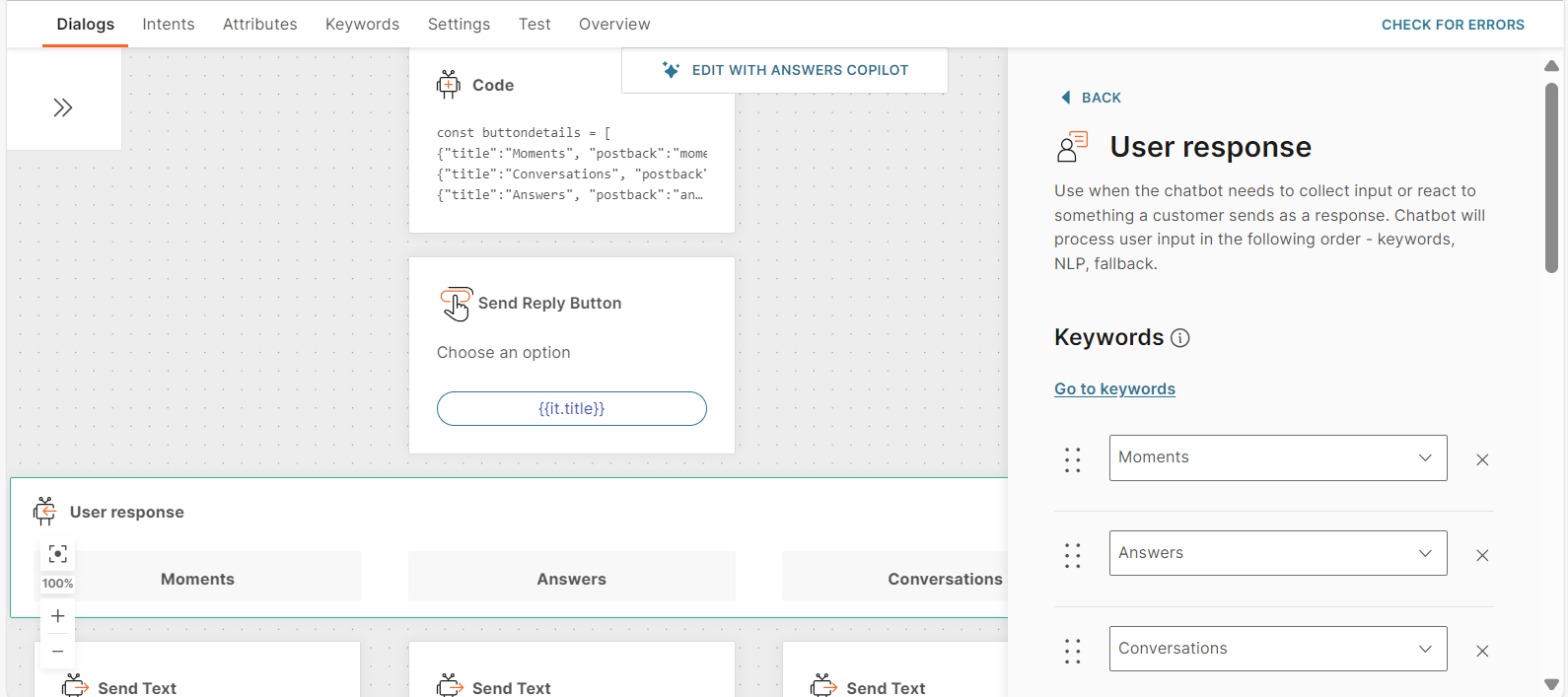
- Postback: Custom data that is sent back to you when the end user clicks the button. Can contain a maximum of 256 characters including special characters, spaces, and attributes. Example: If the Button title is 'Send me more information', you can specify the postback value as 'send_information' The following example is for a list with two reply buttons: const buttondetails = [ {"title":"Moments", "postback":"moments"}, {"title":"Conversations", "postback":"conversations"}, {"title":"Answers", "postback":"answers"}, ]; attributeApi.set('buttons', buttondetails); where buttondetails is the name of the list title and postback are the field names that you need to use in the Reply button element in later steps buttons is the attribute that you created
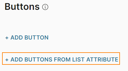
- In the Reply button element that you created, click Add buttons from list attribute.
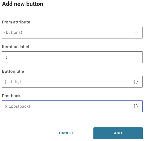
- Complete the following fields:
- From attribute: Choose the list attribute that you created. Example: buttons.
- Iteration label: Enter a label. Example: it. This value is available as a placeholder in the Item title and Postback fields.
- Item title: Add the iteration label and the relevant field name that you created in the Code element. Example: {{it.title}}
- Postback (optional): Add the iteration label and the relevant field name that you created in the Code element. Example: {{it.postback}}
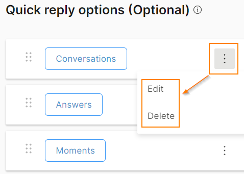
To edit or delete a button, click the three dots against the button and choose an option. You can also edit the button by clicking on it.
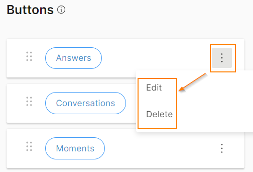
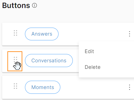
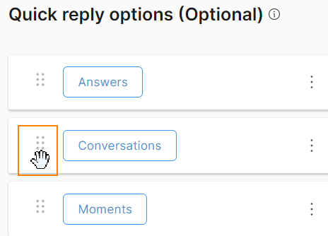
To reorder the buttons, use the six dots against a button to drag and drop the button.
After you configure the Reply Button element, add an element, such as User response, to obtain the response from the end user.
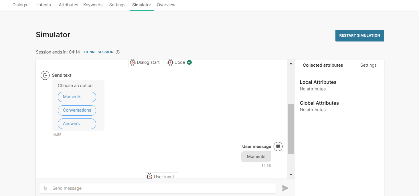
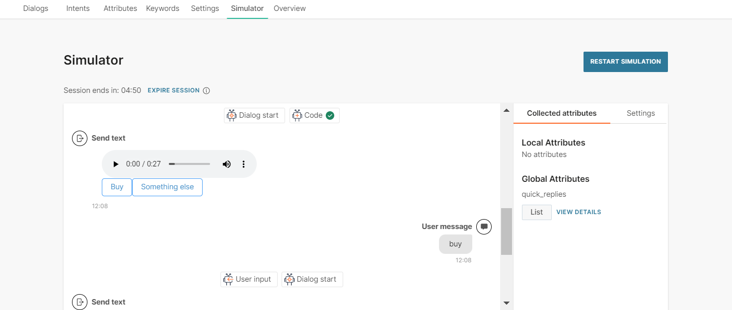
After you configure the chatbot, run the simulator to test the chatbot flow,
For more information about reply buttons, refer to the WhatsApp documentation.
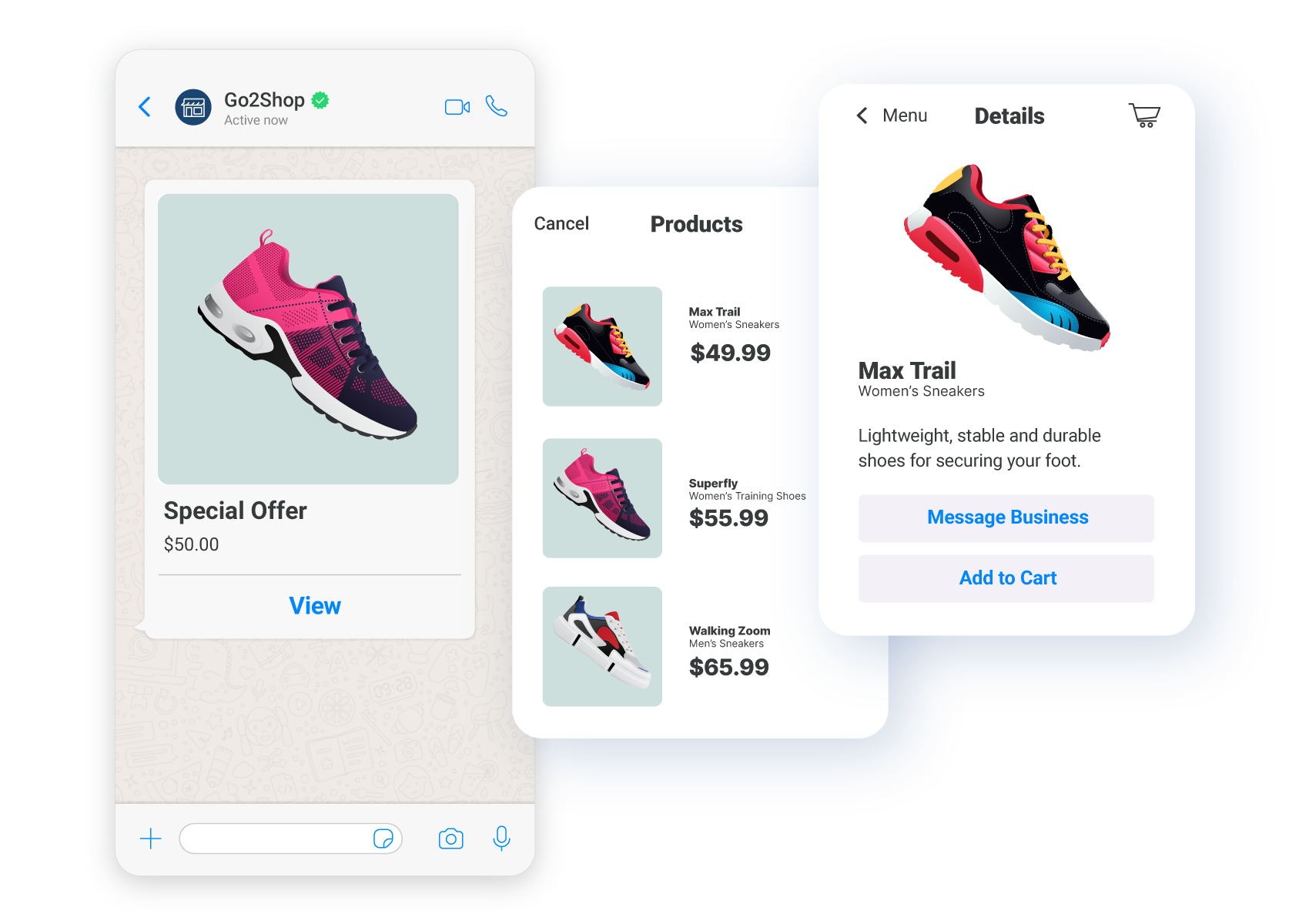
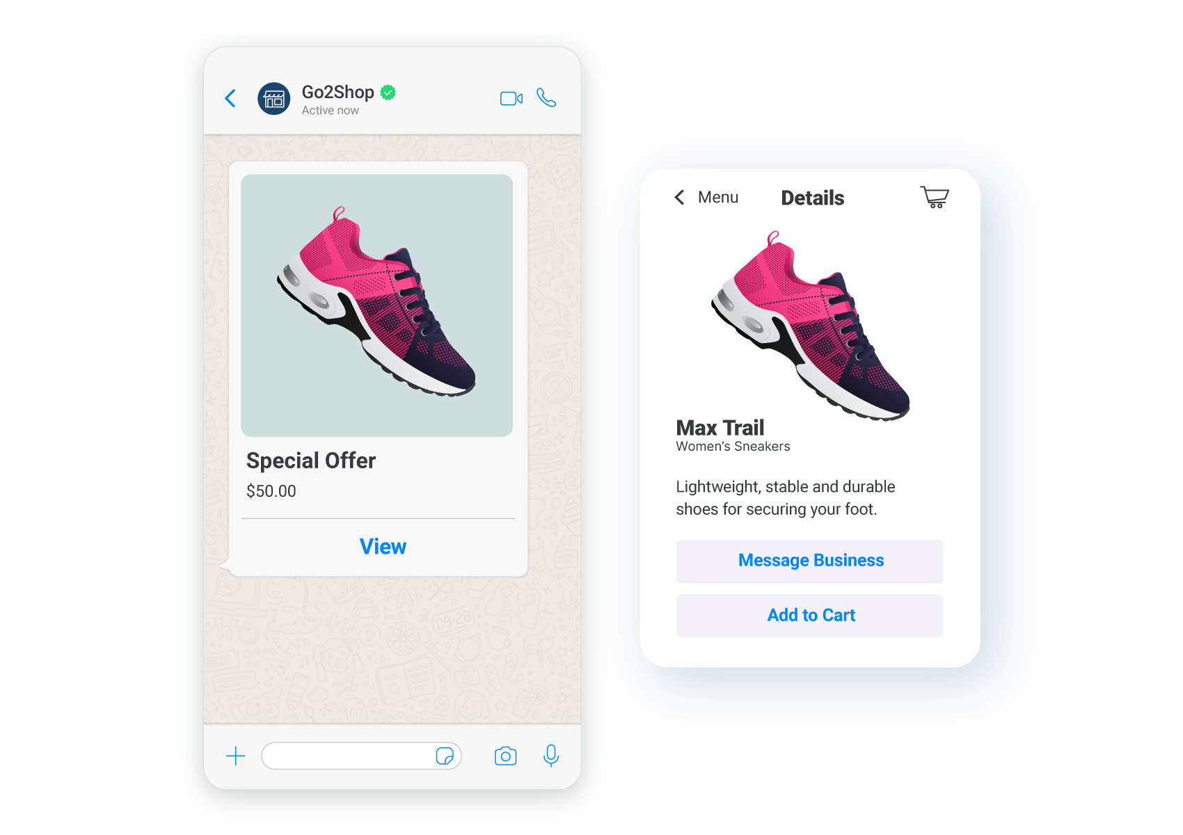
Single product
Send end users an interactive message about a product or service that is present in your catalog. You can include only one product in the message. End users can ask questions about the product, add the product to the cart, and submit the cart without leaving the chat.
To send a Single Product message, you must have a Meta catalog that is connected to your WhatsApp Business Account. For more information, refer to the WhatsApp documentation.
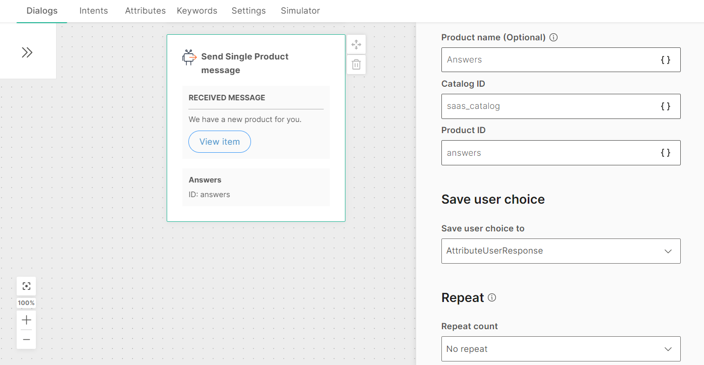
To add a Single Product message to your chatbot, in the chatbot editor, drag and drop the Single product element from Chatbot receives.
Single products contain the following:
- Received message: The message that you send to end users
- Product: The product and its details
Received Message: Configure the message that you send to end users. This tab contains the following fields:
- Body text: The message that you send to end users. Can contain a maximum of 1,024 characters including spaces, special characters, new line, emojis, and attributes.
- Footer text (optional): Additional text that you can send to end users. Can contain a maximum of 60 characters including spaces, special characters, emojis, and attributes. There can be only one line of text.
Product: Configure the product that you send to end users. This tab contains the following fields:
-
Product name (optional): The name of the product. Can contain spaces, special characters, and attributes. There can be only one line of text.
This field is used only in the Answers simulator and is not used in a live session. In a live session, the product name from the Meta catalog is displayed. If you do not specify a name in this field, the Product ID is displayed in the simulator. -
Catalog ID: The ID of the Meta catalog. This value is not displayed to the end user
-
Product ID: The ID of the product that is present in the Meta catalog
-
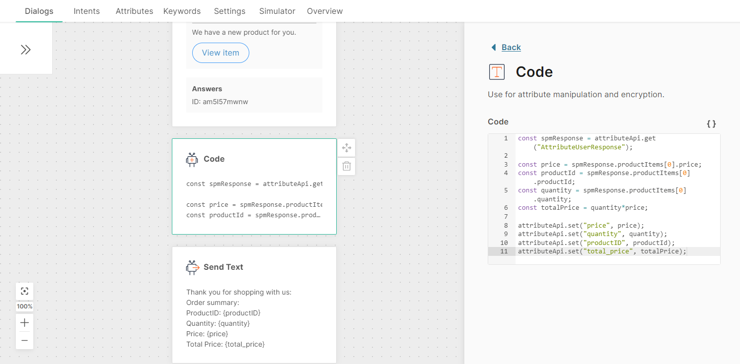
Save user choice to: The attribute in which you want to save the end user's selection. You can either choose an existing attribute from the list or create a new one. To create a new attribute, click Create New Attribute. The response from the end user is in JSON format. Use the Code element from Chatbot actions to extract the attribute value
-
Repeat count: Choose the number of times you want to repeat the message in case you do not receive a valid response from the end user. You can repeat the message a maximum of 3 times
-
Fallback: The action to take if the end user enters an invalid response or performs an unknown action. The Fallback section contains the following fields:
- Fallback action: You can either transfer the chat to an agent (Connect to agent) or send the end user to another dialog (Go to dialog).
- Dialog: If the Fallback action is Go to dialog, choose the relevant dialog. Example: You can go back to the default dialog or to the closing dialog.
- Fallback message (optional): The message to send to the end user. Can contain a maximum of 4,096 characters including spaces, special characters, new line, emojis, and attributes. You can add a maximum of 5 variations of the message. The end user receives one of these messages. To add a variation, click Add variation.
-
Timeout: Specify the time limit that the chatbot waits for the end user to respond. If there is no response within this time, the chatbot takes the action that you specify.
You can set a minimum timeout of 15 seconds and a maximum of 14400 seconds (240 minutes).
NoteThe timeout duration must be less than the session timeout duration.
For more information, refer to the Timeout section.
After you configure the Single Product element, add an element, such as Code, to process the response from the end user.
After you configure the chatbot, run the simulator to test the chatbot flow. In the simulator, do the following:
- Click View items to view the product.
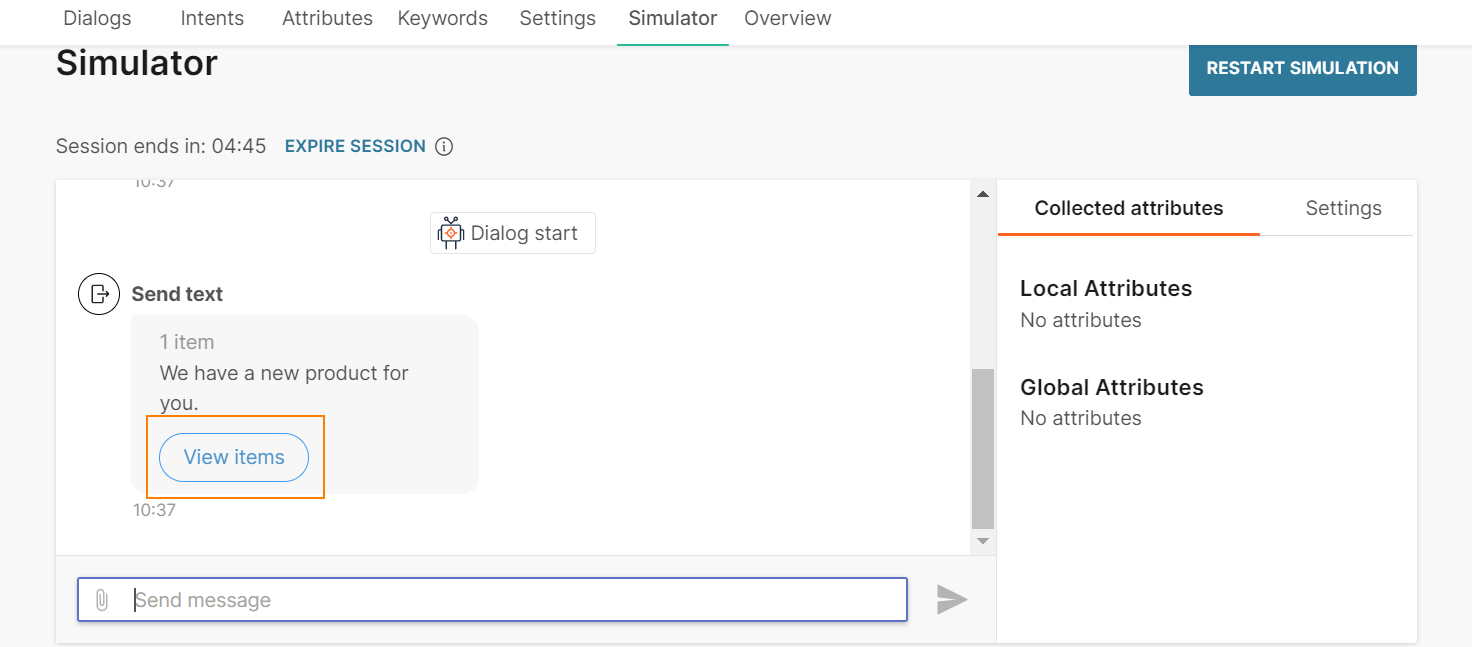
- Click Add to Cart.
- Click View Cart.
- Choose the quantity and enter an order message. Click Order.
 You can now view the order summary.
When you use the Answers simulator to test the chatbot flow, the simulator does not connect to the Meta catalog but uses the values that you specify in the chatbot elements. Only the live session connects to the Meta catalog and obtains information from the catalog.
In a live session, the Product message includes a View items button. When the end user clicks this button, they can view the name and ID of the product. They can do the following:
- Message business: Send a message to your business
- Add to cart: Add the item to the cart
- View cart: View the item in the cart
- View the estimated total price
- Remove the item from the cart
- Order the item
- Send a message along with the order
For more information about single product messages, refer to the WhatsApp documentation.
Sticker
Send stickers to end users.
To add a sticker message to your chatbot, in the chatbot editor, drag and drop the Sticker element from Chatbot sends.
Either upload the sticker or add the link to the sticker. Supported file type is .wepb. Maximum file size is 100 KB. To add the link to a sticker, in the Link tab, enter the public URL that contains the sticker.
For more information about sticker messages, refer to the WhatsApp documentation.
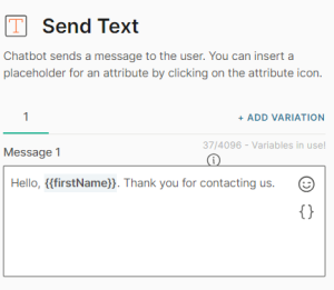
Text
Send text-only messages and use personalization options in conjunction with attributes, objects, links, and emojis. If you are using links, use the link preview option to auto-display previews in messages. This option is enabled by default.
To add variations of the message, select Add variation.
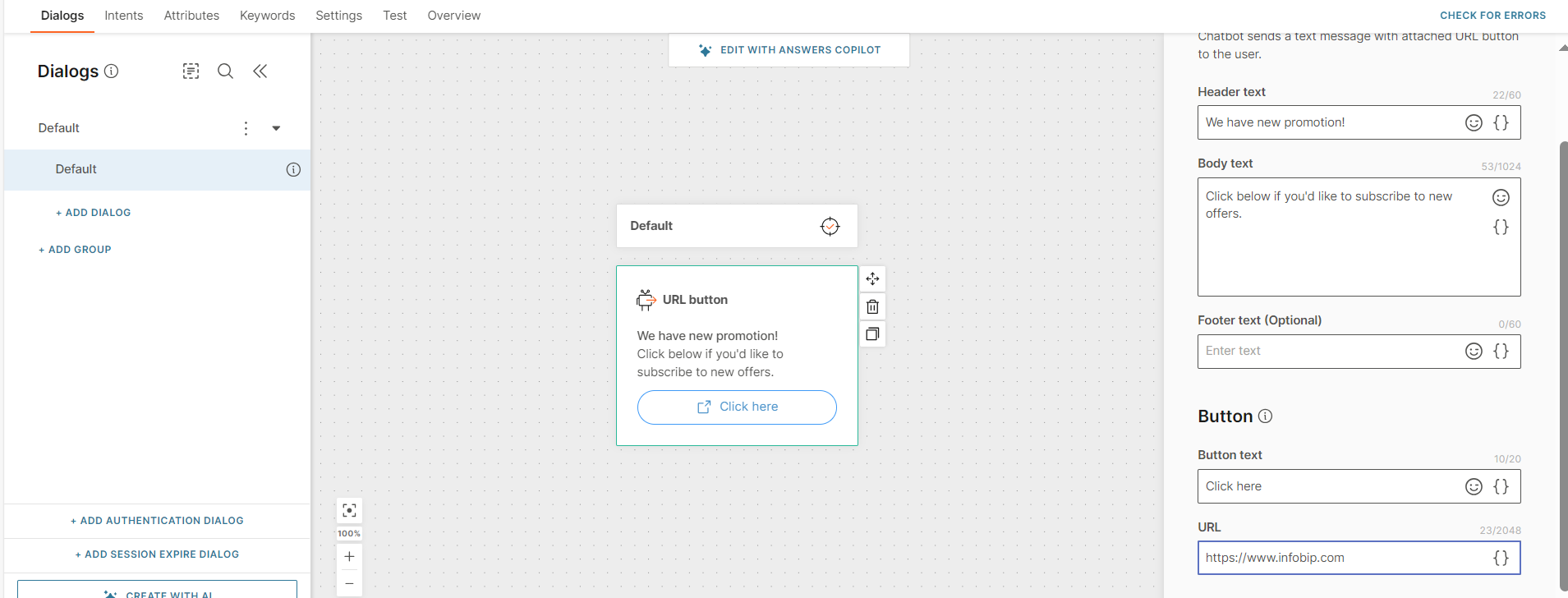
URL button
Use the URL button element to send a call-to-action (CTA) button along with text to the end user. Use the CTA button to direct the end user to a specific URL. Example: Link to your website, FAQ page, or other online resources.
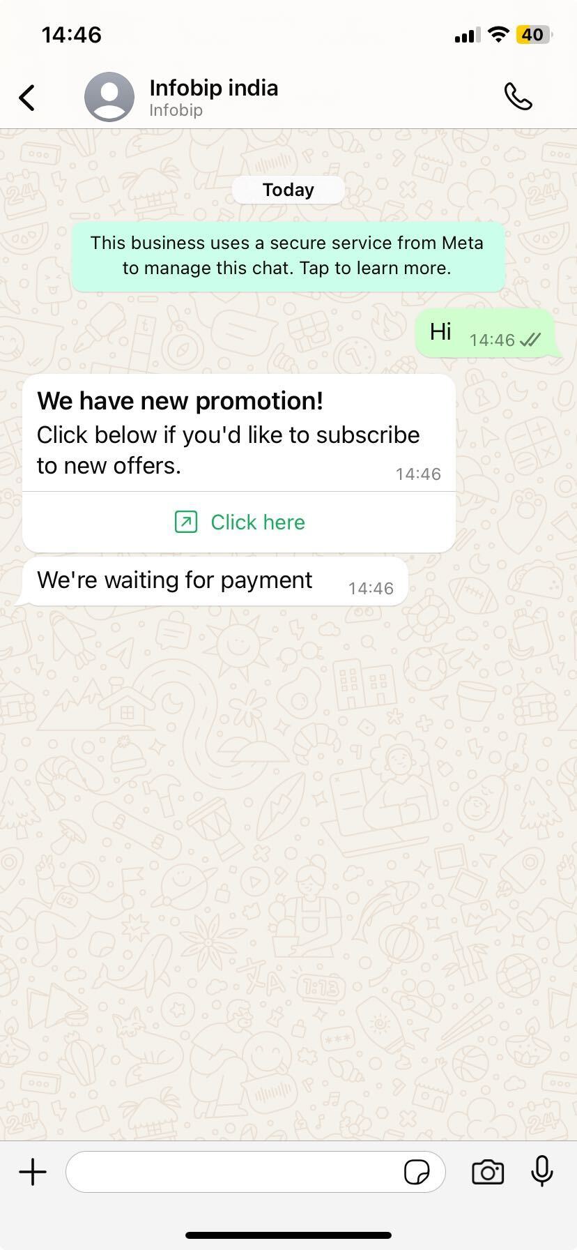
Configure the element
To add the URL button element to your chatbot, drag the element from Chatbot sends to the canvas. Configure the following fields.
Header text (Optional)
Include a header in the message to add context.
You can add a maximum of 60 characters, including spaces, special characters, emojis, and attributes. There can be only one line of text.
Body text
Specify the message content.
You can add a maximum of 1,024 characters, including spaces, special characters, new line, emojis, and attributes.
Footer text (Optional)
Include a footer in the message to add context.
You can add a maximum of 60 characters, including spaces, special characters, emojis, and attributes. There can be only one line of text.
Button text
Specify the text to display on the button. Example: Click here.
You can add a maximum of 20 characters, including spaces, special characters, emojis, and attributes. There can be only one line of text.
URL
Specify the URL that opens when the end user selects the button.
You can add a maximum of 2,048 characters. You can include attributes in the URL.
Test the element
After you configure the chatbot, go to the Test tab to check the chatbot flow.
When you select the button, the web page opens.
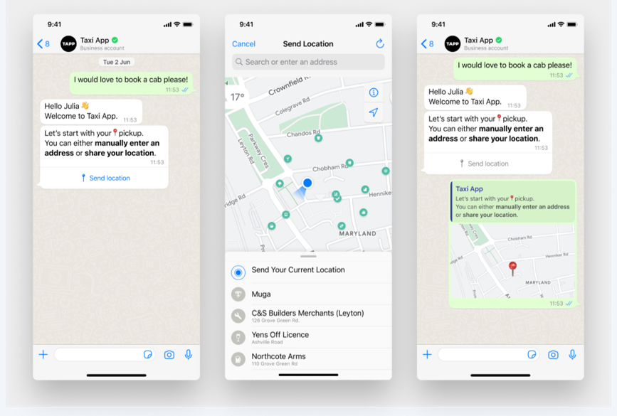
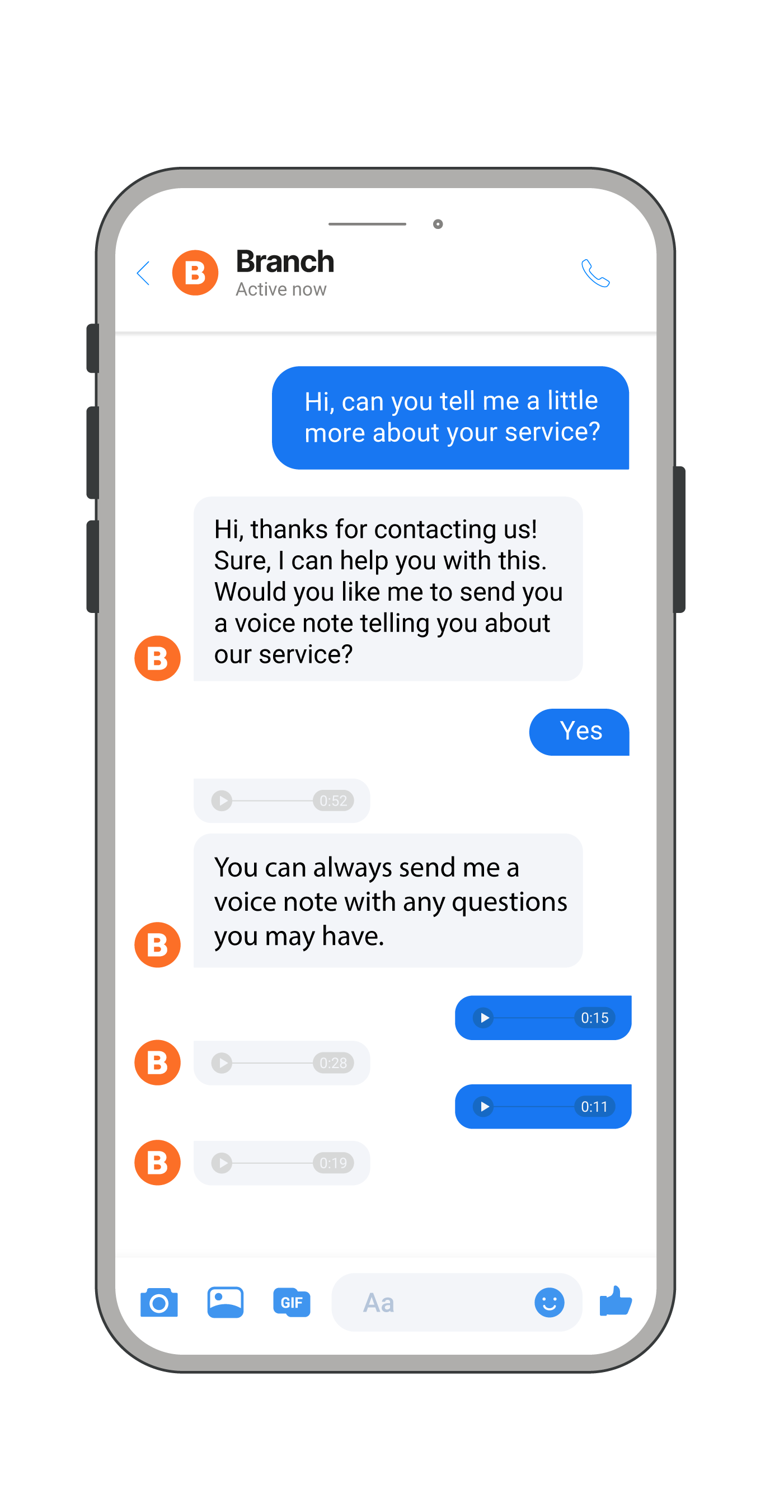
User location
Use the User location element to get the location from an end user. This element sends a button to the end user. When the end user selects the button, they can specify the location to send to the chatbot.
You can then use the end user's location to provide location-based information and services. Example: Food delivery, weather updates, location of the nearest ATM, sending emergency assistance, sending onsite technicians, and booking a taxi.
Configure the element
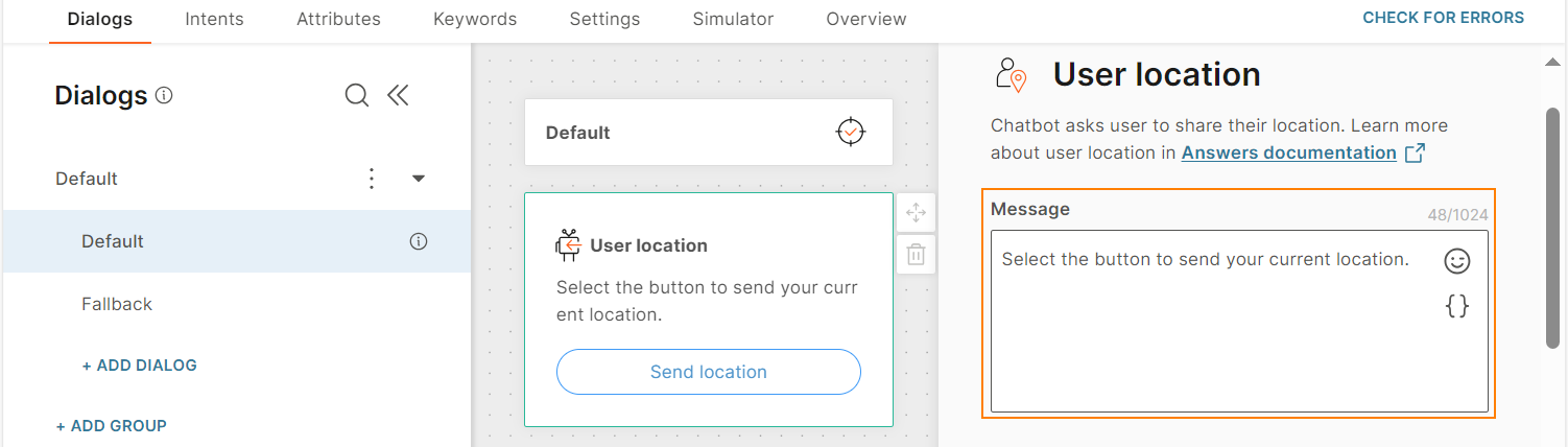
To add the User location element to your chatbot, drag the element from Chatbot receives.
You cannot configure the text that is displayed on the button. The default value is Share location.
Configure the following fields.
Message: Specify the message to send to the end user. Example: Share instructions about how the end user can send their location.
This message is sent along with the button.
You can add a maximum of 1,024 characters, including space, new line, special characters, attributes, and emojis.
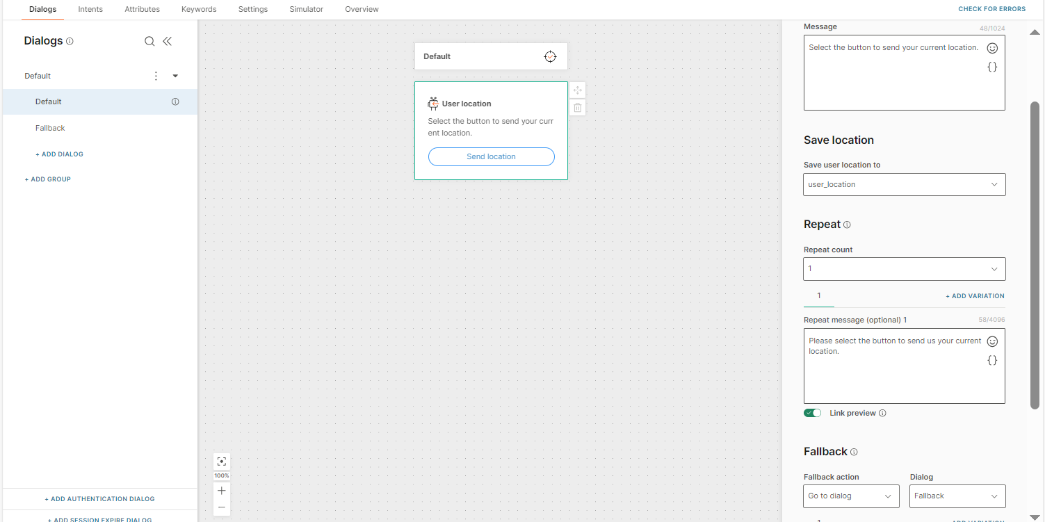
Save user location to: Select the attribute in which to save the location shared by the end user. The attribute data type must be Receive location.
Repeat: Specify whether to resend the message in the Body text field in case you do not receive a valid response from the end user.
- Repeat count: Choose the number of times you want to repeat the message. You can repeat the message a maximum of 3 times.
- Repeat message (Optional): Specify the message to send to the end user. Example: Ask them to select the location button.
The message can contain a maximum of 4,096 characters including spaces, special characters, new line, emojis, and attributes.
To add variations of the message, select Add variation.
- Link preview: Set whether the end user can see a preview of any link that you share in the Repeat message field.
Fallback: Specify the action to take if the end user enters an invalid response or performs an unknown action. The Fallback section contains the following fields:
-
Fallback action: You can either transfer the chat to an agent (Connect to agent) or send the end user to another dialog (Go to dialog).
-
Dialog: If the Fallback action is Go to dialog, choose the relevant dialog. Example: Default dialog, the menu, or the closing dialog.
-
Fallback message (optional): Send the end user a message to inform them that there is an issue. Example: Sorry, we are experiencing technical difficulties. Please try again later.
The message can contain a maximum of 4,096 characters including spaces, special characters, new line, emojis, and attributes.
To add variations of the message, select Add variation.
-
Link preview: Set whether the end user can see a preview of any link that you share in the Fallback message field.
Timeout: Specify the time limit that the chatbot waits for the end user to respond. If there is no response within this time, the chatbot takes the action that you specify.
You can set a minimum timeout of 15 seconds and a maximum of 14400 seconds (240 minutes).
The timeout duration must be less than the session timeout duration.
For more information, refer to the Timeout section.
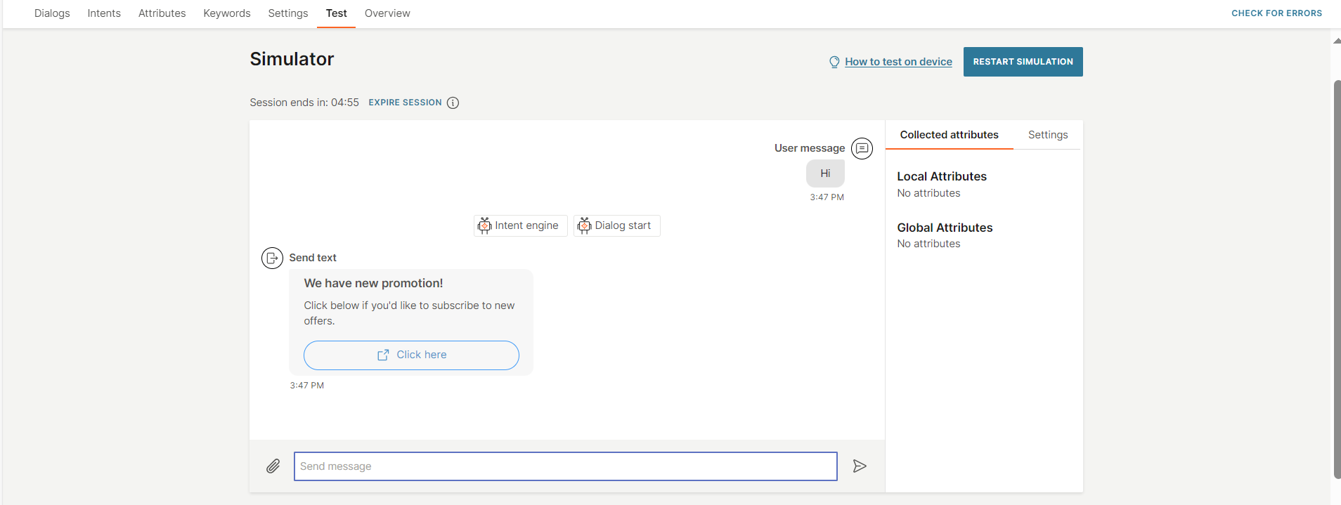
Test the element
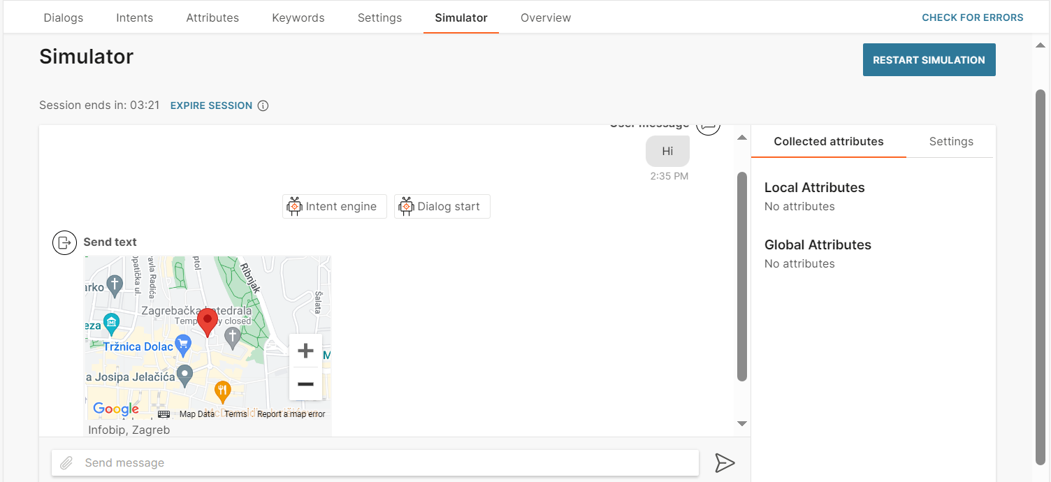
In the simulator, do the following.
- Send a message to the chatbot to start the conversation.
- When the chatbot sends you the location button, select the button.
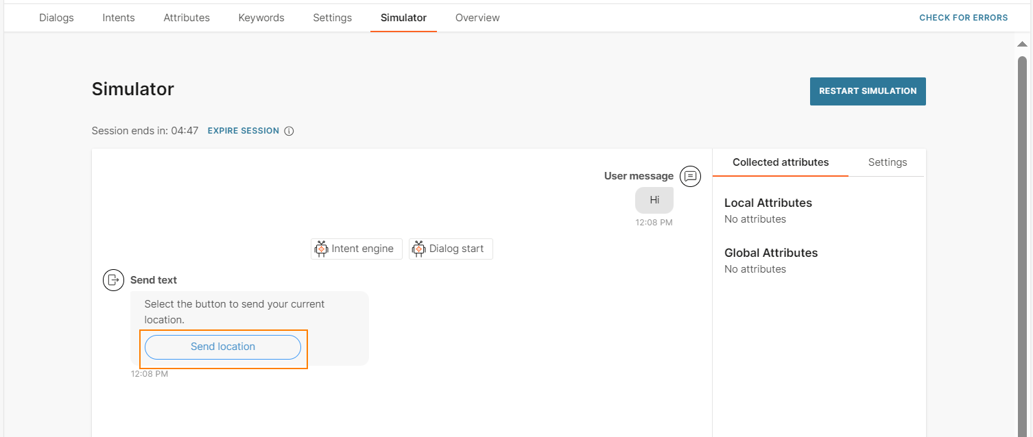
- Either type the address or select a location on the map.
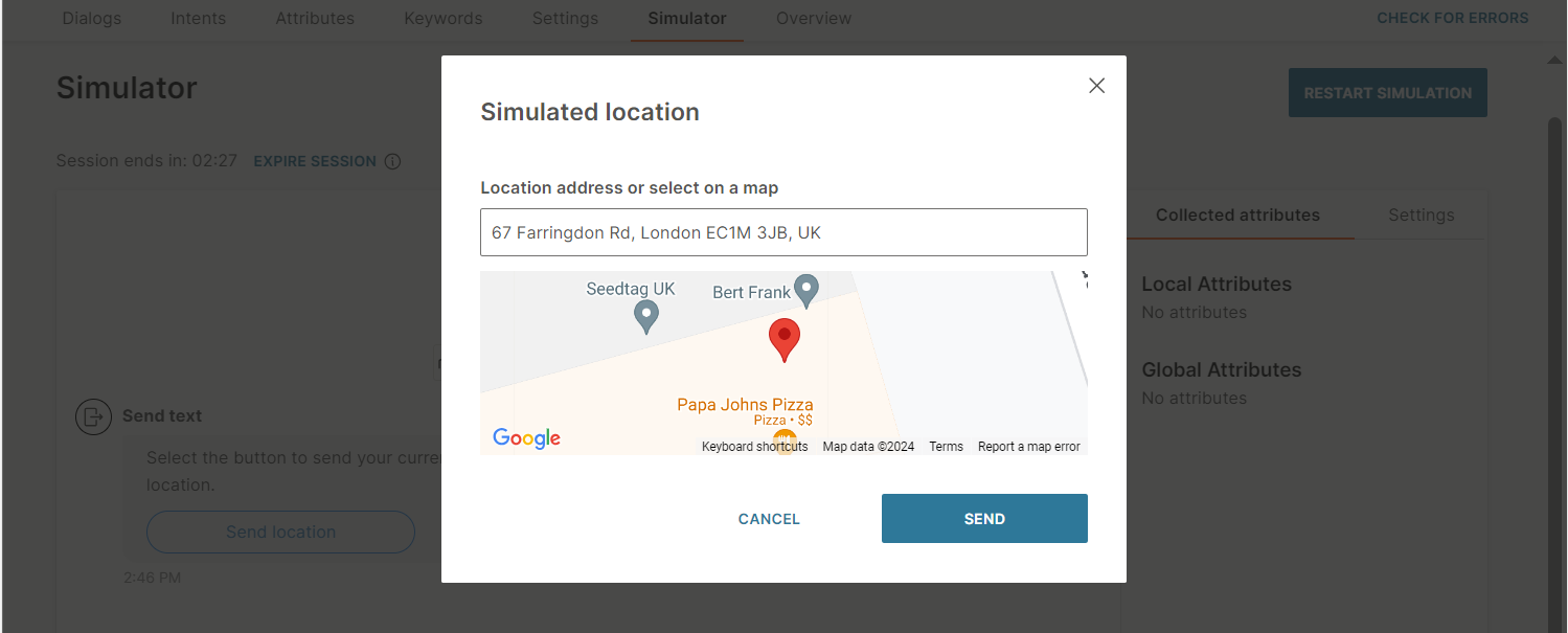
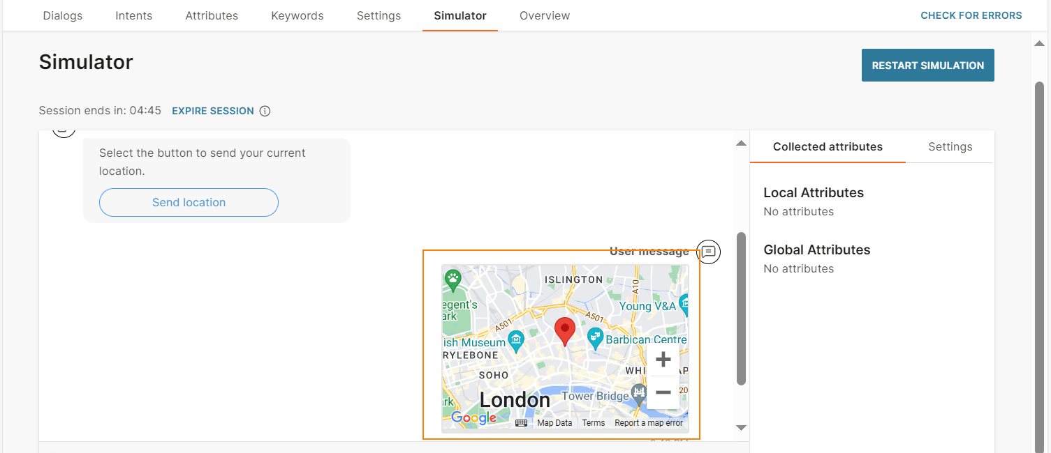
The chatbot receives the selected location.
To check whether the location is stored correctly in the attribute, select Attribute, and then select View location.
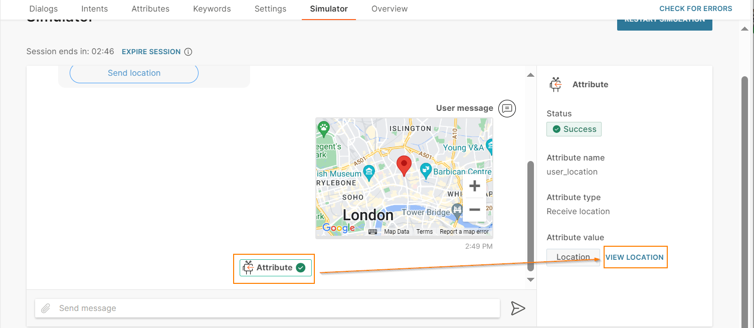
Check whether the location that you selected is shown.
Video
Send pre-recorded videos either by directly uploading into the Answers editor or by providing a direct open URL. The link option also supports attributes if you need to customize the URL. Add an optional caption to your video.
Supported video formats differ depending on which channel your chatbot is using. Make sure to check out the relevant Message types sections for each channel type.
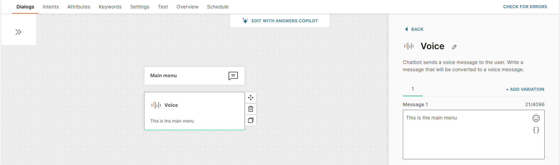
Voice
Use this element to send voice messages to end users. Enter the message in text format. The chatbot uses text-to-speech functionality to send the text as a voice message to end users.
To send pre-recorded messages as audio files, use the Audio element instead.
Prerequisites
Enable voice functionality in your chatbot. Only then, this element is available to use in the chatbot. Configure the voice settings.
Configure the element
Drag the Voice element from Chatbot sends. In the Message field, create the text message.
The message can contain a maximum of 4,096 characters including spaces, special characters, new line, emojis, and attributes.
(Optional) To add variations of the message, select Add variation.
For more information about voice chatbots and guidelines to create voice messages, refer to the Create a voice-enabled chatbot documentation.
Voice functionality in other chatbot elements
You can use voice functionality not only in the Voice element, but also in a few other chatbot elements. In these elements, the text in the message fields is converted to voice when the end user receives the message.
For more information about voice chatbots and guidelines to create voice messages, refer to the Create a voice-enabled chatbot documentation.
Prerequisites
Enable voice functionality and configure the voice settings.
Chatbot elements that support voice functionality
You can enable voice functionality in the following chatbot elements:
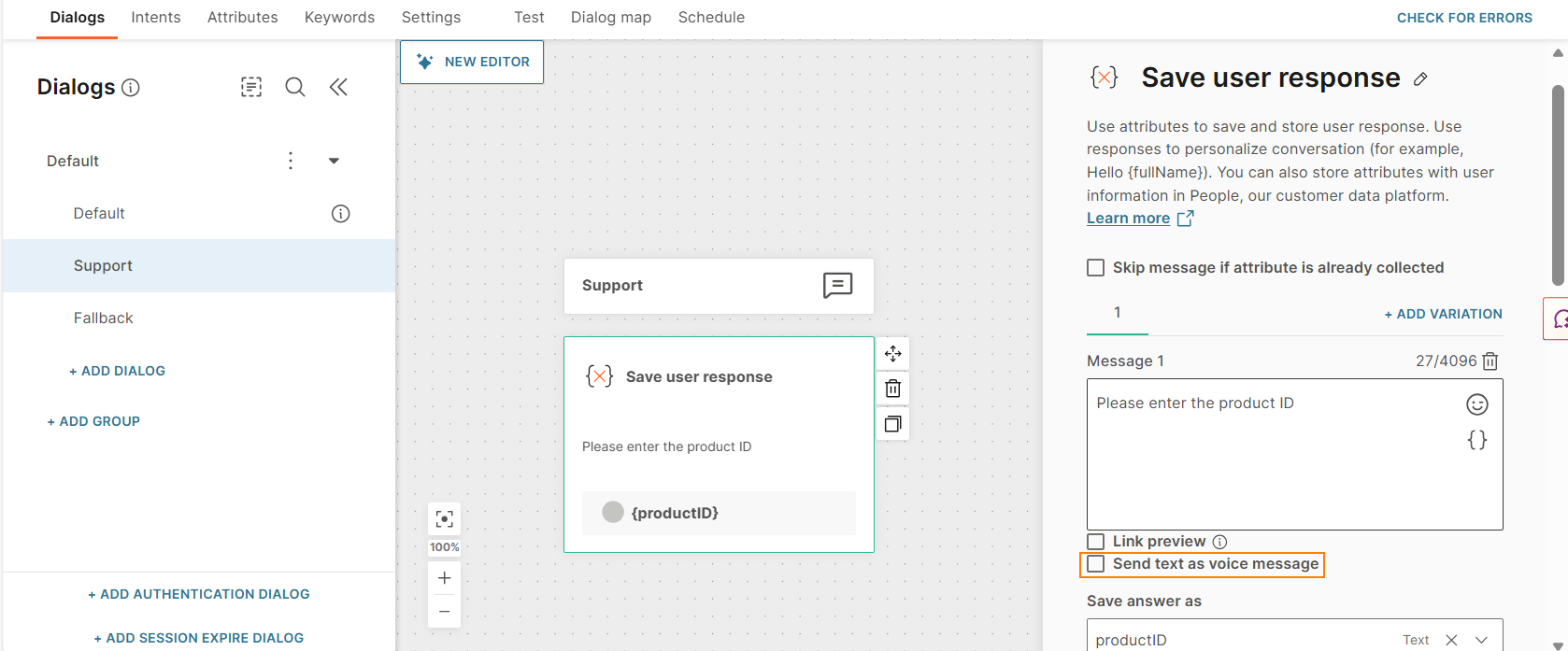
-
Save user response: Enable voice for each message field in the Save user response element individually. Select Send text as voice message for the required field.
Example: In the following image, the chatbot reads out Please enter the product ID.
-
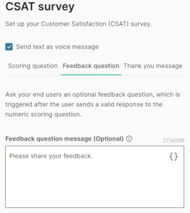
CSAT survey: Enable voice for all the message fields in the CSAT survey element. Select Send text as voice message to apply the setting to all the message fields.
Example: For the Feedback question message field shown in the following image, the chatbot reads Please share your feedback.
WhatsApp flows
WhatsApp flows is an interactive message type that enables you to add end-to-end custom workflows to your chatbot. These workflows enable the end users to perform tasks, such as filling out forms, without leaving the WhatsApp chat with your business.
Use WhatsApp flows to create simple forms, create multi-screen workflows, and exchange information with end users. The following are examples of use cases for WhatsApp flows.
- Offer products to end users.
- Manage orders and delivery.
- Collect information through forms. Example: Collect feedback, register for an event, or schedule an appointment.
- Create personalized offers.
- Create surveys.
How WhatsApp flows work
The flow consists of a set of screens that work together to perform one or more tasks. These screens contain interactive elements such as forms, drop-down menus, and date-pickers.
Create these flows in your WhatsApp manager and then add the flow to your chatbot by using the WhatsApp flows element.
The process is as follows.
- Create the WhatsApp flow in your WhatsApp manager.
- In your chatbot, add and configure the WhatsApp flow element. Specify the ID of the WhatsApp flow in this element so that the chatbot knows which flow to use.
- When the end user contacts your chatbot, direct them to the dialog that contains the WhatsApp flow element, when required.
- The entry point to the flow is a call-to action button that you configure. Send this button to the end user along with a message that guides the end user.
- When the end user selects the button, the first screen of the flow is displayed within the chat screen.
- The end user completes the actions required on this screen and moves to the next screen.
- The end user goes through all the screens until the flow is complete.
- The end user then continues the WhatsApp chat with your chatbot.
Example: In WhatsApp manager, create a flow to book an appointment. Add the flow to your chatbot. An end user contacts your business to book an appointment. Your chatbot design directs them to the flow. The end user follows the screens in the flow to book the appointment. The end user can then continue to chat with your business.
Create a WhatsApp flow in WhatsApp manager
To create and use WhatsApp flows, set up an account on the WhatsApp Business Platform (opens in a new tab). This gives you access to the WhatsApp Manager (opens in a new tab) as part of your WhatsApp Business Account.
If you need help in creating WhatsApp flows in your chatbot journey, contact your Infobip account manager or contact our support team (opens in a new tab).
Add a WhatsApp flow to your chatbot
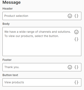
To add a WhatsApp flow to your chatbot, drag the WhatsApp flows element from Chatbot receives. Complete the following fields in the element.
Message
Configure the message and a call-to-action button to send to the end user. When the end user selects the button, the first screen of the WhatsApp flow is displayed to the end user.
This section contains the following fields:
Header (optional)
Header of the message.
You can add a maximum of 60 characters, including spaces, special characters, emojis, and attributes.
Body
Body of the message.
You can add a maximum of 1,024 characters, including spaces, special characters, new line, emojis, and attributes.
Footer (optional)
Footer of the message.
You can add a maximum of 60 characters, including spaces, special characters, emojis, and attributes.
Button text
The text on the call-to-action button.
You can add a maximum of 20 characters, including spaces, special characters, and attributes.
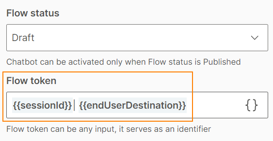
Flow information
Flow ID
Enter the unique identifier of the flow. This ID is created automatically when you create the flow in your WhatsApp Manager.
Flow status
Specify the status of the flow.
- Draft: Select this option when the flow is not ready to be shared with the end user. Example: You are still editing the flow in WhatsApp manager.
- Published: Select this option when the flow is ready to be shared with the end user.
The default value is Published.
If you activate the flow when it is in Draft status, the header, body, footer, and button text are not displayed to the end user.
For more information, refer to the Meta documentation (opens in a new tab).
Flow token
Enter an identifier so that you can identify a session or a flow. You can either create an identifier manually or use attributes. There is no specific format for the token.
This value is different from the Flow ID field.
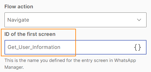
Flow action
Select one of the following options.
- Navigate: Use this option to predefine the first screen of the flow.
- Data exchange: Use this option if the screen is dynamic and needs to fetch data from your endpoints (opens in a new tab).
The default value is Navigate.
For more information, refer to the Meta documentation (opens in a new tab).
ID of first screen
If the Flow action is Navigate, specify the identifier that you created for the first screen of the flow. You can get this information from your flow in WhatsApp manager.
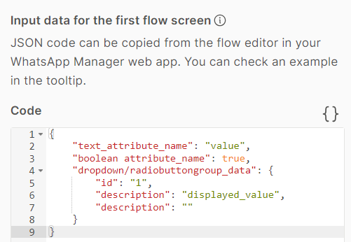
Input data for the first flow screen
If the Flow action is Navigate, define the JSON format of the first screen. You can copy this information from the flow editor in WhatsApp manager.
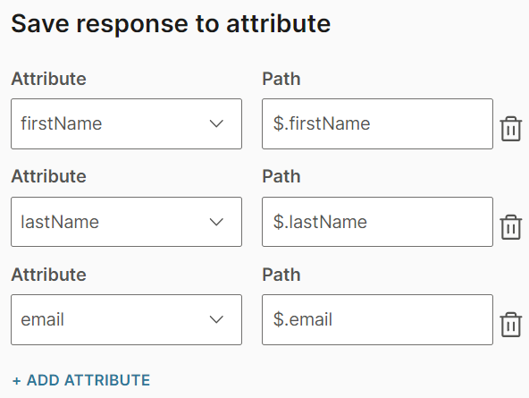
Save response to attribute
When the end user completes the flow, it sends a response in JSON format. Save this response in attributes. You can either save the entire response in a single attribute or save different parameters of the response in multiple attributes.
Do the following:
- Create one or more attributes to save the response.
- Select Add attribute.
- In the Attribute field, select an attribute from the list.
- In the Path field, enter the path to the attribute. The path is the location in the JSON file hierarchy where the value of that attribute is located. Depending on the level where the attribute is located, include all the previous levels separated by a dot “ .” in the attribute path.
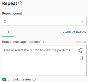
Repeat
Specify whether to resend the message in the Message > Body field in case you do not receive a valid response from the end user.
This section contains the following fields:
Repeat count
Choose the number of times you want to repeat the message. You can repeat the message a maximum of 3 times. The default value is 1.
Repeat message (optional)
Specify the message to send to the end user. The message can contain a maximum of 4,096 characters including spaces, special characters, new line, emojis, and attributes.
To add variations of the message, select Add variation.
Link preview (optional)
Set whether the end user can see a preview of any link that you share in the Repeat message field.
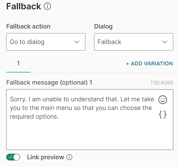
Fallback
Select the action the chatbot needs to take if the end user enters an invalid response or performs an unknown action.
This section contains the following fields:
Fallback action
You can either transfer the chat to an agent (Connect to agent) or send the end user to another dialog (Go to dialog).
Dialog
If the Fallback action is Go to dialog, choose the relevant dialog. Example: You can go back to the default dialog or to the closing dialog.
Fallback message (optional)
Specify the message to send to the end user. The message can contain a maximum of 4,096 characters including spaces, special characters, new line, emojis, and attributes.
To add variations of the message, select Add variation.
Link preview (optional)
Set whether the end user can see a preview of any link that you share in the Fallback message field.
Timeout
Specify the time limit that the chatbot waits for the end user to respond. If there is no response within this time, the chatbot takes the action that you specify.
You can set a minimum timeout of 15 seconds and a maximum of 14400 seconds (240 minutes).
The timeout duration must be less than the session timeout duration.
For more information, refer to the Timeout section.
Test the flow
Test the flow in the simulator and update the flow as required.
Select the button.
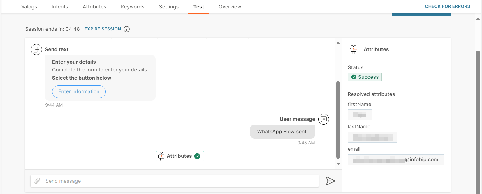
You cannot test the entire flow because you need to have a response from the WhatsApp flow. To simulate the response, enter a valid JSON response in the code editor in the simulator.
Responses are available in the Response section of Snippets in the flow in WhatsApp manager.
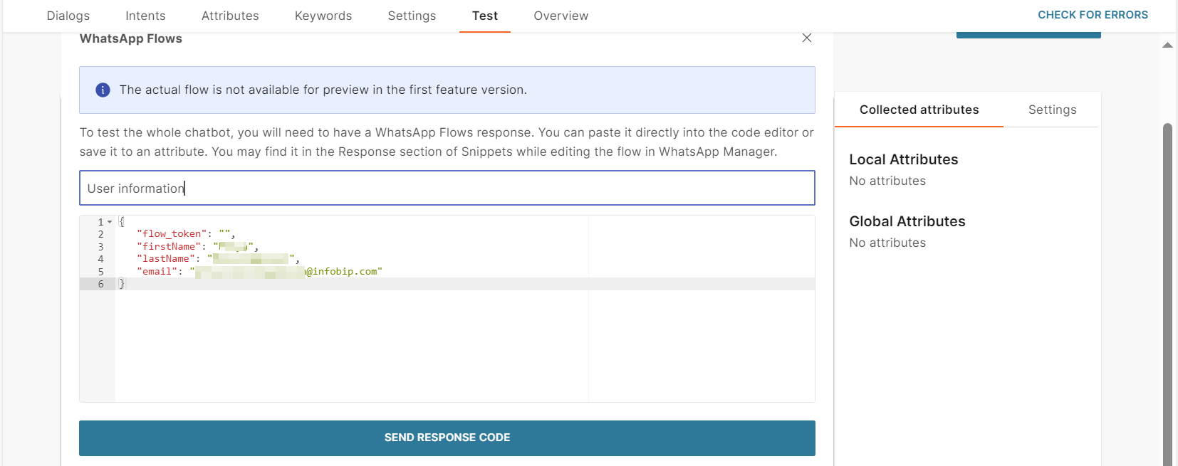
The attributes, which you configured to save the response, contain the information from the JSON response that you added.
Delete a WhatsApp flow
You can delete flows in your WhatsApp manager. You can delete only draft flows.
When you delete a draft flow, the WhatsApp flows element in the chatbot results in an error and the message is not sent to the end user.
To avoid this situation, in your chatbot > WhatsApp flows element, do one of the following:
- Use another suitable WhatsApp flow in the element.
- If you do not want to use any WhatsApp flows, delete the WhatsApp flow element, and redirect the end user to a different section of the chatbot.
Viber Business Messages
Viber Business Messages is a secure, two-way communication channel that helps businesses communicate with end users. Use Business Messages on Answers to provide customer support.
Viber Business Messages offers a variety of message types, as well as Viber-specific message types such as custom keyboards. Refer to the messaging limitations for each message type.
To use Viber Business Messages in Answers, you must enable this channel in your Infobip account.
Button
Send options for the user to select from when they receive this message. Add buttons and define their postback values, rather than letting the user enter their own value. This allows you to capture the specific responses you need from users.
Provide a button message, then use the add options to add generic buttons or buttons based on attribute values.
Image
Send images to end users by either uploading the image in the Answers editor or by providing a direct open URL to the image. The link option also supports attributes if you need to customize the URL. Add an optional caption to your image.
Supported image formats depend on the channel that your chatbot uses. Refer to the Message types section for the relevant channel.
Location
Send locations to users when you need to provide them with directions. You can do this either by directly searching for a location, entering the specific coordinates or by using a value stored against an MO Location attribute.

The search engine is powered by Google so the location will need to be live in Google Maps. For the coordinates, you will need to provide the specific longitude and latitude values.
If you are using an MO attribute you will need to have already created it in the Attributes tab. The value captured during the chat and stored against this attribute will be used when sending the location.
Once you have provided the desired location, you can rename it using the Location name field to appear in the Answers chat.
Text
Send text-only messages and use personalization options in conjunction with attributes, objects, links, and emojis. If you are using links, use the link preview option to auto-display previews in messages. Note however not all channels support this. This option is enabled by default.
To add variations of the message, select Add variation.
Character limits differ depending on which channel your chatbot is using. Make sure to check out the relevant Message types sections for each channel type.
LINE
LINE is one of the most popular chat apps in East Asia and is mostly used in Japan, Indonesia, Thailand, and Taiwan. Use your LINE Official account to connect with end users.
LINE offers a variety of message types such as images and carousels. Refer to the messaging limitations for each message type.
To use LINE in Answers, you must enable this channel in your Infobip account.
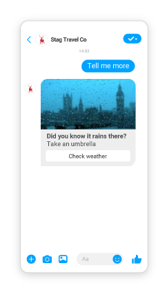
Carousel
Send a string of up to 10 rich cards in one message. Carousels are the easiest way for users to scroll through items and compare them individually without having to receive multiple messages.
Set which size you would like the carousel layout to be, then configure the rest of the cards the same way you would a rich card message. As well as having quick replies you also have card replies for individual cards which work on the same principle.
To use attributes in replies for this message type, you need to set this up as a list attribute. In this case, the Iteration labelis the name you give to the attribute value placeholder – depending on the number of values saved in the list attribute, that many quick replies will be created (values will replace the placeholder in the quick reply).
As soon as you enter the Iteration label text, it appears as an item in the Personalize {} list and is available for use.
If you want each card to have a different image, you can always save the image in the attribute list and use it as one of the displayed items (use Personalize { } on the image link).
Carousel message limitations differ depending on which channel your chatbot is using. Make sure to check out the relevant Message types sections for each channel type.
Image
Send images to end users by either uploading the image in the Answers editor or by providing a direct open URL to the image. The link option also supports attributes if you need to customize the URL. Add an optional caption to your image.
Supported image formats depend on the channel that your chatbot uses. Refer to the Message types section for the relevant channel.
Location
Send locations to users when you need to provide them with directions. You can do this either by directly searching for a location, entering the specific coordinates or by using a value stored against an MO Location attribute.
The search engine is powered by Google so the location will need to be live in Google Maps. For the coordinates, you will need to provide the specific longitude and latitude values.
If you are using an MO attribute you will need to have already created it in the Attributes tab. The value captured during the chat and stored against this attribute will be used when sending the location.
Once you have provided the desired location, you can rename it using the Location name field to appear in the Answers chat.
Rich card
Send templated rich card messages to users which allows them to quickly reply selecting one of the options provided in the message.
Rich card messages combine other simple message types all into one and allow you to add an image, text, a link, and buttons all in one.
If you are using the option to populate the values from a list attribute, bear in mind that only 3 values from the list can be populated as buttons, and use the Iteration label for the name you give to the attribute value placeholder.
As soon as you enter the Iteration label text, it appears as an item in the Personalize {} list and can be used as both the title and postback placeholder.
Use image ratio 1:1. The Suggested image size is 600x600 pixels and the maximum file size is 30MB.
Text
Send text-only messages and use personalization options in conjunction with attributes, objects, links, and emojis. If you are using links, use the link preview option to auto-display previews in messages. Note however not all channels support this. This option is enabled by default.
To add variations of the message, select Add variation.
Character limits differ depending on which channel your chatbot is using. Make sure to check out the relevant Message types sections for each channel type.
SMS
Short Message Service (SMS) is a two-way communication channel to deliver text messages to end users. SMS requires signal coverage. It does not require an internet or data connection. So, it is a reliable channel to deliver messages. It is also a secure channel for two-factor authentication.
SMS supports only text message type. Refer to the messaging limitations for the message type.
To use SMS in Answers, you must enable this channel in your Infobip account.
Text
Send text-only messages and use personalization options in conjunction with attributes, objects, links, and emojis. If you are using links, use the link preview option to auto-display previews in messages. Note however not all channels support this. This option is enabled by default.
To add variations of the message, select Add variation.
Character limits differ depending on which channel your chatbot is using. Make sure to check out the relevant Message types sections for each channel type.
Live Chat
Live Chat is a real-time two-way communication channel that helps businesses communicate with end users.
Integrate Live Chat into your company website or app, End users can use your Live Chat chatbot to request immediate assistance while browsing.
Live Chat offers a variety of message types such as carousels and buttons. Refer to the messaging limitations for each message type.
To use Live Chat in Answers, you must enable this channel in your Infobip account.
Button
Send options for the user to select from when they receive this message. Add buttons and define their postback values, rather than letting the user enter their own value. This allows you to capture the specific responses you need from users.
Provide a button message, then use the add options to add generic buttons or buttons based on attribute values.
Carousel
Carousel messages enable you to send multiple rich cards in a single message. In addition to text, you can include an image, a hyperlink, and buttons for each rich card. End users can use horizontal scroll to view the rich cards, compare the items, and take action for individual rich cards.
To add a carousel, drag and drop the Carousel element from Chatbot sends.
Cards: Add rich cards to the carousel. You can add them either manually or from a list attribute.
To add a rich card manually, click Add card. To add a rich card from a list attribute, select Build multiple cards from list attribute.
Each rich card contains the following elements:
- From attribute: The attribute used to create the rich card. Applicable if you create a rich card from a list attribute
- Item name: Applicable if you create a rich card from a list attribute
- Title (optional): One line with a maximum of 80 characters
- Description: Maximum of three lines. Maximum of 240 characters totally
- Either upload an image or add the URL for the image. Supported file types are .jpg and .png. Even if one rich card has an image, all other rich cards must also have an image
- Buttons: Maximum of four buttons
Buttons: You can add buttons either manually or from a list attribute. To add a button manually, click Add button. To add a button from a list attribute, select Add button from list attribute.
Buttons contain the following elements:
- From attribute: The attribute used to create the button. Applicable if you create a button from a list attribute
- Iteration label: Name of the attribute value placeholder. Applicable if you create a button from a list attribute
- Button title: Text that is displayed on the button. Maximum of 32 characters, including spaces.
- Button action and Postback: Choose an action. Depending on the action, specify the postback value.
| Button action | Postback | |
|---|---|---|
| Postback | Instead of typing a reply to your message, end users can click these buttons to send you a predefined reply. This enables you to capture specific responses from end users. | Postback value |
| URL | Share a URL. When end users click the button, the link opens. | URL of the website |
Quick replies (optional): You can add a maximum of 10 quick replies to the carousel. Quick replies are for the entire carousel and are not specific to a rich card.
You can add quick replies either manually or from a list attribute. To add a quick reply manually, click Add quick reply. To add a quick reply from a list attribute, select Add quick replies from list attribute.
Quick replies consist of the following elements:
- From attribute: The attribute used to create the quick reply. Applicable if you create a quick reply from a list attribute
- Iteration label: Name of the attribute value placeholder. Applicable if you create a quick reply from a list attribute
- Button: Text displayed on the quick reply button. Maximum of 25 characters
For more information about carousels, refer to the Live Chat documentation.
File
Send files and documents directly to end users either by uploading the file in the Answers editor or by providing a link to the file.
Supported file formats depend on the channel that your chatbot uses. Refer to the Message types section for the relevant channel.
For WhatsApp, you can either define the individual file types that the chatbot should handle or you can set to all.
Image
Send images to end users by either uploading the image in the Answers editor or by providing a direct open URL to the image. The link option also supports attributes if you need to customize the URL. Add an optional caption to your image.
Supported image formats depend on the channel that your chatbot uses. Refer to the Message types section for the relevant channel.
Text
Send text-only messages and use personalization options in conjunction with attributes, objects, links, and emojis. If you are using links, use the link preview option to auto-display previews in messages. Note however not all channels support this. This option is enabled by default.
To add variations of the message, select Add variation.
Character limits differ depending on which channel your chatbot is using. Make sure to check out the relevant Message types sections for each channel type.
Video
Send pre-recorded videos either by directly uploading into the Answers editor or by providing a direct open URL. The link option also supports attributes if you need to customize the URL. Add an optional caption to your video.
Supported video formats differ depending on which channel your chatbot is using. Make sure to check out the relevant Message types sections for each channel type.
Messenger
Messenger by Facebook is a two-way communication channel that helps businesses communicate with end users. Use Messenger on Answers to provide support and respond to inquiries through end user-initiated communication.
Messenger is linked to your Facebook business page. For more information, refer to the Messenger documentation.
When an end user starts a conversation with a chatbot on Messenger, a person profile with the Messenger ID is automatically created as type Lead in People.
Messenger offers a variety of message types such as rich cards and carousels. Refer to the messaging limitations for each message type.
To use Messenger in Answers, you must enable this channel in your Infobip account.
Audio
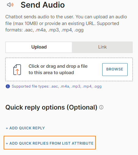
Send audio files to end users. Audio messages include an audio file and optional quick replies.
To add an audio message to your chatbot, in the chatbot editor, drag and drop the Audio element from Chatbot sends.
Either upload an audio file or add the link to the file. Supported file types are .aac, .m4a, .mp3, .mp4, and .ogg.
- If you upload an audio file, the maximum file size must be 10 MB.
- To add the link to an audio file, in the Link tab, enter the public URL that contains the file.
Quick replies: Include a set of quick reply buttons to obtain information from the end user. Instead of typing a reply to your message, the end user can click one of these buttons to send you a predefined reply. The chatbot receives the postback value of that button. This enables you to capture a specific response from the end user.
Quick replies can be of the following types:
- Text: Send text and an optional image as a quick reply button to the end user.
- Phone Number: Use this quick reply button to ask the end user for their phone number. When the end user receives the message with this quick reply button, the phone number from the end user's Messenger profile is displayed on the quick reply button. This phone number is sent to the chatbot only when the end user clicks the quick reply button. If the end user's Messenger profile does not contain a phone number, this quick reply button is not sent to the end user.
- Email: Use this quick reply button to ask the end user for their email address. When the end user receives the message with this quick reply button, the email address from the end user's Messenger profile is displayed on the quick reply button. This email address is sent to the chatbot only when the end user clicks the quick reply button. If the end user's Messenger profile does not contain an email address, this quick reply button is not sent to the end user.
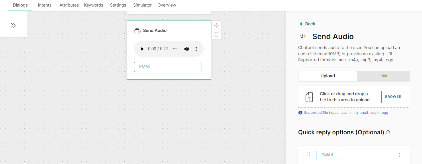
You can add a maximum of 13 Quick replies to an Audio element.
You can add quick replies either manually or from a list attribute. If you use a list attribute, you can add only Text quick replies.
To add a quick reply manually, follow these steps:
- Click Add quick reply.
- In the Quick reply type field, choose one of the following options:
- Text quick reply
- Phone number quick reply
- Email quick reply
- If you choose Text quick reply, complete the following fields:
- Image (optional): Image that is present as an icon on the quick reply button and is visible to the end user. Either upload an image or add the link to the image. Supported file types are .jpg and .png. To add the link to an image, in the Link tab, enter the public URL that contains the image.
- Quick reply title: Text that is present on the quick reply button and is visible to the end user. Maximum of 20 characters. Can include spaces, special characters, and attributes. There can be only one line of text
- Postback: Customize the data that is sent back to you when the end user clicks the quick reply button. Can include spaces, special characters, and attributes. There can be only one line of text. Example: If the Quick Reply title is 'Send me more information', you can specify the postback value as 'send_information'
To add a quick reply from a list attribute, follow these steps:
- In the Attributes tab > Attributes tab, click Add attribute.
- In the Name field, enter a name. Example: quick_replies. In the Type field, choose List.
- In the Dialogs tab, go to the dialog that contains the Audio element that you created.
- From the Chatbot actions section, drag and drop the Code element. Add it before the Audio element in the editor.
- In the Code element, create a set of quick replies and set it to the attribute that you created. Add the following information for each quick reply:
- Image (optional): Image that is present as an icon on the quick reply button and is visible to the end user. Supported file types are .jpg and .png. Enter the public URL that contains the image.
- Quick reply title: Text that is present on the quick reply button and is visible to the end user. Maximum of 20 characters. Can include spaces, special characters, and attributes. There can be only one line of text
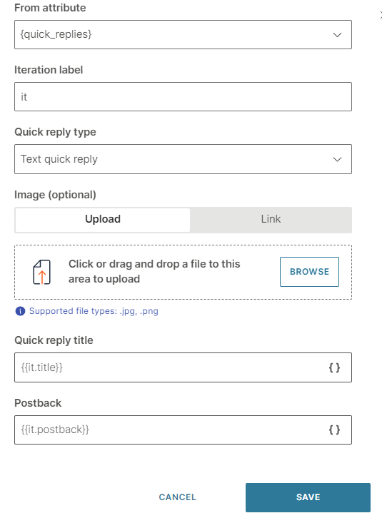
- Postback: Data that is sent back to you when the end user clicks the quick reply button. Can include spaces, special characters, and attributes. There can be only one line of text. Example: If the Quick Reply title is 'Send me more information', you can specify the postback value as 'send_information' The following example is for two quick replies of type Text: const replies = [ {"title":"Buy", "postback":"buy"}, {"title":"Something else", "postback":"something_else"} ]; attributeApi.set('quick_replies', replies); where replies is the name of the list title and postback are the field names that you need to use in the Audio element in later steps quick_replies is the attribute that you created
- In the Audio element that you created, click Add quick replies from list attribute.
- Complete the following fields:
- From attribute: Choose the list attribute that you created. Example: quick_replies.
- Iteration label: Enter a label. Example: it. This value is available as a placeholder in the Quick reply title and Postback fields.
- Quick reply type: Choose Text quick reply.
- Quick reply title: Add the iteration label and the relevant field name that you created in the Code element. Example: {{it.title}}
- Postback: Add the iteration label and the relevant field name that you created in the Code element. Example: {{it.postback}}
To edit or delete a quick reply, click the three dots against the quick reply and choose an option. You can also edit the quick reply by clicking on it.
To reorder the quick replies, use the six dots against a quick reply to drag and drop it.
To process the quick reply selection made by the end user, add User response as the next element.
After you configure the chatbot, use the simulator to test the chatbot flow. In the simulator, images may not be displayed on quick reply buttons. But the images will be displayed in a live session.
Button
Use buttons to obtain predefined responses from end users or to perform specific actions. These buttons are attached to a text message.
You can include a maximum of three buttons in a message.
To add a button, drag and drop the Button element from Chatbot sends. Each button contains the following fields:
- Message: Maximum of 640 characters, including spaces
- Buttons: You can add a maximum of three buttons
You can add buttons either manually or from a list attribute. To add a button manually, click Add button. To add a button from a list attribute, select Add button from list attribute.
Buttons contain the following elements:
- From attribute: The attribute used to create the button. Applicable if you create a button from a list attribute. If the list attribute contains more than three values, the message will not be sent
- Iteration label: Name of the attribute value placeholder. This value is added to the Personalize {} list and can be used as a placeholder in the Title and Postback fields. Applicable if you create a button from a list attribute
- Title: Text that is displayed on the button. Maximum of 20 characters, including spaces
- Action and Postback: Choose an action. Depending on the action, specify the postback value
| Action | Postback | ||
|---|---|---|---|
| Postback | Instead of typing a reply to your message, customers can click these buttons to send you a predefined reply. This enables you to capture specific responses from end users. | Postback value | |
| URL | Share a URL. When end users click the button, the link opens. | URL of the website | |
| Call | Share your business phone number. When end users click the button, the phone number is dialed. | Phone number. Prefix "+" followed by the country code, area code, and local number. Example, +12345678912. |
Carousel
Carousel messages enable you to send multiple rich cards in a single message. In addition to text, you can include an image, a hyperlink, and buttons for each rich card. End users can use horizontal scroll to view the rich cards, compare the items, and take action for individual rich cards.
A carousel contains a minimum of 2 rich cards and a maximum of 10 rich cards.
To add a carousel, drag and drop the Carousel element from Chatbot sends.
Cards: Add rich cards to the carousel. You can add them either manually or from a list attribute.
- To add a rich card manually, in the Manual tab, click Add variation.
- To add a rich card from a list attribute, go to the From attribute tab. If you want each card to have a different image, save the image in the attribute list and use it as one of the displayed items (use Personalize { } on the image link). In the From attribute field, choose the attribute used to create the rich card. Enter an Item name.
Each rich card contains the following elements:
- Image (optional): Either upload an image or add the URL for the image. Supported file types are .jpg and .png.
- Title
- Subtitle (optional)
- **Default action URL:**Enter a URL that opens when the end user clicks the title or image in the rich card.
- Buttons: You can add a maximum of three buttons
Buttons: You can add buttons either manually or from a list attribute. To add a button manually, click Add button. To add a button from a list attribute, select Add button from list attribute.
Buttons contain the following elements:
- From attribute: The attribute used to create the button. Applicable if you create a button from a list attribute. If the list attribute contains more than three values, the message will not be sent
- Iteration label: Name of the attribute value placeholder. Applicable if you create a button from a list attribute
- Title: Enter the text that is displayed on the button. Maximum of 20 characters, including spaces
- Action and Postback: Choose an action. Depending on the action, specify the postback value
| Action | Description | Postback |
|---|---|---|
| Postback | Instead of typing a reply to your message, customers can click these buttons to send you a predefined reply. This enables you to capture specific responses from end users. | Postback value |
| URL | Share a URL. When end users click the button, the link opens. | URL of the website. Use only HTTPS links that are hosted on a public domain. |
| Call | Share your business phone number. When end users click the button, the phone number is dialed. | Phone number. Prefix "+" followed by the country code, area code, and local number. Example, +12345678912 |
Troubleshooting
Issue: You get an error message such as the following:
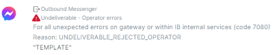
Cause: There may be an issue with the URL that you have used as postback in a button.
Resolution: Use an HTTPS link that is hosted on a public domain.
For more information about carousels, refer to the Messenger documentation.
File
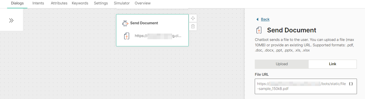
Send files to end users. File messages include a file and optional quick replies.
To add a file message to your chatbot, in the chatbot editor, drag and drop the File element from Chatbot sends.
Either upload a file or add the link to the file. Supported file types are .pdf, .doc, .docx, .ppt, .pptx, .xls, and .xlsx.
- If you upload a file, the maximum file size must be 10 MB.
- To add the link to a file, in the Link tab, enter the public URL that contains the file.
Quick replies: Include a set of quick reply buttons to obtain information from the end user. Instead of typing a reply to your message, the end user can click one of these buttons to send you a predefined reply. The chatbot receives the postback value of that button. This enables you to capture a specific response from the end user.
Quick replies can be of the following types:
- Text: Send text and an optional image as a quick reply button to the end user.
- Phone Number: Use this quick reply button to ask the end user for their phone number. When the end user receives the message with this quick reply button, the phone number from the end user's Messenger profile is displayed on the quick reply button. This phone number is sent to the chatbot only when the end user clicks the quick reply button. If the end user's Messenger profile does not contain a phone number, this quick reply button is not sent to the end user.
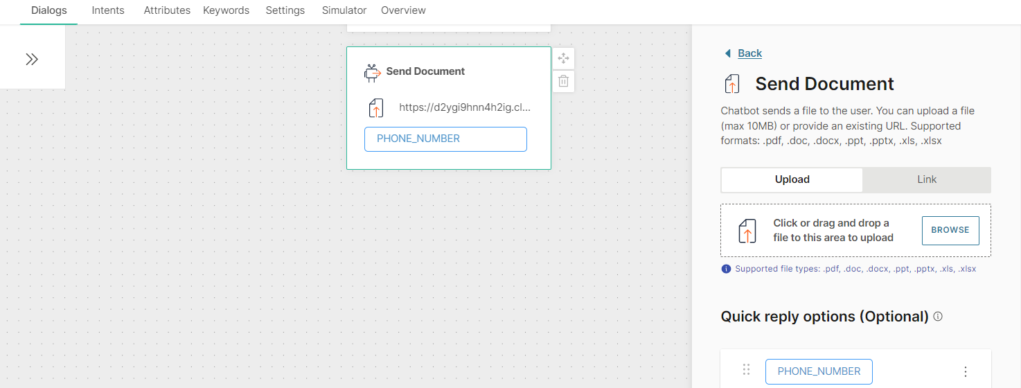
- Email: Use this quick reply button to ask the end user for their email address. When the end user receives the message with this quick reply button, the email address from the end user's Messenger profile is displayed on the quick reply button. This email address is sent to the chatbot only when the end user clicks the quick reply button. If the end user's Messenger profile does not contain an email address, this quick reply button is not sent to the end user.
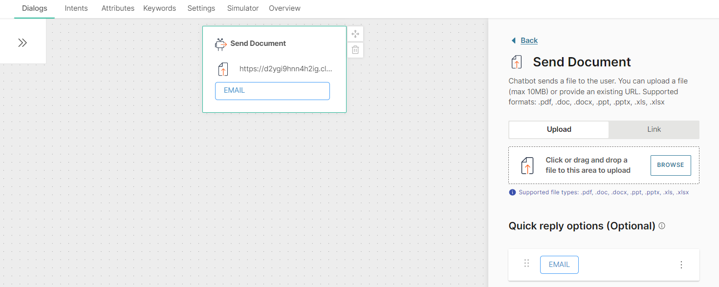
You can add a maximum of 13 Quick replies to a File element.
You can add quick replies either manually or from a list attribute. If you use a list attribute, you can add only Text quick replies.
To add a quick reply manually, follow these steps:
- Click Add quick reply.
- In the Quick reply type field, choose one of the following options:
- Text quick reply
- Phone number quick reply
- Email quick reply
- If you choose Text quick reply, complete the following fields:
- Image (optional): Image that is present as an icon on the quick reply button and is visible to the end user. Either upload an image or add the link to the image. Supported file types are .jpg and .png. To add the link to an image, in the Link tab, enter the public URL that contains the image.
- Quick reply title: Text that is present on the quick reply button and is visible to the end user. Maximum of 20 characters. Can include spaces, special characters, and attributes. There can be only one line of text
- Postback: Customize the data that is sent back to you when the end user clicks the quick reply button. Can include spaces, special characters, and attributes. There can be only one line of text. Example: If the Quick Reply title is 'Send me more information', you can specify the postback value as 'send_information'
To add a quick reply from a list attribute, follow these steps:
- In the Attributes tab > Attributes tab, click Add attribute.
- In the Name field, enter a name. Example: quick_replies. In the Type field, choose List.
- In the Dialogs tab, go to the dialog that contains the File element that you created.
- From the Chatbot actions section, drag and drop the Code element. Add it before the File element in the editor.
- In the Code element, create a set of quick replies and set it to the attribute that you created. Add the following information for each quick reply:
- Image (optional): Image that is present as an icon on the quick reply button and is visible to the end user. Supported file types are .jpg and .png. Enter the public URL that contains the image.
- Quick reply title: Text that is present on the quick reply button and is visible to the end user. Maximum of 20 characters. Can include spaces, special characters, and attributes. There can be only one line of text
- Postback: Data that is sent back to you when the end user clicks the quick reply button. Can include spaces, special characters, and attributes. There can be only one line of text. Example: If the Quick Reply title is 'Send me more information', you can specify the postback value as 'send_information' The following example is for two quick replies of type Text: const replies = [ {"title":"Buy", "postback":"buy"}, {"title":"Something else", "postback":"something_else"} ]; attributeApi.set('quick_replies', replies); where replies is the name of the list title and postback are the field names that you need to use in the File element in later steps quick_replies is the attribute that you created
- In the File element that you created, click Add quick replies from list attribute.
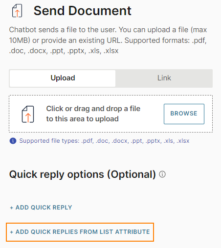
- Complete the following fields:
- From attribute: Choose the list attribute that you created. Example: quick_replies.
- Iteration label: Enter a label. Example: it. This value is available as a placeholder in the Quick reply title and Postback fields.
- Quick reply type: Choose Text quick reply.
- Quick reply title: Add the iteration label and the relevant field name that you created in the Code element. Example: {{it.title}}
- Postback: Add the iteration label and the relevant field name that you created in the Code element. Example: {{it.postback}}.
To edit or delete a quick reply, click the three dots against the quick reply and choose an option. You can also edit the quick reply by clicking on it.
To reorder the quick replies, use the six dots against a quick reply to drag and drop it.
To process the quick reply selection made by the end user, add User response as the next element.
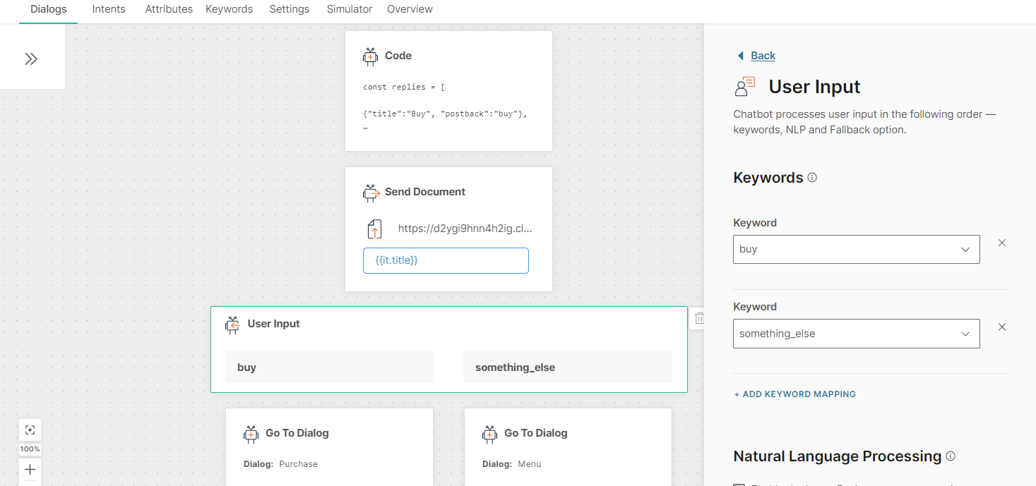
After you configure the chatbot, use the simulator to test the chatbot flow. In the simulator, images may not be displayed on quick reply buttons. But the images will be displayed in a live session.
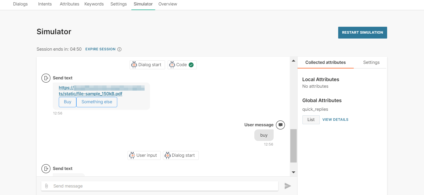
Image
Send images to end users. Image messages include an image and optional quick replies.
To add an image message to your chatbot, in the chatbot editor, drag and drop the Image element from Chatbot sends.
Either upload an image or add the link to the image. Supported file types are .jpg and .png.
- If you upload an image, the maximum file size must be 10 MB.
- To add the link to an image, in the Link tab, enter the public URL that contains the image.
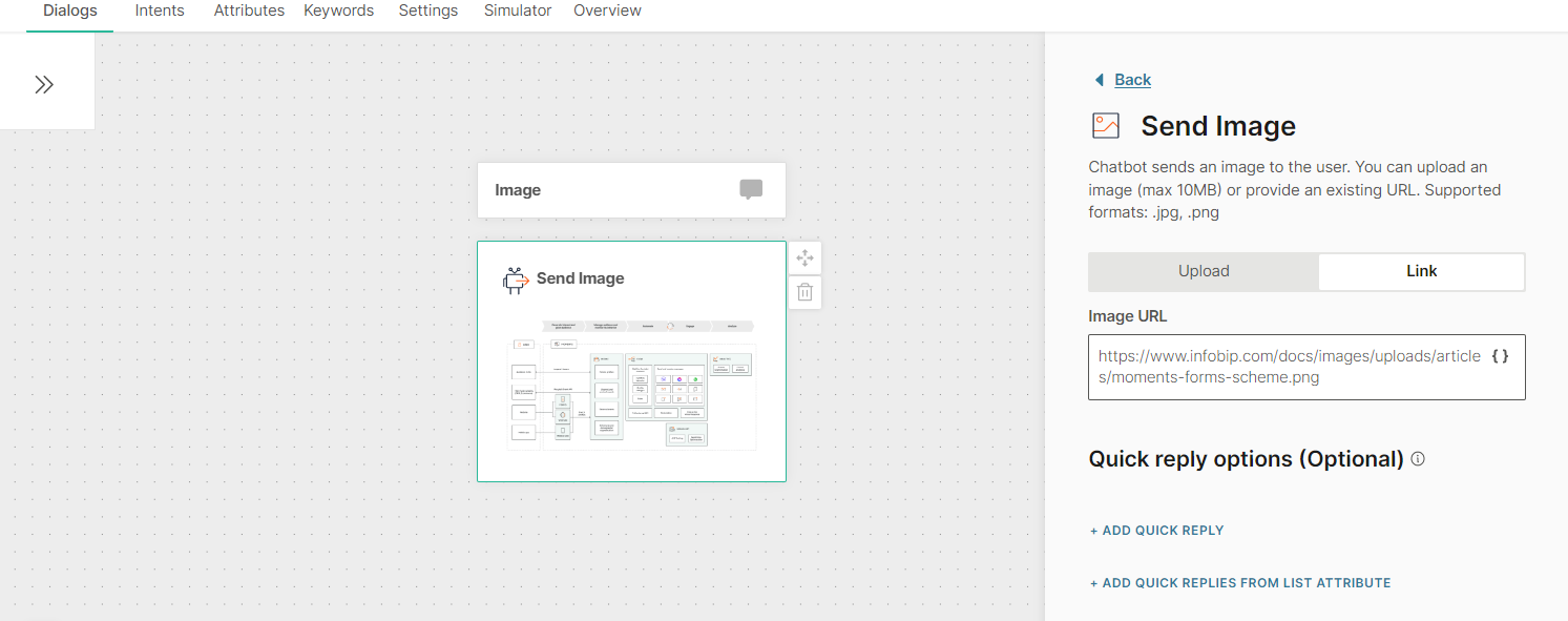
Quick replies: Include a set of quick reply buttons to obtain information from the end user. Instead of typing a reply to your message, the end user can click one of these buttons to send you a predefined reply. The chatbot receives the postback value of that button. This enables you to capture a specific response from the end user.
Quick replies can be of the following types:
- Text: Send text and an optional image as a quick reply button to the end user.
- Phone Number: Use this quick reply button to ask the end user for their phone number. When the end user receives the message with this quick reply button, the phone number from the end user's Messenger profile is displayed on the quick reply button. This phone number is sent to the chatbot only when the end user clicks the quick reply button. If the end user's Messenger profile does not contain a phone number, this quick reply button is not sent to the end user.
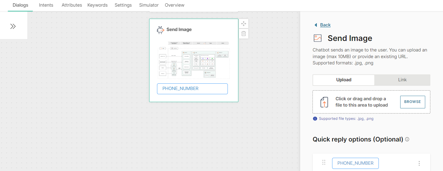
- Email: Use this quick reply button to ask the end user for their email address. When the end user receives the message with this quick reply button, the email address from the end user's Messenger profile is displayed on the quick reply button. This email address is sent to the chatbot only when the end user clicks the quick reply button. If the end user's Messenger profile does not contain an email address, this quick reply button is not sent to the end user.
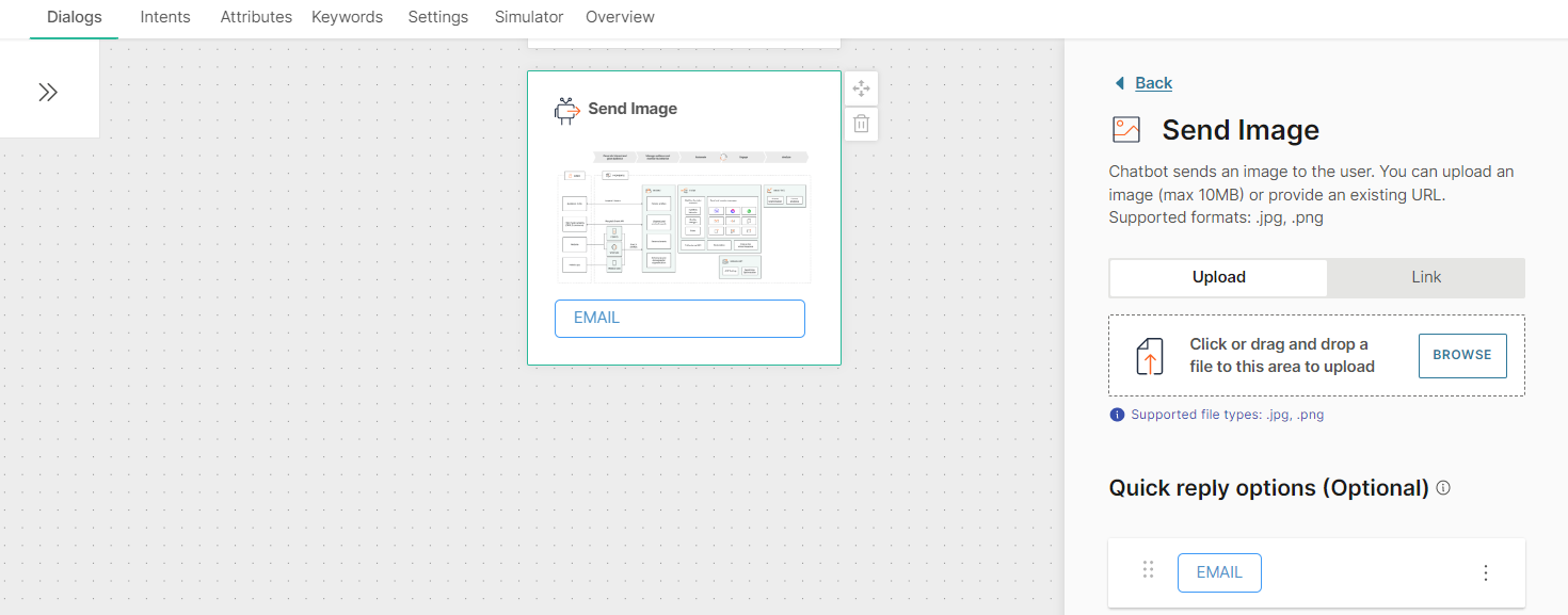
You can add a maximum of 13 Quick replies to an Image element.
You can add quick replies either manually or from a list attribute. If you use a list attribute, you can add only Text quick replies.
To add a quick reply manually, follow these steps:
- Click Add quick reply.
- In the Quick reply type field, choose one of the following options:
- Text quick reply
- Phone number quick reply
- Email quick reply
- If you choose Text quick reply, complete the following fields:
- Image (optional): Image that is present as an icon on the quick reply button and is visible to the end user. Either upload an image or add the link to the image. Supported file types are .jpg and .png. To add the link to an image, in the Link tab, enter the public URL that contains the image.
- Quick reply title: Text that is present on the quick reply button and is visible to the end user. Maximum of 20 characters. Can include spaces, special characters, and attributes. There can be only one line of text
- Postback: Customize the data that is sent back to you when the end user clicks the quick reply button. Can include spaces, special characters, and attributes. There can be only one line of text. Example: If the Quick Reply title is 'Send me more information', you can specify the postback value as 'send_information'
To add a quick reply from a list attribute, follow these steps:
- In the Attributes tab > Attributes tab, click Add attribute.
- In the Name field, enter a name. Example: quick_replies. In the Type field, choose List.
- In the Dialogs tab, go to the dialog that contains the Image element that you created.
- From the Chatbot actions section, drag and drop the Code element. Add it before the Image element in the editor.
- In the Code element, create a set of quick replies and set it to the attribute that you created. Add the following information for each quick reply:
- Image (optional): Image that is present as an icon on the quick reply button and is visible to the end user. Supported file types are .jpg and .png. Enter the public URL that contains the image.
- Quick reply title: Text that is present on the quick reply button and is visible to the end user. Maximum of 20 characters. Can include spaces, special characters, and attributes. There can be only one line of text
- Postback: Data that is sent back to you when the end user clicks the quick reply button. Can include spaces, special characters, and attributes. There can be only one line of text. Example: If the Quick Reply title is 'Send me more information', you can specify the postback value as 'send_information' The following example is for two quick replies of type Text: const replies = [ {"title":"Buy", "postback":"buy"}, {"title":"Something else", "postback":"something_else"} ]; attributeApi.set('quick_replies', replies); where replies is the name of the list title and postback are the field names that you need to use in the Image element in later steps quick_replies is the attribute that you created
- In the Image element that you created, click Add quick replies from list attribute.
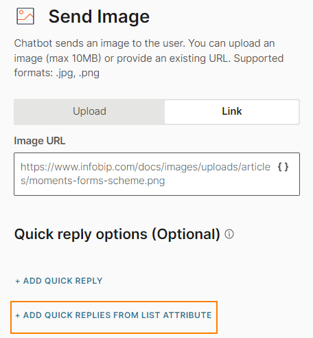
- Complete the following fields:
- From attribute: Choose the list attribute that you created. Example: quick_replies.
- Iteration label: Enter a label. Example: it. This value is available as a placeholder in the Quick reply title and Postback fields.
- Quick reply type: Choose Text quick reply.
- Quick reply title: Add the iteration label and the relevant field name that you created in the Code element. Example: {{it.title}}
- Postback: Add the iteration label and the relevant field name that you created in the Code element. Example: {{it.postback}}.
To edit or delete a quick reply, click the three dots against the quick reply and choose an option. You can also edit the quick reply by clicking on it.
To reorder the quick replies, use the six dots against a quick reply to drag and drop it.
To process the quick reply selection made by the end user, add User response as the next element.
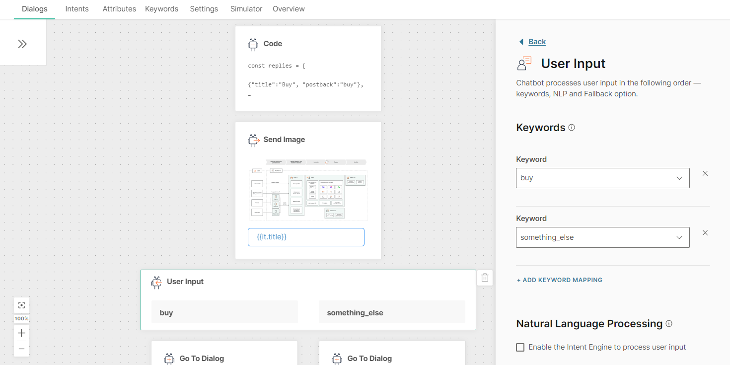
After you configure the chatbot, use the simulator to test the chatbot flow. In the simulator, images may not be displayed on quick reply buttons. But the images will be displayed in a live session.
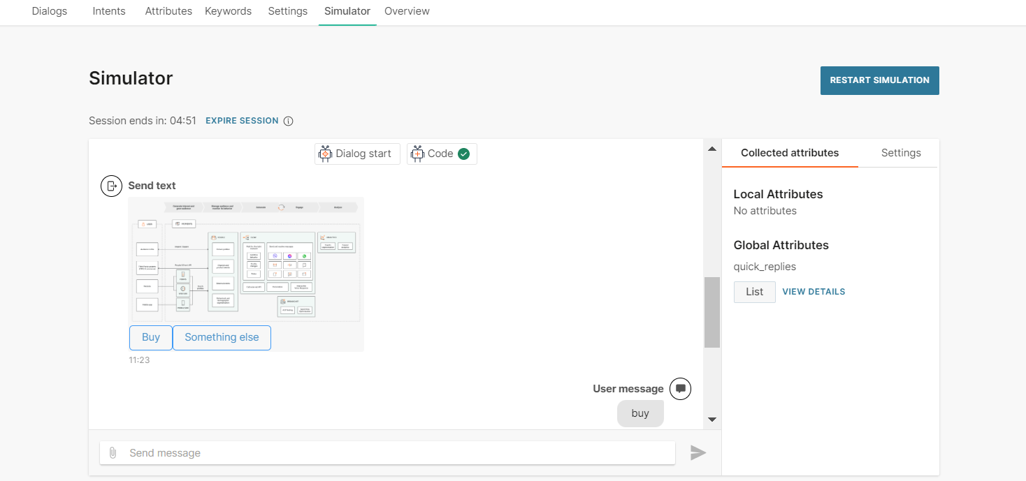
Location
Send locations to users when you need to provide them with directions. You can do this either by directly searching for a location, entering the specific coordinates or by using a value stored against an MO Location attribute.
The search engine is powered by Google so the location will need to be live in Google Maps. For the coordinates, you will need to provide the specific longitude and latitude values.
If you are using an MO attribute you will need to have already created it in the Attributes tab. The value captured during the chat and stored against this attribute will be used when sending the location.
Once you have provided the desired location, you can rename it using the Location name field to appear in the Answers chat.
Message variation
Answers enables you to vary the messages you send to your end users and enables you to enter up to 5 different messages for one text field. There are a few ways you can set up the randomization logic:
- Text
- Attributes
- Repeats and fallbacks
This means that every time your end user is in the situation to receive a message that has this option configured, the system will randomly select one of the available messages to send to the end user, thus making the user experience varied.
To add message randomization, use the +Add variationoption in channel elements to add additional messages. You can add a maximum of 5 messages to be sent at random.
Rich Card
Use templated rich card messages to obtain predefined responses from end users or to perform specific actions. In addition to text, you can include an image, a hyperlink, and buttons in the message.
To add a rich card, drag and drop the Rich Card element from Chatbot sends. Each rich card contains the following fields:
- Image (optional): Either upload an image or add the URL for the image. Image ratio must be 1:1. Suggested image size is 600 px x 600 px. Maximum file size is 30 MB. Supported file types are .jpg and .png.
- Title
- Subtitle (optional)
- Default action URL
- Buttons: You can add a maximum of three buttons
You can add buttons either manually or from a list attribute. To add a button manually, click Add button. To add a button from a list attribute, select Add button from list attribute.
Buttons contain the following elements:
- From attribute: The attribute used to create the button. Applicable if you create a button from a list attribute. If the list attribute contains more than three values, the message will not be sent
- Iteration label: Name of the attribute value placeholder. This value is added to the Personalize {} list and can be used as a placeholder in the Title and Postback fields. Applicable if you create a button from a list attribute
- Title: Text that is displayed on the button. Maximum of 20 characters, including spaces
- Action and Postback: Choose an action. Depending on the action, specify the postback value
| Action | Postback | |
|---|---|---|
| Postback | Instead of typing a reply to your message, customers can click these buttons to send you a predefined reply. This enables you to capture specific responses from end users. | Postback value |
| URL | Share a URL. When end users click the button, the link opens. | URL of the website |
| Call | Share your business phone number. When end users click the button, the phone number is dialed. | Phone number. Prefix "+" followed by the country code, area code, and local number. Example, +12345678912. |
For more information about rich cards, refer to the Messenger documentation.
Text
Send text messages to end users. Text messages include text and optional quick replies.
To add a text message to your chatbot, in the chatbot editor, drag and drop the Text element from Chatbot sends.
Each text element contains the following fields:
- Message
- (Optional) Quick replies
Message: Can contain a maximum of 1,000 characters including spaces, new line, emojis, special characters, hyperlinks, and attributes. If you add attributes, make sure that the message length does not exceed the limit after the attribute values are filled. If the message length exceeds the limit, the message may not be sent.
You can add variants of the message. When the chatbot sends the Text message, the end user receives one of these variants at random. Message variants add variety to the end user experience. You can add a maximum of 5 message variants.
To add a new message variant, click Add variation.
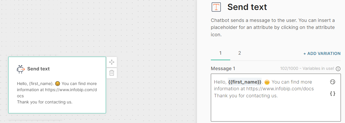
Quick replies: Include a set of quick reply buttons to obtain information from the end user. Instead of typing a reply to your message, the end user can click one of these buttons to send you a predefined reply. The chatbot receives the postback value of that button. This enables you to capture a specific response from the end user.
Quick replies can be of the following types:
- Text: Send text and an optional image as a quick reply button to the end user.
- Phone Number: Use this quick reply button to ask the end user for their phone number. When the end user receives the message with this quick reply button, the phone number from the end user's Messenger profile is displayed on the quick reply button. This phone number is sent to the chatbot only when the end user clicks the quick reply button. If the end user's Messenger profile does not contain a phone number, this quick reply button is not sent to the end user.
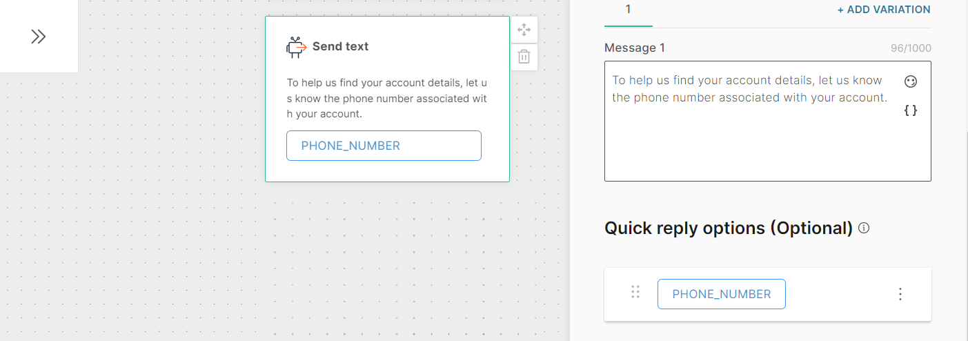
- Email: Use this quick reply button to ask the end user for their email address. When the end user receives the message with this quick reply button, the email address from the end user's Messenger profile is displayed on the quick reply button. This email address is sent to the chatbot only when the end user clicks the quick reply button. If the end user's Messenger profile does not contain an email address, this quick reply button is not sent to the end user.
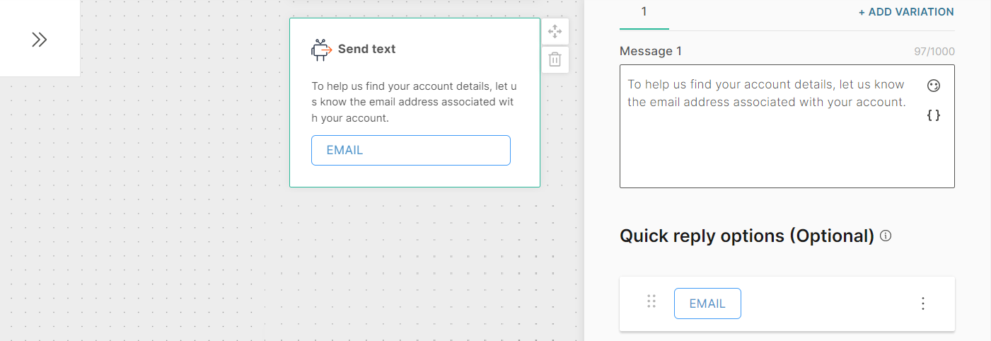
You can add a maximum of 13 Quick replies to a Text element. Quick replies are for the entire Text element and are not specific to a Message variant.
You can add quick replies either manually or from a list attribute. If you use a list attribute, you can add only Text quick replies.
To add a quick reply manually, follow these steps:
- Click Add quick reply.
- In the Quick reply type field, choose one of the following options:
- Text quick reply
- Phone number quick reply
- Email quick reply
- If you choose Text quick reply, complete the following fields:
- Image (optional): Image that is present as an icon on the quick reply button and is visible to the end user. Either upload an image or add the link to the image. Supported file types are .jpg and .png. To add the link to an image, in the Link tab, enter the public URL that contains the image.
- Quick reply title: Text that is present on the quick reply button and is visible to the end user. Maximum of 20 characters. Can include spaces, special characters, and attributes. There can be only one line of text
- Postback: Customize the data that is sent back to you when the end user clicks the quick reply button. Can include spaces, special characters, and attributes. There can be only one line of text. Example: If the Quick Reply title is 'Send me more information', you can specify the postback value as 'send_information'
To add a quick reply from a list attribute, follow these steps:
- In the Attributes tab > Attributes tab, click Add attribute.
- In the Name field, enter a name. Example: quick_replies. In the Type field, choose List.
- In the Dialogs tab, go to the dialog that contains the Text element that you created.
- From the Chatbot actions section, drag and drop the Code element. Add it before the Text element in the editor.
- In the Code element, create a set of quick replies and set it to the attribute that you created. Add the following information for each quick reply:
- Image (optional): Image that is present as an icon on the quick reply button and is visible to the end user. Supported file types are .jpg and .png. Enter the public URL that contains the image.
- Quick reply title: Text that is present on the quick reply button and is visible to the end user. Maximum of 20 characters. Can include spaces, special characters, and attributes. There can be only one line of text
- Postback: Data that is sent back to you when the end user clicks the quick reply button. Can include spaces, special characters, and attributes. There can be only one line of text. Example: If the Quick Reply title is 'Send me more information', you can specify the postback value as 'send_information'
The following example is for two quick replies of type Text:
const replies = [{"title":"Answers", "postback":"answers", "image":"https://cdn-www.infobip.com/wp-content/uploads/2021/03/08230929/answers-benefit-002-2x.png"},{"title":"Things", "postback":"things", "image":"https://cdn-www.infobip.com/wp-content/uploads/2021/05/25141144/iot-header-2x.png"}];attributeApi.set('quick_replies', replies);where replies is the name of the list title, postback, and image are the field names that you need to use in the Text element in later steps quick_replies is the attribute that you created
- In the Text element that you created, click Add quick replies from list attribute.
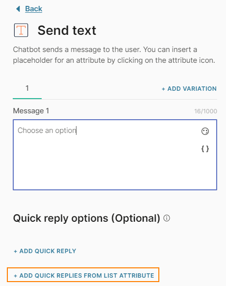
- Complete the following fields:
- From attribute: Choose the list attribute that you created. Example: quick_replies.
- Iteration label: Enter a label. Example: it. This value is available as a placeholder in the Quick reply title and Postback fields.
- Quick reply type: Choose Text quick reply.
- Quick reply title: Add the iteration label and the relevant field name that you created in the Code element. Example: {{it.title}}
- Postback: Add the iteration label and the relevant field name that you created in the Code element. Example: {{it.postback}}.
To edit or delete a quick reply, click the three dots against the quick reply and choose an option. You can also edit the quick reply by clicking on it.
To reorder the quick replies, use the six dots against a quick reply to drag and drop it.
To process the quick reply selection made by the end user, add User response as the next element.
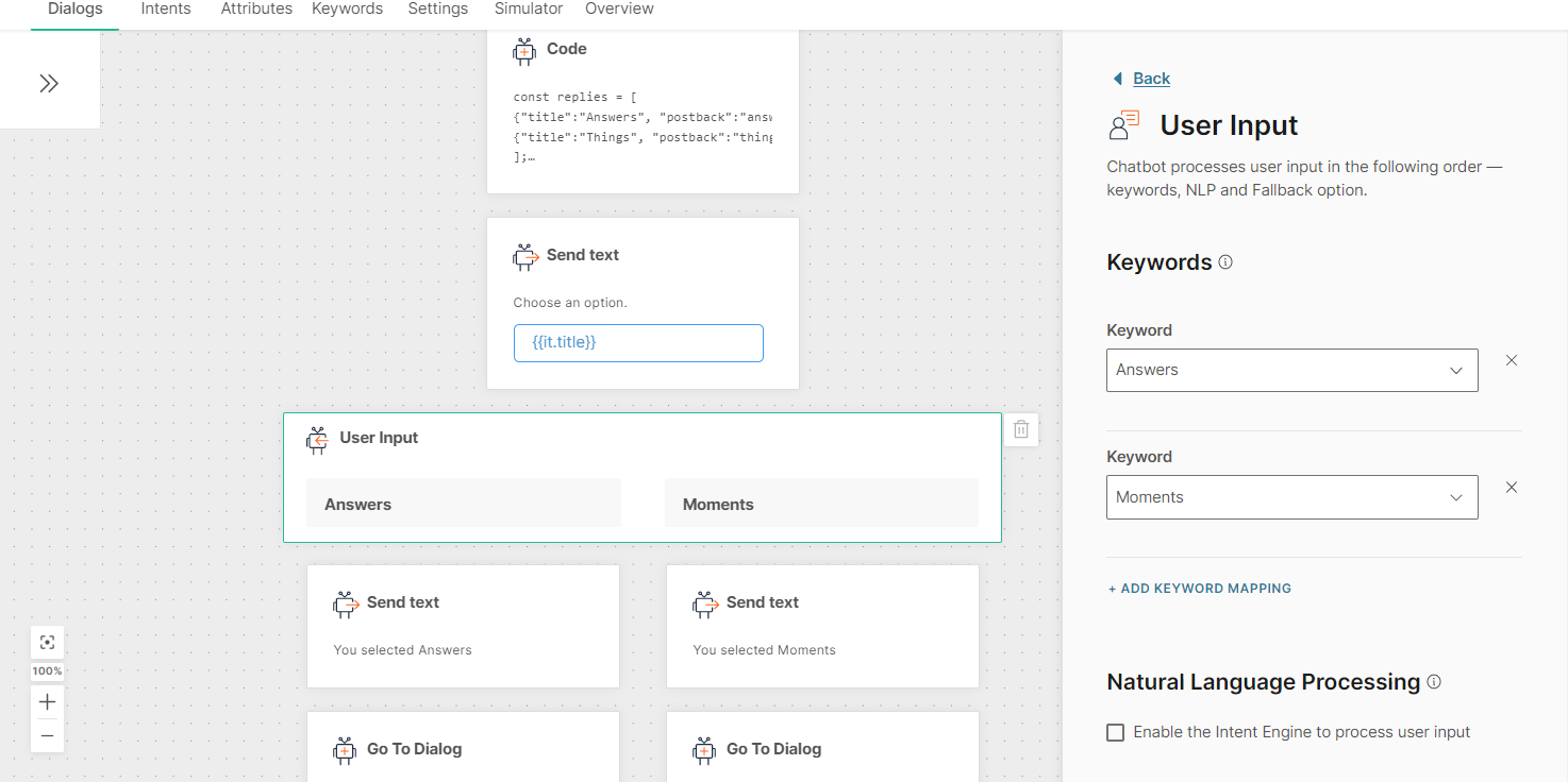
After you configure the chatbot, use the simulator to test the chatbot flow. In the simulator, images may not be displayed on quick reply buttons. But the images will be displayed in a live session.
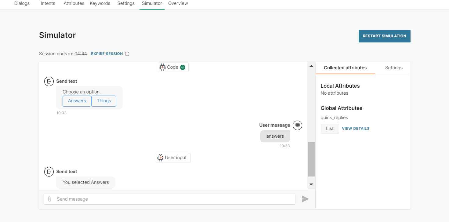
Video
Send video files to end users. Video messages include a video and optional quick replies.
To add a video message to your chatbot, in the chatbot editor, drag and drop the Video element from Chatbot sends.
Either upload a video or add the link to the video. Supported file type is .mp4.
- If you upload a video, the maximum file size must be 10 MB.
- To add the link to a video, in the Link tab, enter the public URL that contains the video.
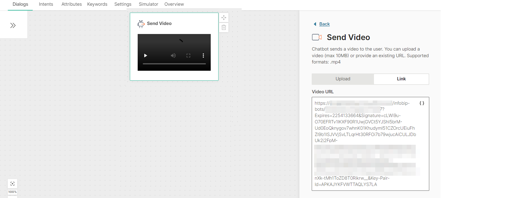
Quick replies: Include a set of quick reply buttons to obtain information from the end user. Instead of typing a reply to your message, the end user can click one of these buttons to send you a predefined reply. The chatbot receives the postback value of that button. This enables you to capture a specific response from the end user.
Quick replies can be of the following types:
- Text: Send text and an optional image as a quick reply button to the end user.
- Phone Number: Use this quick reply button to ask the end user for their phone number. When the end user receives the message with this quick reply button, the phone number from the end user's Messenger profile is displayed on the quick reply button. This phone number is sent to the chatbot only when the end user clicks the quick reply button. If the end user's Messenger profile does not contain a phone number, this quick reply button is not sent to the end user.
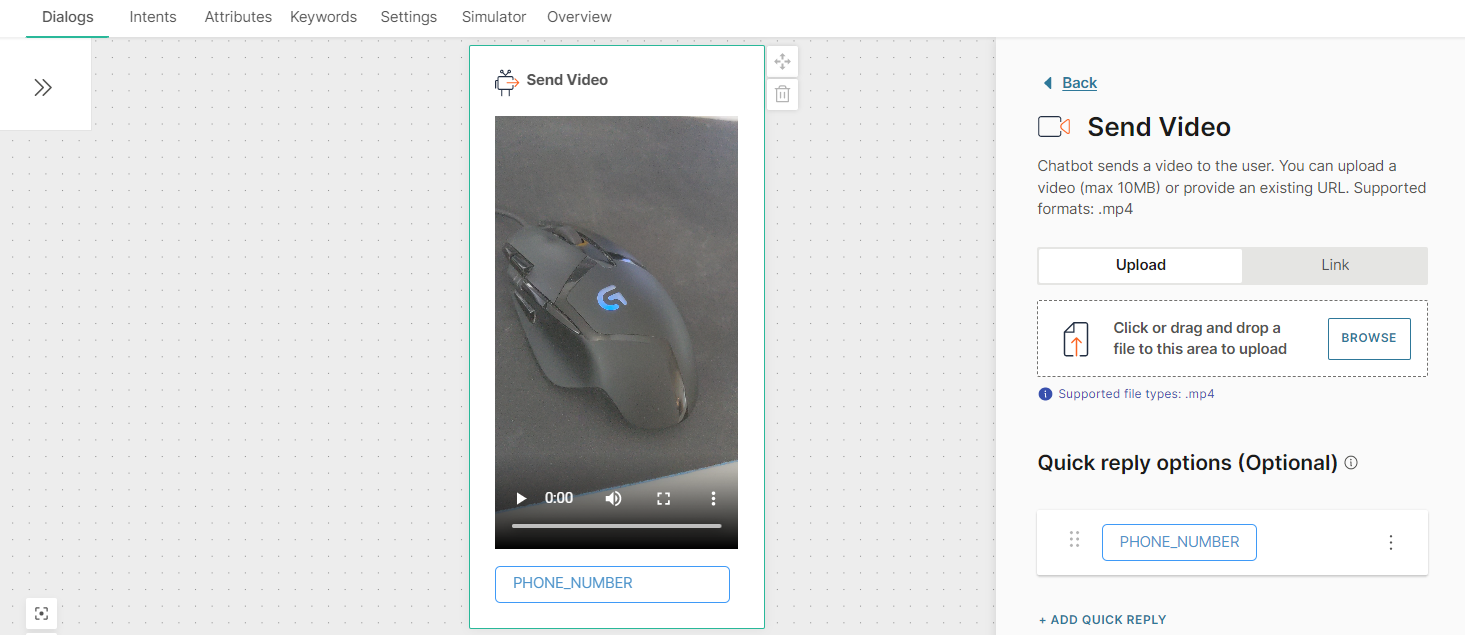
- Email: Use this quick reply button to ask the end user for their email address. When the end user receives the message with this quick reply button, the email address from the end user's Messenger profile is displayed on the quick reply button. This email address is sent to the chatbot only when the end user clicks the quick reply button. If the end user's Messenger profile does not contain an email address, this quick reply button is not sent to the end user.
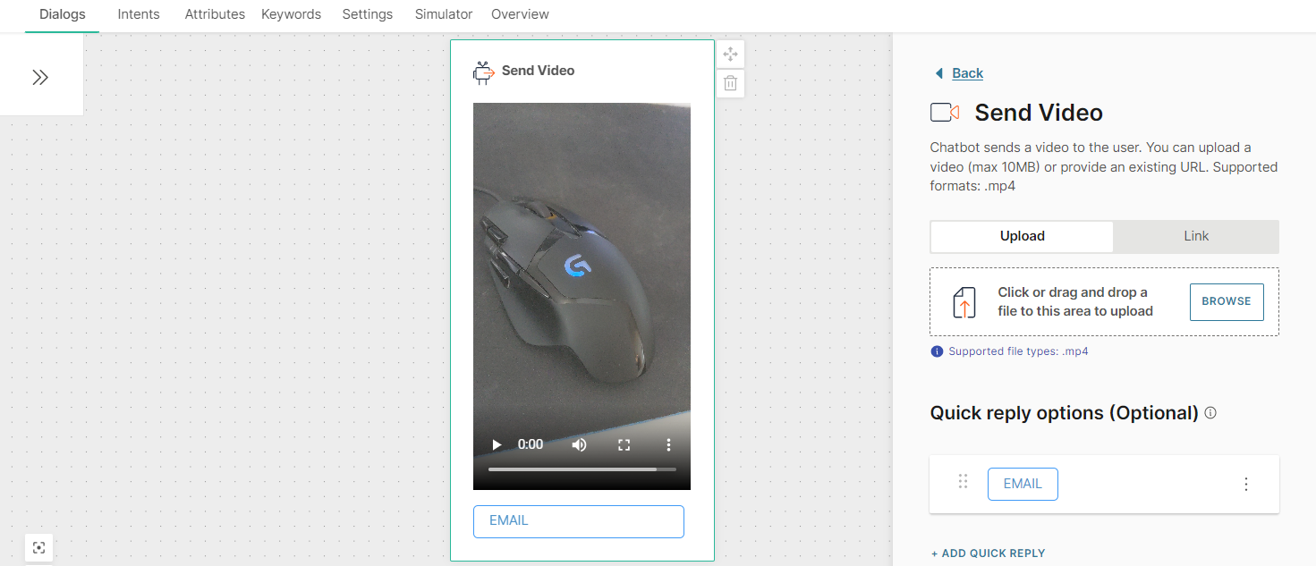
You can add a maximum of 13 Quick replies to a Video element.
You can add quick replies either manually or from a list attribute. If you use a list attribute, you can add only Text quick replies.
To add a quick reply manually, follow these steps:
- Click Add quick reply.
- In the Quick reply type field, choose one of the following options:
- Text quick reply
- Phone number quick reply
- Email quick reply
- If you choose Text quick reply, complete the following fields:
- Image (optional): Image that is present as an icon on the quick reply button and is visible to the end user. Either upload an image or add the link to the image. Supported file types are .jpg and .png. To add the link to an image, in the Link tab, enter the public URL that contains the image.
- Quick reply title: Text that is present on the quick reply button and is visible to the end user. Maximum of 20 characters. Can include spaces, special characters, and attributes. There can be only one line of text.
- Postback: Customize the data that is sent back to you when the end user clicks the quick reply button. Can include spaces, special characters, and attributes. There can be only one line of text. Example: If the Quick Reply title is 'Send me more information', you can specify the postback value as 'send_information'
To add a quick reply from a list attribute, follow these steps:
- In the Attributes tab > Attributes tab, click Add attribute.
- In the Name field, enter a name. Example: quick_replies. In the Type field, choose List.
- In the Dialogs tab, go to the dialog that contains the Video element that you created.
- From the Chatbot actions section, drag and drop the Code element. Add it before the Video element in the editor.
- In the Code element, create a set of quick replies and set it to the attribute that you created. Add the following information for each quick reply:
- Image (optional): Image that is present as an icon on the quick reply button and is visible to the end user. Supported file types are .jpg and .png. Enter the public URL that contains the image.
- Quick reply title: Text that is present on the quick reply button and is visible to the end user. Maximum of 20 characters. Can include spaces, special characters, and attributes. There can be only one line of text
- Postback: Data that is sent back to you when the end user clicks the quick reply button. Can include spaces, special characters, and attributes. There can be only one line of text. Example: If the Quick Reply title is 'Send me more information', you can specify the postback value as 'send_information' The following example is for two quick replies of type Text: const replies = [ {"title":"Buy", "postback":"buy"}, {"title":"Something else", "postback":"something_else"} ]; attributeApi.set('quick_replies', replies); where replies is the name of the list title and postback are the field names that you need to use in the Video element in later steps quick_replies is the attribute that you created
- In the Video element that you created, click Add quick replies from list attribute.
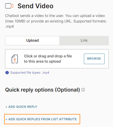
- Complete the following fields:
- From attribute: Choose the list attribute that you created. Example: quick_replies.
- Iteration label: Enter a label. Example: it. This value is available as a placeholder in the Quick reply title and Postback fields.
- Quick reply type: Choose Text quick reply.
- Quick reply title: Add the iteration label and the relevant field name that you created in the Code element. Example: {{it.title}}
- Postback: Add the iteration label and the relevant field name that you created in the Code element. Example: {{it.postback}}.
To edit or delete a quick reply, click the three dots against the quick reply and choose an option. You can also edit the quick reply by clicking on it.
To reorder the quick replies, use the six dots against a quick reply to drag and drop it.
To process the quick reply selection made by the end user, add User response as the next element.
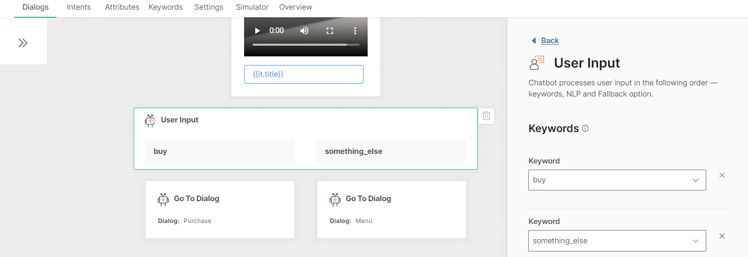
After you configure the chatbot, use the simulator to test the chatbot flow.
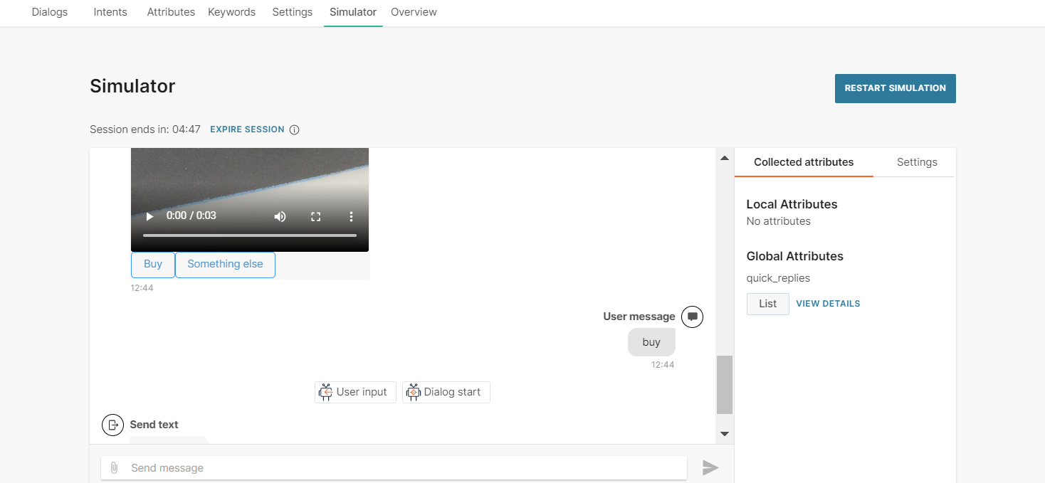
Telegram
Telegram is a cloud-based messaging application that can be used on mobile devices and desktops. Telegram is one of the most secure channels and features encryption, high speed, and open APIs.
Telegram offers a variety of message types such as audio and videos. Refer to the messaging limitations for each message type.
To use Telegram in Answers, you must enable this channel in your Infobip account.
Audio
Send audio files when you need your chatbot to send pre-recorded messages or voice notes. Send audio either by directly uploading into the Answers editor or by providing a direct open URL. The link option also supports attributes if you need to customize the URL.
Add an optional quick reply option(s) to let customers respond directly to the message with the requested information.
Supported audio files differ depending on which channel your chatbot is using. Make sure to check out the relevant Message types sections for each channel type.
Document
Send files to end users.
In the chatbot editor, drag and drop the Document element from Chatbot sends.
Either upload the file or add the link to the file. To add the link to a file, in the Link tab, enter the public URL that contains the file.
Files must follow the specifications shown in the table below:
| Attribute | Specification |
|---|---|
| File size | 10 MB (maximum) |
| File format |
(Optional) Caption: Add a caption for the file. Maximum of 1,024 characters, including spaces, special characters, emojis, new line, and attributes.
For more information about documents, refer to the Infobip Telegram documentation.
Image
Send images to end users by either uploading the image in the Answers editor or by providing a direct open URL to the image. The link option also supports attributes if you need to customize the URL. Add an optional caption to your image.
Supported image formats depend on the channel that your chatbot uses. Refer to the Message types section for the relevant channel.
Text
Send text-only messages and use personalization options in conjunction with attributes, objects, links, and emojis. If you are using links, use the link preview option to auto-display previews in messages. Note however not all channels support this. This option is enabled by default.
To add variations of the message, select Add variation.
Character limits differ depending on which channel your chatbot is using. Make sure to check out the relevant Message types sections for each channel type.
Video
Send pre-recorded videos either by directly uploading into the Answers editor or by providing a direct open URL. The link option also supports attributes if you need to customize the URL. Add an optional caption to your video.
Supported video formats differ depending on which channel your chatbot is using. Make sure to check out the relevant Message types sections for each channel type.
RCS
Rich communication services (RCS) is an A2P messaging service that offers rich functionality and customization in addition to the features offered by SMS and MMS. RCS is enabled by default on new Android devices and uses carriers to send messages.
RCS offers a variety of message types such as multimedia and reply buttons. Refer to the messaging limitations for each message type.
To use RCS in Answers, you must enable this channel in your Infobip account.
Carousel
Use carousel messages to present multiple products, services, or other information to end users in a single message. A carousel message contains multiple rich cards. End users can use horizontal scroll to view the rich cards, compare the information, and take action for individual rich cards.
You can include text, media (images and videos), hyperlinks, and buttons in the rich cards.
For more information about carousels, refer to the RCS documentation.
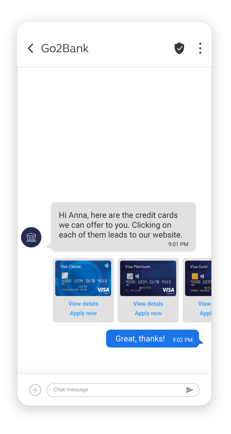
To add a carousel, drag and drop the Carousel element from Chatbot sends.
Configure the following fields.
Layout
Configure the layout of the cards. These settings are applied to all cards in the carousel.
Card width
Select one of the following options for the width of the cards.
- Small
- Medium
Content
Add the required number of cards. You can add a minimum of 2 cards and a maximum of 10 cards.
You can add cards in one of the following ways.
- Manually: Add and configure each card individually. Select Add card and configure the fields.
- From a list attribute: Define multiple cards in a list attribute and use this attribute in the carousel. Select Build multiple cards from list attribute. For more information about using list attributes, refer to the Configure elements by using list attributes section.
Media (Optional)
Either upload the media file or add a public URL of the media.
The specifications for the media are as follows.
| Maximum file size | 100 MB |
| Supported file types | .jpg, .jpeg, .png, .gif, .h263, .mp4, .m4v, .mpeg, .mpeg4, .webm |
Title
Title of the card. You can include spaces, special characters, and attributes.
Description (Optional)
Description of the card. You can include spaces, special characters, new line, and attributes.
Card suggested replies and Suggested replies (Optional)
Add predefined response options that are displayed as buttons within a message. End users can select a button to send their response, instead of typing a message.
You can add suggested reply buttons to one or more of the following.
- To the card. Complete the Card suggested replies section. You can add a maximum of 4 suggested replies.
- To the message. Complete the suggested replies section. You can add a maximum of 13 suggested replies.
Refer to the Add suggested replies section.
File
Send files such as documents, audio files, images, and videos to end users.
Some file formats or features such as suggested replies may not be available on all RCS carriers. For more information, refer to the Feature parity documentation.
For more information about files, refer to the RCS documentation.
Specifications for the file
- Supported file formats:
- Document: .pdf
- Image: .jpg, .jpeg, .gif, .png
- Video: .m4v, .mp4, .mpeg, .webm, .3gp, .h263
- Audio: .aac, .mp3, .ogx
- Maximum file size: 100 MB
Add the file to the element
Use one of the following ways.
- Upload: Upload the file.
- Link: Enter the public URL that contains the file. You can include attributes in the URL to customize it.
Thumbnail (optional)
Add a thumbnail to provide a visual preview of the file.
Specifications for the thumbnail: Supported file formats are .png, .gif, .jpg.
Add the thumbnail to the element
Use one of the following ways.
- Upload: Upload the file.
- Link: Enter the public URL that contains the thumbnail. You can include attributes in the URL to customize it.
Suggested replies (Optional)
Add predefined response options that are displayed as buttons within a message. End users can select a button to send their response, instead of typing a message.
Refer to the Add suggested replies section.
The following image shows the fields in the File element.
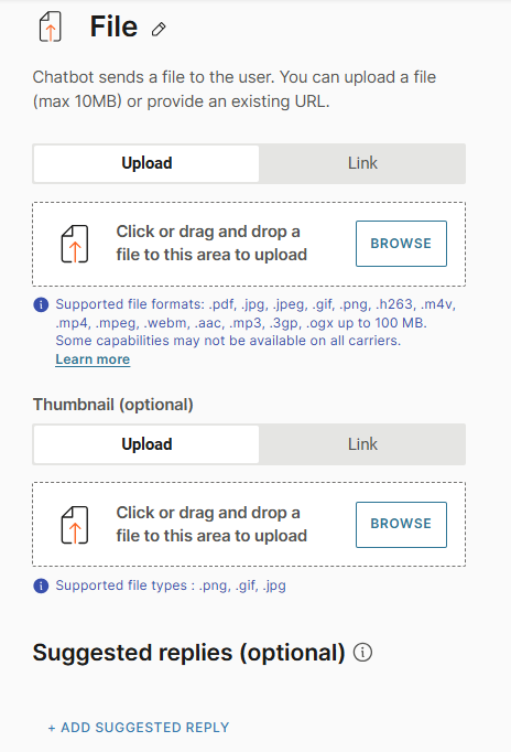
Rich card
Use rich card messages to send multiple, related information in a single message. Example: For an advertisement of a mobile phone, you can include an image or video of the phone, information about the phone, and a button that the end user can click to view the phone on your website.
Use rich cards to send previews of your web page or a product.
You can include text, media (images and videos), hyperlinks, and suggested reply buttons in the rich card.
For more information about rich cards, refer to the RCS documentation.
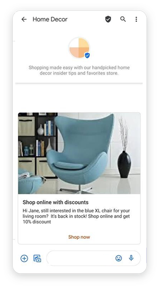
To add a rich card, drag and drop the Rich card element from Chatbot sends.
Configure the following fields.
Layout
Configure the layout of the cards.
Orientation
Select whether the cards must be
- Horizontal: Displays vertical media on the left or right side of the card.
- Vertical: Displays horizontal media at the top of the card.
Text alignment
If the Orientation is Horizontal, select whether the text in the cards must be
- Left aligned
- Right aligned
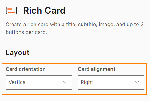
Content
Configure the content of the card.
Media (Optional)
Either upload the media file or add a public URL of the media.
The specifications for the media are as follows.
| Maximum file size | 100 MB |
| Supported file types | .jpg, .jpeg, .png, .gif, .h263, .mp4, .m4v, .mpeg, .mpeg4, .webm |
Media height
Select one of the following options for the height of the image.
- Short
- Medium
- Tall
Title
Title of the rich card. You can include spaces, special characters, and attributes.
Description (Optional)
Description of the rich card. You can include spaces, special characters, new line, and attributes.
Card suggested replies and Suggested replies (Optional)
Add predefined response options that are displayed as buttons within a message. End users can select a button to send their response, instead of typing a message.
You can add suggested reply buttons to one or more of the following.
- To the card. Complete the Card suggested replies section. You can add a maximum of 4 suggested replies.
- To the message. Complete the suggested replies section. You can add a maximum of 13 suggested replies.
Refer to the Add suggested replies section.
Text
Send text-only messages and use personalization options in conjunction with attributes, objects, links, and emojis. If you are using links, use the link preview option to auto-display previews in messages. Note however not all channels support this. This option is enabled by default.
To add variations of the message, select Add variation.
Character limits differ depending on which channel your chatbot is using. Make sure to check out the relevant Message types sections for each channel type.
Suggested replies in messages
Not all message types support suggested replies. Refer to the documentation for the message type.
Not all RCS carriers support suggested replies. For more information, refer to the Feature parity documentation.
Add predefined response options that are displayed as buttons within a message. End users can select a button to send their response, instead of typing a message.
How to add suggested replies
You can add suggested replies in one of the following ways.
-
Manually: Configure each suggested reply button individually. Select Add suggested reply and configure the fields.
-
From a list attribute: Define multiple suggested reply buttons in a list attribute and use this attribute in the rich card. Select Add suggested replies from list attribute.
For more information about using list attributes, refer to the Configure elements by using list attributes section.
Fields in suggested replies
Complete the following fields.
-
Type: Specify what happens when the end user selects the suggested reply button. For more information, refer to the table below.
NoteAfter configuring one or more suggested replies, if you change the type, all suggested reply buttons that you added earlier are removed automatically.
-
Suggested reply title: Enter the text to display on the suggested reply button.
-
Postback: Enter the information that needs to be sent to the chatbot when the end user selects the suggested reply button. You can also use an attribute that contains this information. This field value is not visible to the end user.
Depending on the type of suggested reply, configure the fields as shown in the following table.
| Suggested reply type | Description | Fields | |
| Text suggested reply | Enable the end user to send predefined responses to the chatbot. Example: Send users a set of options. The end user can select one of these options. | ||
| Dial a phone | Enable the end user to call your business. When the end user selects the suggested reply button, the Phone app in their device opens with your phone number prepopulated. | Phone number: The phone number on which the end user can contact you. | |
| View location | Send a location to the end user. | Latitude and Longitude: Specify the latitude and longitude of the location. You can also use attributes that contain this information. | |
| Open URL | Share URLs with the end user. When the end user selects the suggested reply button, the predefined URL opens in the browser. | URL: Specify the URL that opens when the end user selects the suggested reply button. You can also use an attribute that contains this information. In the URL appearance for users section, select how the web page should open: - Browser: Web page opens in a browser. - Webview: Web page opens in the chat window, without opening an external browser. For Webview, select one of the following options: - Full: Message fully covers the screen - Half: Message covers half the screen - Tall: Message covers one-third of the screen | |
| Create calendar event | Send the end user a time slot. Example: For meetings or events. | Event title: Enter a name or description of the event. You can also use an attribute that contains this information. Slot type: Select whether to enter the event time manually (Free-form) or to select from the calendar (Picker). Start time and End time: Specify the start and end time of the event. You can also use an attribute that contains this information. If the Slot type is Free-form, enter the date and time in yyyy-mm-ddThh:mm:ssZ format. If the Slot type is Picker, select the time and date. |
Viber Bots
Viber Bots is a two-way communication channel that helps businesses communicate with end users. Use Viber Bots on Answers for user-initiated chats with end users. End users can search for your Viber bot or can click the Bot icon on your company profile image in your Viber channel to initiate a chat.
Viber Bots offers a variety of message types, as well as Viber-specific message types such as custom keyboards. Refer to the messaging limitations for each message type.
To use Viber Bots in Answers, you must enable this channel in your Infobip account.
Carousel
Send a string of up to 10 rich cards in one message. Carousels are the easiest way for users to scroll through items and compare them individually without having to receive multiple messages.
Set which size you would like the carousel layout to be, then configure the rest of the cards the same way you would a rich card message. As well as having quick replies you also have card replies for individual cards which work on the same principle.
To use attributes in replies for this message type, you need to set this up as a list attribute. In this case, the Iteration labelis the name you give to the attribute value placeholder – depending on the number of values saved in the list attribute, that many quick replies will be created (values will replace the placeholder in the quick reply).
As soon as you enter the Iteration label text, it appears as an item in the Personalize {} list and is available for use.
If you want each card to have a different image, you can always save the image in the attribute list and use it as one of the displayed items (use Personalize { } on the image link).
Carousel message limitations differ depending on which channel your chatbot is using. Make sure to check out the relevant Message types sections for each channel type.
Document
Send files to end users.
In the chatbot editor, drag and drop the Document element from Chatbot sends.
Either upload the file or add the link to the file. To add the link to a file, in the Link tab, enter the public URL that contains the file.
Files must follow the specifications shown in the table below:
| Attribute | Specification |
|---|---|
| File name | 256 characters (maximum), including file extension.You must include a file name. Infobip recommends that you include the file extension in the file name because some devices may not recognize the file type without this information. |
| File size | 50 MB (maximum) |
| File format | .pdf, .doc, .docx, .ppt, .pptx, .xls, .xlsx |
(Optional) Keyboard: Add a custom keyboard.
For more information about documents, refer to the Infobip Viber Bots documentation.
Image
Send images to end users by either uploading the image in the Answers editor or by providing a direct open URL to the image. The link option also supports attributes if you need to customize the URL. Add an optional caption to your image.
Supported image formats depend on the channel that your chatbot uses. Refer to the Message types section for the relevant channel.
Keyboard
Use custom keyboards to enable end users to send you predefined replies or perform predefined actions. When end users receive the custom keyboard, this keyboard temporarily replaces the native keyboard on their device. The chatbot processes the end user's response to continue the dialog.
The custom keyboard is not a standalone element. You can send a custom keyboard only as part of other Viber Bots elements. Example: Text element.
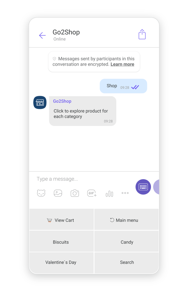
Add a Keyboard
To add a custom keyboard to an element, drag and drop the element to the chatbot editor and click Add keyboard.
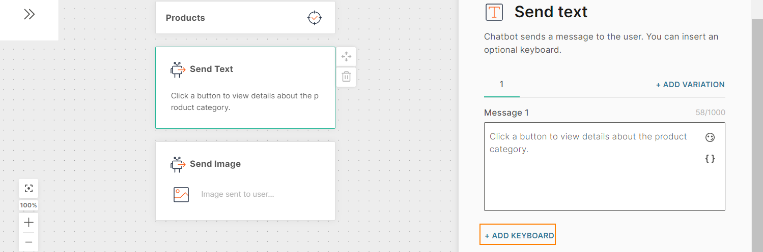
Configure the keyboard as follows:
- Keyboard Background Color: Background color for the entire keyboard. Enter the hexadecimal color code. Example: FF7F00.
- Native keyboard: Determine what happens to the device keyboard when the end user receives the custom keyboard. Choose one of the following options:
- Hidden: The default Viber input field is hidden. There is no option for the end user to use the native keyboard.
- Minimized: There is a toggle option to display the default Viber input field. End users can click this field to display the native keyboard.
- Regular: The default Viber input field is visible. End users can click this field to display the native keyboard.
- Keyboard columns: Total number of columns for the keyboard. Maximum of 6.
- Keyboard rows: Total number of rows for the keyboard. Maximum of 100.
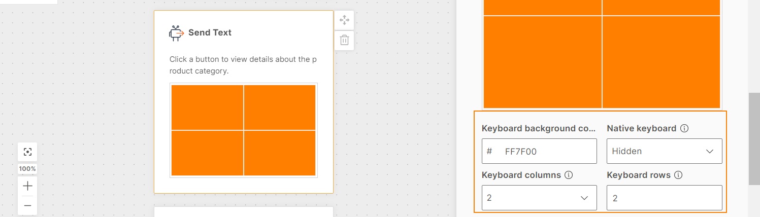
Add Buttons to the Keyboard
You can add buttons to the keyboard either manually or from a list attribute. To add a button manually, click Add keyboard button. To add a button from a list attribute, click Add keyboard button from list attribute.
You must configure one or more of the following for each button:
- Action
- Background
- Text
- Image
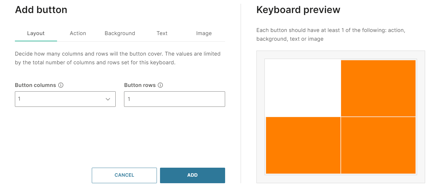
- Layout: The number of rows and columns that the button occupies in the keyboard. The total size of all the buttons cannot exceed the size of the keyboard. Example: If the keyboard has 1 row and 2 columns, you can add 1 button of 1 column, 2 buttons of 1 column each, or 1 button of 2 columns.
Configure the following:- Button columns
- Button rows
- Action: Determine what happens when the end user clicks the button. You can configure the button to do one of the following:
| Action Type | Description | Fields |
|---|---|---|
| None | Use this option if you do not want the button to be clickable but want to provide information on the button. Example: A heading or category. | |
| Reply | Instead of typing a reply to your message, end users can choose an option from the keyboard to send you a pre-defined response. | Action body: Postback value that you receive when the end user clicks the button.This value is not displayed to the end user. For information about what the end user sees, refer to the Troubleshooting section. |
| URL | When end users click the button, the configured URL opens. | URL: Public URL that opens when the end user clicks the button.Open in browser: Choose one of the following:
|
- Background: Customize the background of the button. Each button can have a different configuration.
- Button background color (optional): Background color for the button.
- Media type: Choose the type of media that is displayed as the button background.
- None
- Image
- GIF
- Image layout: This field is applicable if the Media type is either Image or GIF. Choose how the background image is displayed on the button.
- None: The image is not resized. If the image is larger than the button, the image is cropped, and the aspect ratio is not maintained.
- Fit: Resizes the image to fit either the row height or column width. The aspect ratio is maintained, and the image is not cropped.
- Fill: Resizes the image to fit the entire button. The aspect ratio is not maintained, and the image is not cropped.
- Crop: Resizes the image to fit the entire button. The aspect ratio is maintained, and the image may be cropped.
- Button media upload: Applicable if the Media type is either Image or GIF. Either upload the media or add a public URL that contains the media. Supported file types are .jpg, .png, and .gif.
- Text(Optional): Configure the text as follows:
-
Button text: Text that is displayed in a single line on the button. Maximum of 250 characters including spaces, special characters, HTML tags. emojis, and attributes.
-
Vertical alignment: How the text is displayed in relation to the height of the button. Choose one of the following:
- Top
- Middle
- Bottom
-
Horizontal alignment: How the text is displayed in relation to the width of the button. Choose one of the following:
- Left
- Right
- Center
-
Text size: Choose one of the following:
- Regular
- Small
- Large
-
Text opacity: Level of transparency for the text. Enter a percentage. At 100%, the text is opaque. At 0%, the text is transparent.
-
Text fitting: Determine what happens when the text does not fit within the button size. Choose one of the following:
- Decrease text size
- Overflow text but retain the text size
-
- Image (Optional): Image that is displayed on the foreground of the button. This image is displayed over any image or background color that you specify in the Background tab.
- Image upload: Either upload the image or add a public URL that contains the image. Supported file types are .jpg, .png, and .gif.
- Image layout: Choose how the background image is displayed on the button.
- None: The image is not resized.
- Fit: Resizes the image to fit either the row height or column width. The aspect ratio is maintained, and the image is not cropped.
- Fill: Resizes the image to fit the entire button. The aspect ratio is not maintained, and the image is not cropped.
- Crop: Resizes the image to fit the entire button. The aspect ratio is maintained, and the image may be cropped.
For more information about Keyboards, refer to the Infobip Viber Bots documentation.
Troubleshooting
When End User Clicks a Button, URL or Hexadecimal Value is Displayed
Issue: In the Viber app, when the end user clicks a button of action type Reply, a URL or hexadecimal value is displayed as the end user's message.
Cause: You have not configured the Text section for the button.
When an end user clicks a button of action type Reply, the value of the Action body field is sent to the chatbot. So, in the Answers simulator, this value is displayed as the message from the end user.
However, in the Viber app, this value is not displayed. Instead, the following is displayed as the message from the end user, in decreasing order of priority:
- The content that you specify in the Text section is displayed.
- If you do not configure the Text section, the URL of the image that you specify in the Image section is displayed.
- If you do not configure the Image section, the URL of the media that you specify in the Background section is displayed.
- If you do not configure media in the Background section, the hexadecimal value of the button background color, which you specify in the Background section, is displayed. Example: FF7F00
- If you do not configure the button background color in the Background section, the hexadecimal value of the button's default background color, FFFFFF, is displayed.
Workaround: Do the following:
- Go to the Text section.
- In the Button text field, enter the text that needs to be displayed when the end user clicks the button.
- In the Text opacity field, set the value to 0%.
Because the text opacity is 0, the text is not visible on the button. But when the end user clicks the button, the text is displayed as the end user's message in the Viber app.
Location
Send locations to users when you need to provide them with directions. You can do this either by directly searching for a location, entering the specific coordinates or by using a value stored against an MO Location attribute.
The search engine is powered by Google so the location will need to be live in Google Maps. For the coordinates, you will need to provide the specific longitude and latitude values.
If you are using an MO attribute you will need to have already created it in the Attributes tab. The value captured during the chat and stored against this attribute will be used when sending the location.
Once you have provided the desired location, you can rename it using the Location name field to appear in the Answers chat.
Stickers
Send channel approved stickers to add more custom and branded elements to your chats with customers.
Various chat apps have different recommendations and availability with stickers.
Make sure to check the relevant sections of the documentation on Message Types for your selected chatapp.
Text
Send text-only messages and use personalization options in conjunction with attributes, objects, links, and emojis. If you are using links, use the link preview option to auto-display previews in messages. Note however not all channels support this. This option is enabled by default.
Character limits differ depending on which channel your chatbot is using. Make sure to check out the relevant Message types sections for each channel type.
URL
Send URLs to end users to direct them to web pages, online images, or online files.
In the chatbot editor, drag and drop the URL element from Chatbot sends. Enter a publicly-accessible URL. To add placeholders to the URL, use attributes.
URLs can contain a maximum of 2,000 characters, including attributes.
For more information about URLs, refer to the Infobip Viber Bots documentation.
Video
Send pre-recorded videos either by directly uploading into the Answers editor or by providing a direct open URL. The link option also supports attributes if you need to customize the URL. Add an optional caption to your video.
Supported video formats differ depending on which channel your chatbot is using. Make sure to check out the relevant Message types sections for each channel type.
Apple Messages for Business
Apple Messages for Business is a two-way communication channel that helps businesses communicate with end users. Use Apple Messages for Business in Answers to help end users resolve issues, schedule appointments, buy products and services, make payments with Apple Pay, and more.
Apple Messages for Business enables iOS users to initiate a chat from within an iOS application, such as Apple Maps, without having to navigate to a contact page.
When an end user starts a conversation with a chatbot on Apple Messages for Business, a person profile is automatically created as type Lead in People.
Apple Messages for Business offers a variety of message types, as well as Apple-specific message types such as Apple Pay, Apple authentication, and iMesages app. Refer to the messaging limitations for each message type.
To use Apple Messages for Business in Answers, you must enable this channel in your Infobip account.
Apple authentication
Verify Apple users through 3rd party company client bases, all within the Apple chat. This works by adding your Apple integration via the web interface using some simple parameters. When customers reach the Apple authentication step in the chat, a browser will automatically prompt the user to provide their credentials to authenticate themselves.
To add Apple authentication, drag the Apple Authentication channel element into the dialog editor then set up the initial message to the customer in the Received message tab.
The next step is to set up the authentication logic for this chatbot. Note that you will need to have already configured your connection to your 3rd party system before you can use Apple authentication.
In the Authentication tab, select an attribute your customer's authorization token will be stored against. The Repeat option lets you set how many times a user can fail authentication before the fallback option is triggered. Set the number of times they can repeat attempted authentication.
Fallback is used in cases where the user is unable to authenticate themselves. Set whether to send them to another dialog if this happens, or whether to transfer them to an agent, as well as an optional message if required.
Timeout: Specify the time limit that the chatbot waits for the end user to respond. If there is no response within this time, the chatbot takes the action that you specify.
You can set a minimum timeout of 15 seconds and a maximum of 14400 seconds (240 minutes).
The timeout duration must be less than the session timeout duration.
For more information, refer to the Timeout section.
In the Reply Message tab, set up a message to be sent to the end user in case of successful authentication. After this, the next step in the dialog will follow automatically.
Apple Form
Send embedded interactive forms as part of the custom journey for some channels all in a single step. This allows you to collect information from customers using questions and selections providing the chatbot with more information and context.
Forms let your users complete things like surveys, troubleshooting, account creation, etc. without having to leave the chat or even having to open any additional windows onscreen.
You must first create your forms for supported channels in the Content module to be able to use them in Answers. Forms must also be enabled or they will not show up for selection in the chatbot building experience.
Once forms are created in the content module, you cannot modify the contents of them through Answers. If you need to make any edits before using the form, you'll need to edit it back in the Content module in Forms.
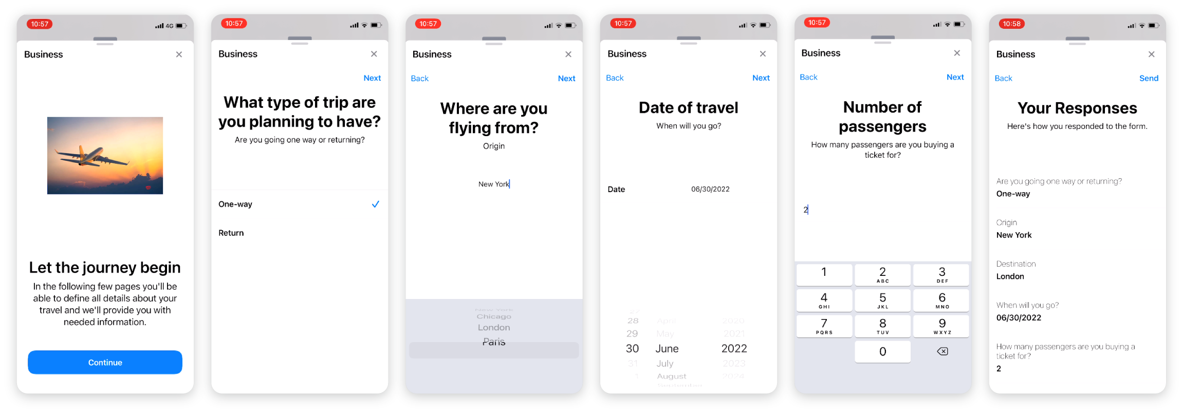
Provide a title, message and optional image to be sent just before the form for clarification about the user is about to start. This is added in the Received message tab in form configuration.
In the Form tab, select an available form from the dropdown, then go on to define how responses are handled and to which attributes they can be optionally saved to.
Repeat determines the number of times they can try again if the chatbot does not recognize a repose, before reverting to the fallback option.
Timeout: Specify the time limit that the chatbot waits for the end user to respond. If there is no response within this time, the chatbot takes the action that you specify.
You can set a minimum timeout of 15 seconds and a maximum of 14400 seconds (240 minutes).
The timeout duration must be less than the session timeout duration.
For more information, refer to the Timeout section.
Reply: Use the message options in the Reply tab to send a message after the user successfully completed the form.
Note that users cannot navigate away from the chat and come back to open forms. Switching apps or windows will close the form and responses will be lost.
For more information about Apple forms, refer to the Infobip Apple Messages for Business documentation.
Apple Pay
Add Apple payment services to your chatbot so that end users can securely pay for products and services without leaving the Apple Messages for Business chat.
When an end user selects the payment request, the payment review and confirmation window opens. After the end user authorizes payment, the payment request chat message updates to reflect that the payment is complete. The chat progress is not lost during the payment process.
You can also include information such as order confirmation and order tracking.
You must have an Apple Pay Merchant ID in the Apple Business Register. This ID identifies your business as a merchant that is able to accept payments. The ID is unique to your Apple Pay service and does not expire.
Configure Apple payment
To configure Apple payment in your chatbot, do the following:
-
Configure Apple Pay. Alternatively, you can configure it through the Apple Pay element in later steps.
-
In the Attributes tab, create the following attributes:
- An attribute of type Text to store the unique order identifier. Example: ID
- An attribute of type JSON to store the order response. Example: order_response
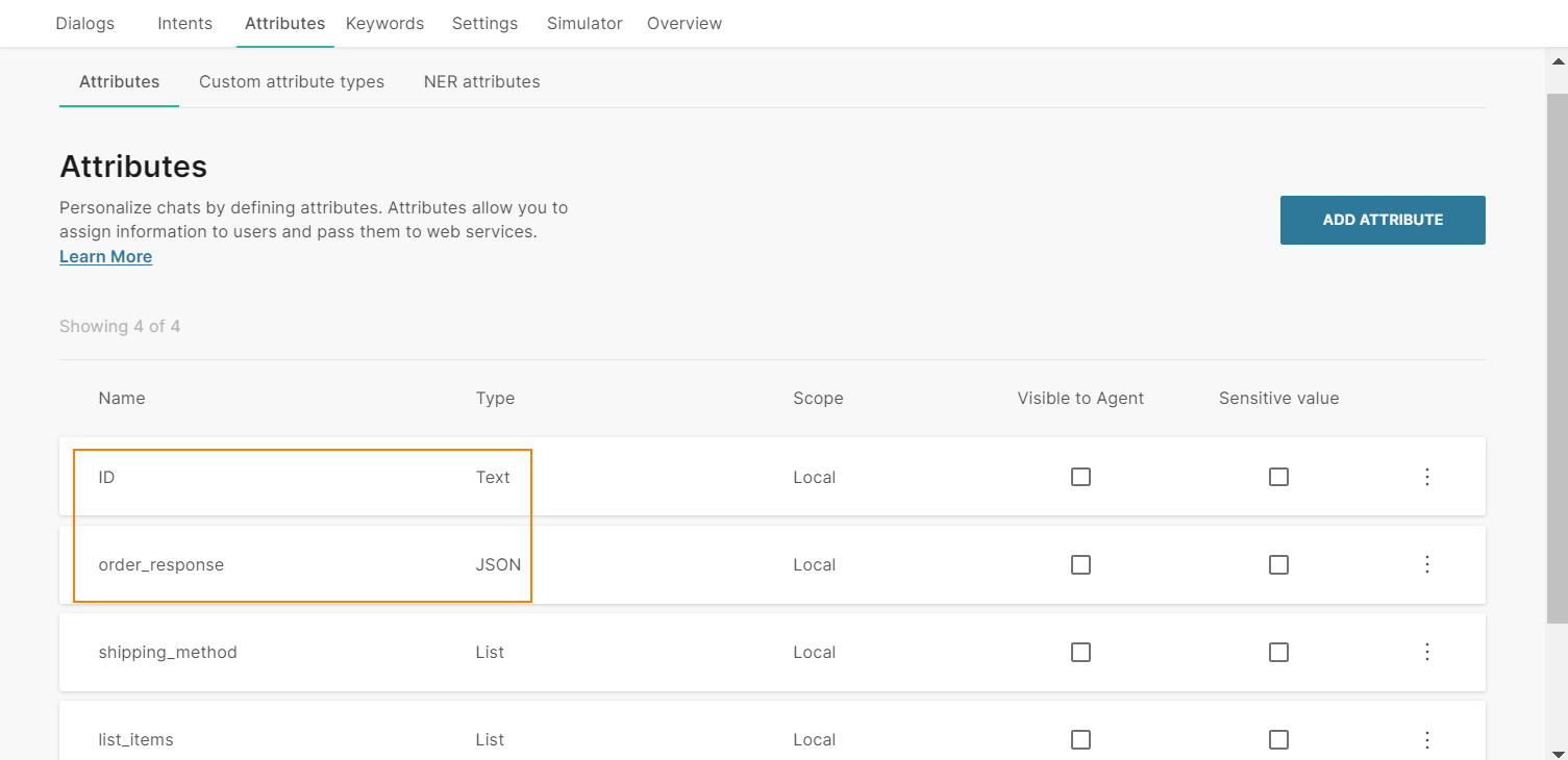
-
In the chatbot editor, follow these steps for each dialog in which you want to use the Apple Pay element.
-
Add the Code element from the Chatbot actions section.
-
In the Code element, use the generateUUID function to generate a unique identifier for the order. attributeApi.set('attributeName', UUID.generate()); where attributeName is the name of the attribute in which the unique order identifier is saved. Example: attributeApi.set('ID', UUID.generate());
-
(Optional) Add the API element from the Chatbot actions section. In the Body section, configure the Key-value pair to send the order identifier to your payment gateway. Responses that are sent to the webhooks in the Apple Pay configuration include this identifier. Key: The attribute that is used to identify the order in the payment gateway. Value: The attribute that contains the unique order identifier in Answers.
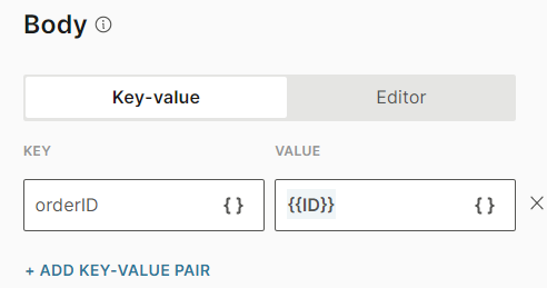
-
Add the Apple Pay element from the Chatbot receives section. You must use only one Apple Pay element in the dialog.
-
Configure the following sections:
- Received message: The message that you send to end users before they start the payment process.
- Apple pay settings: The list of items and their prices. End users can select one or more options.
- Reply message: The message that you send to end users after a successful checkout.
For more information about the Apple Pay element, refer to the Apple Messages for Business documentation.
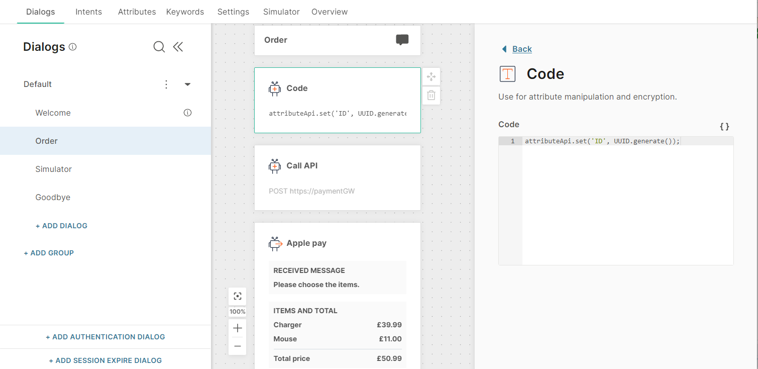
When an end user creates an order, they go to the dialog that contains Apple Pay. The Code element in the dialog generates a unique order identifier.
Each time the end user edits the order, they need to go to the dialog again. So, each time, the Code element in the dialog generates a new order identifier.
Received Message
Configure the message that the end user sees before they start the payment process. This tab contains the following fields:
- Title: Title of the message. This field can contain a maximum of 512 characters including spaces and special characters. There can be only one line of text.
- Message text (optional): Message that you send to the end user. This field can contain a maximum of 512 characters including spaces, new line, emojis, hyperlinks, and attributes.
- Image (optional): Image to be displayed in the message. If you do not add an image, a default icon is used. Either upload the image or add the link to the image. Supported file types are .jpg and .png. To add the link to an image, in the Link tab, enter the public URL that contains the image.
- Image style: The style of the image. Example: icon, small, and large. The default value is icon.
Apple pay settings
In this tab, you can create a list of items and configure the shipping method.
Apple pay configuration: If you have not configured Apple Pay already, select Edit configurationto set up Apple pay. For information about the configuration, refer to the Apple Messages for Business documentation.
After you complete the configuration, go to the chatbot > Apple pay element > Apple pay settings tab, and complete the following fields.
Set order ID from attribute ID: Choose the attribute that contains the unique order identifier.
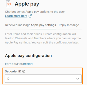
Items: Create a list of items. Add the items either manually or from a list attribute.
To add an item manually, select Add item. Complete the following fields:
- Item name: Name of the item. Can contain spaces, special characters, and attributes. There can be only one line of text.
- Item price: Price of the item. Can contain positive numbers, including zero, with a maximum of 2 decimal places. For decimals, use a decimal point as the decimal separator and not a comma. You can use an attribute.
- Status: Choose one of the following:
- Final: The price of the item is set and is not affected when the end user checks out. Example: The price does not change if the end user applies a promotional code or a coupon.
- Pending: The price of the item may change when the end user checks out. Example: The price changes if the end user applies a promotional code or a coupon.
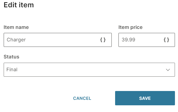
To add an item from a list attribute, follow these steps:
- In the Attributes tab > Attributes tab, select Add attribute.
- In the Name field, enter a name. Example: list_items. In the Type field, choose List.
- In the Dialogs tab, go to the dialog that contains the Apple Pay element.
- From the Chatbot actions section, drag the Code element to the editor. Add it before the Apple Pay element.
- In the Code element, create a list of items and set it to the attribute that you created. Add the following information for each list item:
- Item name: Name of the item. Can contain spaces, special characters, and attributes. There can be only one line of text.
- Item price: Price of the item. Can contain positive numbers, including zero, with a maximum of 2 decimal places. For decimals, use a decimal point as the decimal separator and not a comma. You can use an attribute. The following example is for a list with two list items: const items = [ {"name":"Charger", "price":"39.99"}, {"name":"Mouse", "price":"11"} ]; attributeApi.set('list_items', items); where items is the name of the list name and price are the field names that you need to use in the Apple Pay element in later steps list_items is the attribute that you created
- In the Apple Pay element that you created > Apple pay settings tab, select Add item from list attribute.
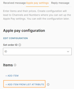
- Complete the following fields:
- From attribute: Choose the list attribute that you created. Example: list_items.
- Iteration label: Enter a label. Example: it. The label is available as a placeholder in the Item name and Item price fields.
This field can contain a maximum of 100 characters, including underscores. There cannot be spaces or special characters. There can be only one line of text.
- Item name: Add the iteration label and the relevant field name that you created in the Code element. Example: {{it.name}}
- Item price: Add the iteration label and the relevant field name that you created in the Code element. Example: {{it.price}}.
- Status: Choose one of the following:
- Final: The price of the item is set and is not affected when the end user checks out. Example: The price does not change if the end user applies a promotional code or a coupon.
- Pending: The price of the item may change when the end user checks out. Example: The price changes if the end user applies a promotional code or a coupon.
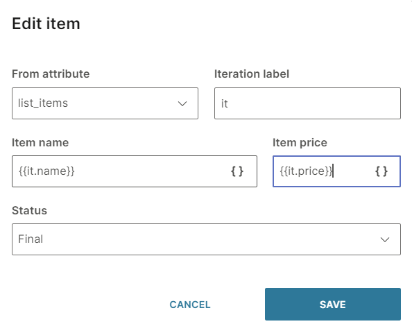
After you add all the items, configure the following fields:
Total title: Enter a title. Example: Total price.
Total price: The total price of the items is calculated automatically. This price does not include shipping charges.
Status: Choose one of the following:
- Final: The total price is set and is not affected when the end user checks out. Example: The price does not change if the end user applies a promotional code or a coupon.
- Pending: The total price may change when the end user checks out. Example: The price changes if the end user applies a promotional code or a coupon.
Shipping: Configure the shipping information. Add the shipping method either manually or from a list attribute.
To add a shipping method manually, select Add shipping method. Complete the following fields:
- Shipping method name: Name of the shipping method. Can contain spaces, special characters, and attributes. There can be only one line of text.
- Shipping price: Price of shipping. Can contain positive numbers, including zero. You can also use an attribute.
- Shipping method detail: Add information about the shipping. You can also use an attribute.
- Shipping method identifier: Create a unique identifier for the shipping method. You can also use an attribute.
To add a shipping method from a list attribute, follow these steps:
- In the Attributes tab > Attributes tab, select Add attribute.
- In the Name field, enter a name. Example: shipping_method. In the Type field, choose List.
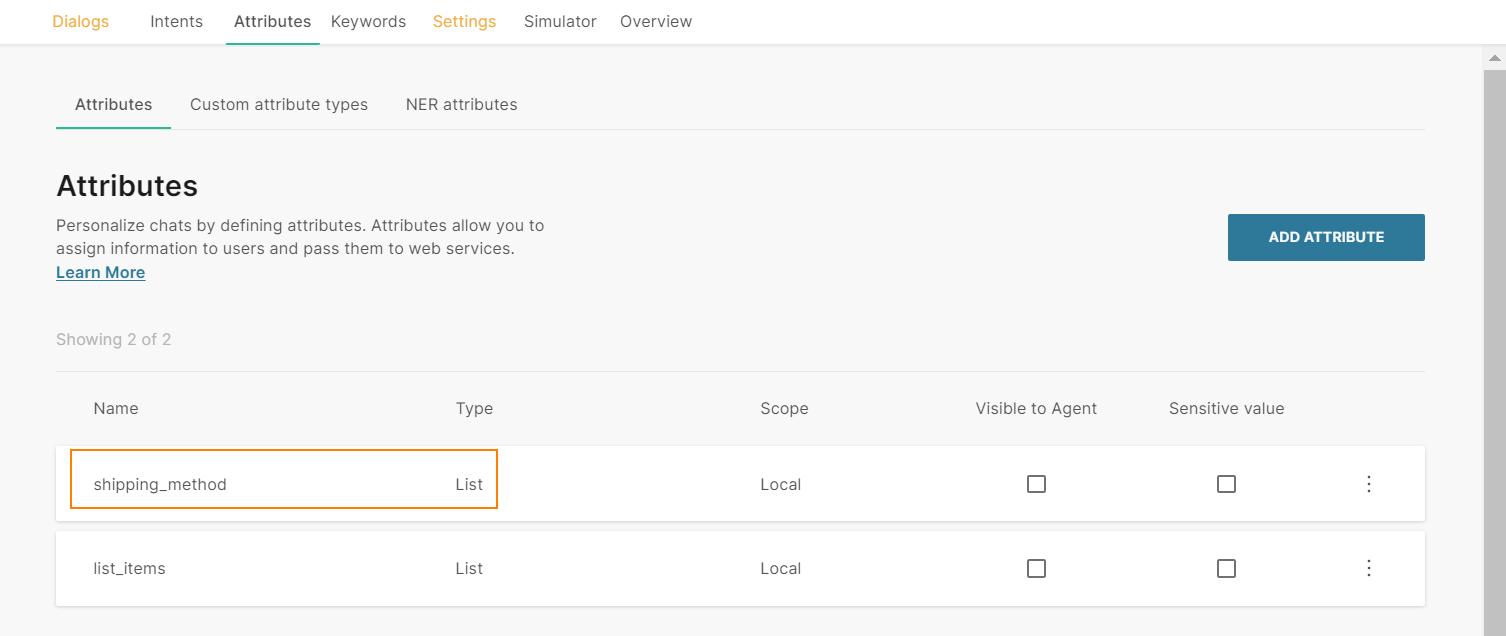
- In the Dialogs tab, go to the dialog that contains the Apple Pay element.
- From the Chatbot actions section, drag the Code element to the editor. Add it before the Apple Pay element.
- In the Code element, create a set of shipping methods and set it to the attribute that you created. Add the following information for each shipping method:
- Shipping method name: Name of the shipping method. Can contain spaces, special characters, and attributes. There can be only one line of text.
- Shipping price: Price of shipping. Can contain positive numbers, including zero. You can also use an attribute.
- Shipping method detail: Add information about the shipping. You can also use an attribute.
- Shipping method identifier: Create a unique identifier for the shipping method. You can also use an attribute. The following example is for two shipping methods: const shipping = [ {"name":"Express", "price":"4.99", "detail":"Next day delivery", "id":"21"}, {"name":"Standard", "price":"0.99", "detail":"Delivery within 4-5 business days", "id":"22"} ]; attributeApi.set('shipping_method', shipping); where shipping is the name of the shipping method list name, price, detail, and id are the field names that you need to use in the Apple Pay element in later steps shipping_method is the attribute that you created
- In the Apple Pay element that you created > Apple pay settings tab, select Add shipping method from list attribute.
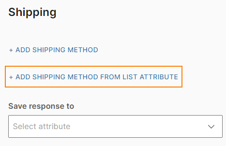
- Complete the following fields:
- From attribute: Choose the list attribute that you created. Example: shipping_method.
- Iteration label: Enter a label. Example: lbl. This value is available as a placeholder in the Shipping method name, Shipping method price, Shipping method detail, and Shipping method identifier fields.
This field can contain a maximum of 100 characters, including underscores. There cannot be spaces or special characters. There can be only one line of text.
- Shipping method name: Add the iteration label and the relevant field name that you created in the Code element. Example: {{lbl.name}}
- Shipping method price: Add the iteration label and the relevant field name that you created in the Code element. Example: {{lbl.price}}.
- Shipping method detail: Add the iteration label and the relevant field name that you created in the Code element. Example: {{lbl.detail}}.
- Shipping method identifier: Add the iteration label and the relevant field name that you created in the Code element. Example: {{lbl.id}}.
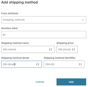
Save response to (optional): Choose the attribute in which to save the order response. This attribute contains the response from Apple and contains the following information:
- The unique order identifier
- Whether the payment was made (Boolean - true/false)
- Items for which the payment was made
- Amount paid for these items
- Total amount paid
Fallback: The action to take if the end user enters an invalid response or performs an unknown action. This section contains the following fields:
- Fallback action: You can either transfer the chat to an agent (Connect to agent) or send the end user to another dialog (Go to dialog).
- Dialog: If the Fallback action is Go to dialog, choose the relevant dialog. Example: You can go back to the default dialog or to the closing dialog. You can choose an existing dialog or create a new one.
- Fallback message (optional): The message to send to the end user. Can contain a maximum of 1,000 characters including spaces, special characters, new line, emojis, and attributes. You can add a maximum of 5 variations of the message. The end user receives one of these messages. To add a variation, select Add variation.
Timeout: Specify the time limit that the chatbot waits for the end user to respond. If there is no response within this time, the chatbot takes the action that you specify.
You can set a minimum timeout of 15 seconds and a maximum of 14400 seconds (240 minutes).
The timeout duration must be less than the session timeout duration.
For more information, refer to the Timeout section.
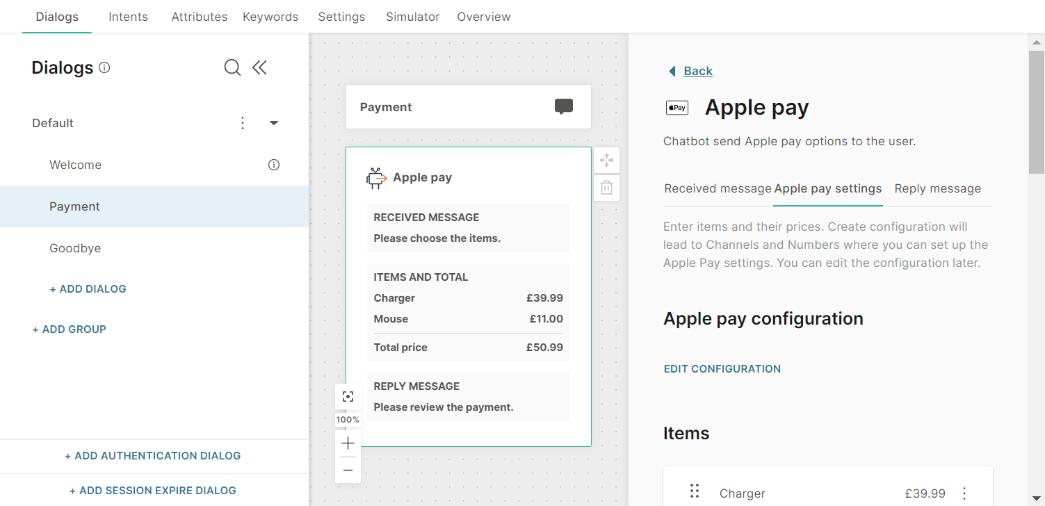
Reply Message
Configure the message that the end user sees after a successful checkout. This tab contains the following fields:
- Title: Title of the message. This field can contain a maximum of 512 characters including spaces and special characters. There can be only one line of text.
- Message text (optional): Message that you send to the end user. This field can contain a maximum of 512 characters including spaces, new line, emojis, hyperlinks, and attributes.
Test the Chatbot
After you configure the chatbot, use the simulator to test the chatbot flow. In the simulator, follow these steps:
- Start a conversation with the chatbot. When the chatbot enters the dialog that contains the Apple Pay element, the Code element in the dialog generates a unique order ID, which is saved in the ID attribute.
In this example, the chatbot is not configured to connect to a real-life API.
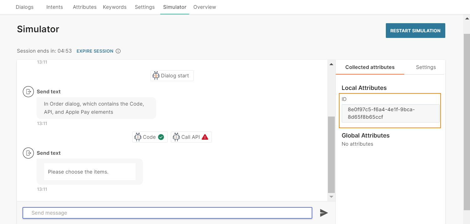
- Select the button.
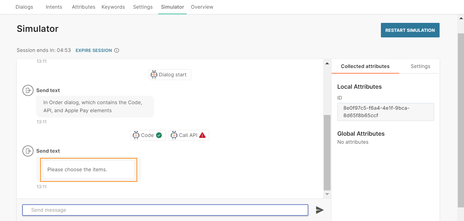
- Select Pay. In the simulator, you can see only the total price.
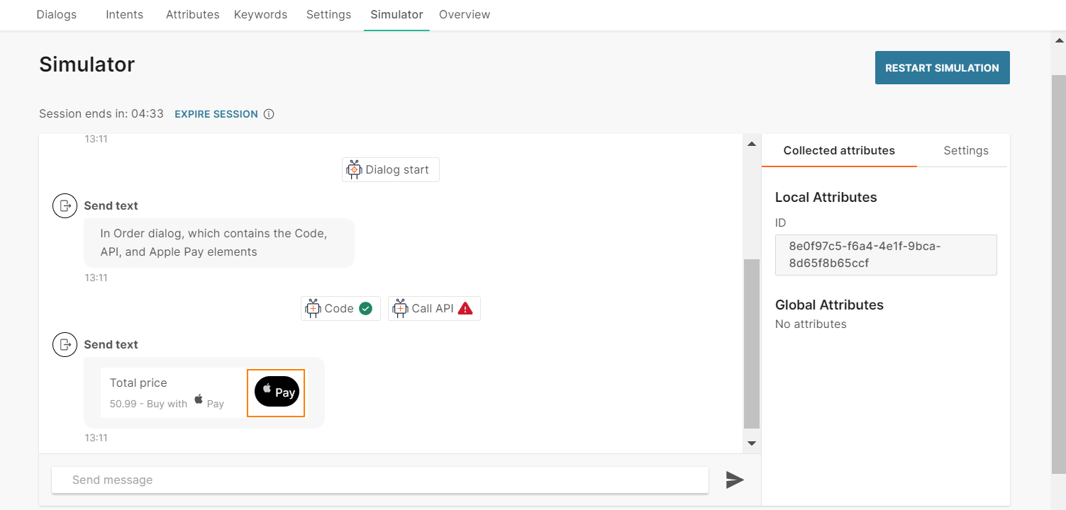
- Select Attribute.
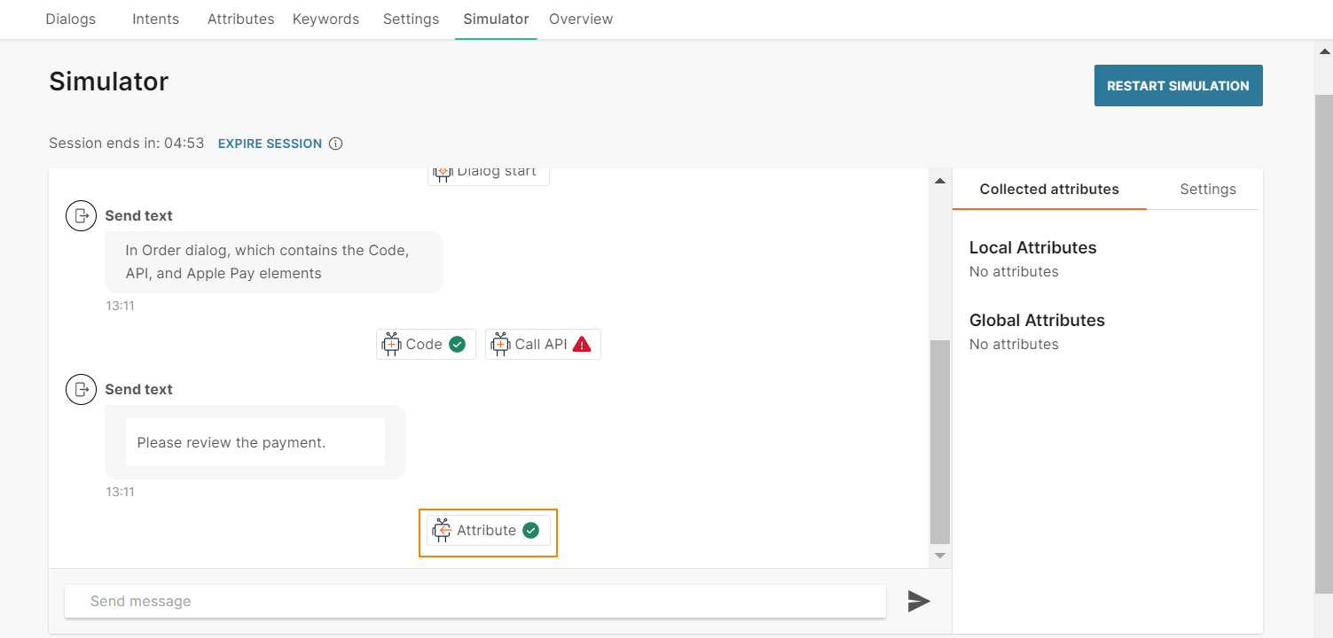
- Select View details.
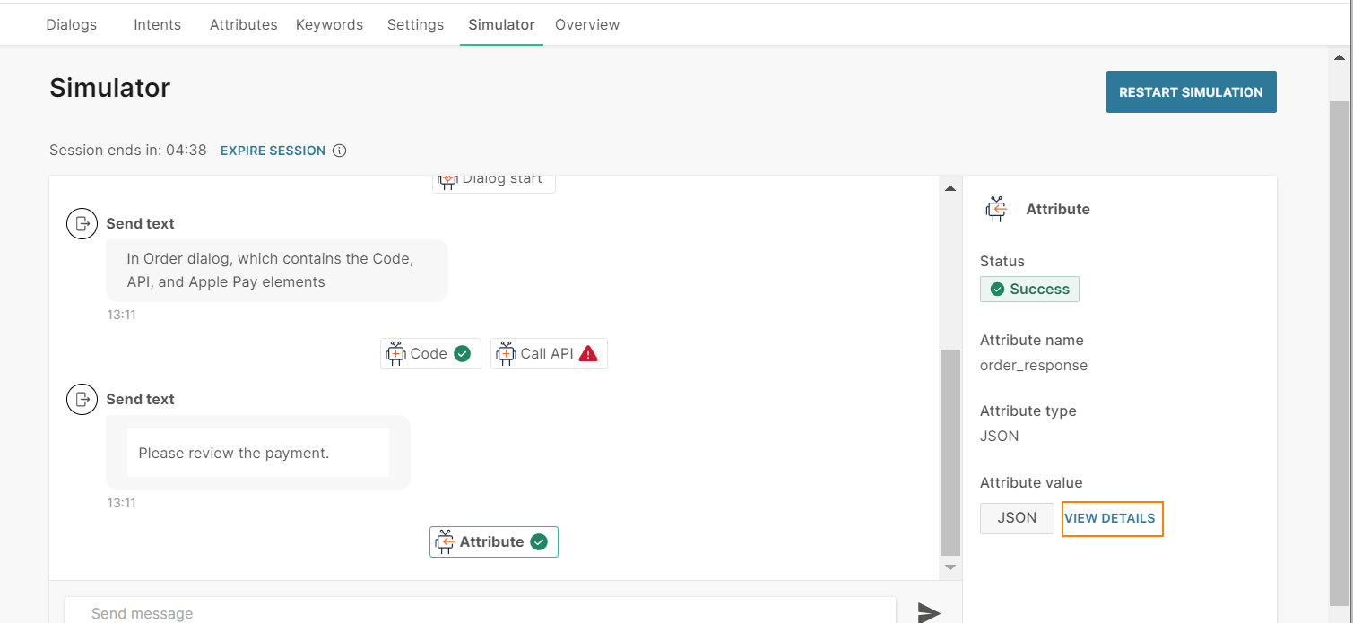
The order response contains the unique order ID that was saved in the ID attribute.
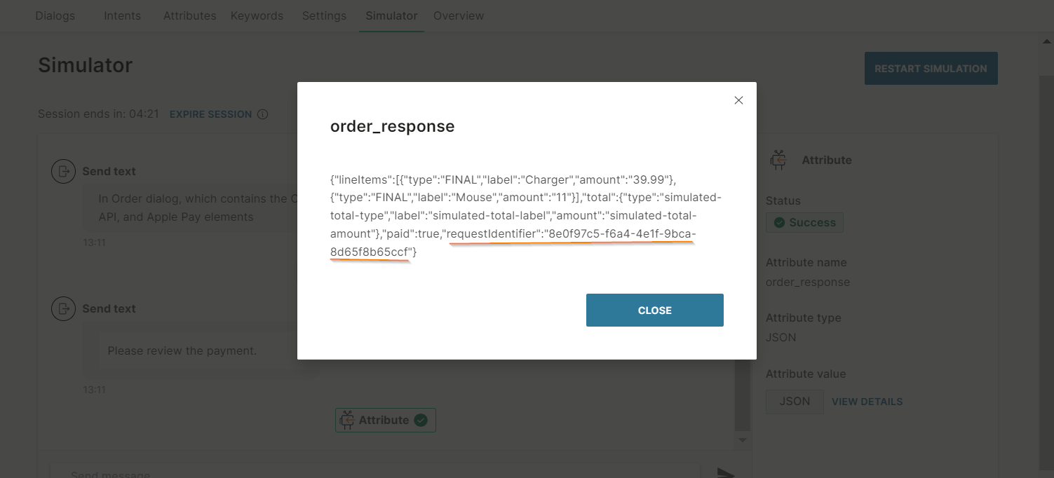
If you go to the dialog again, a new order ID is generated.
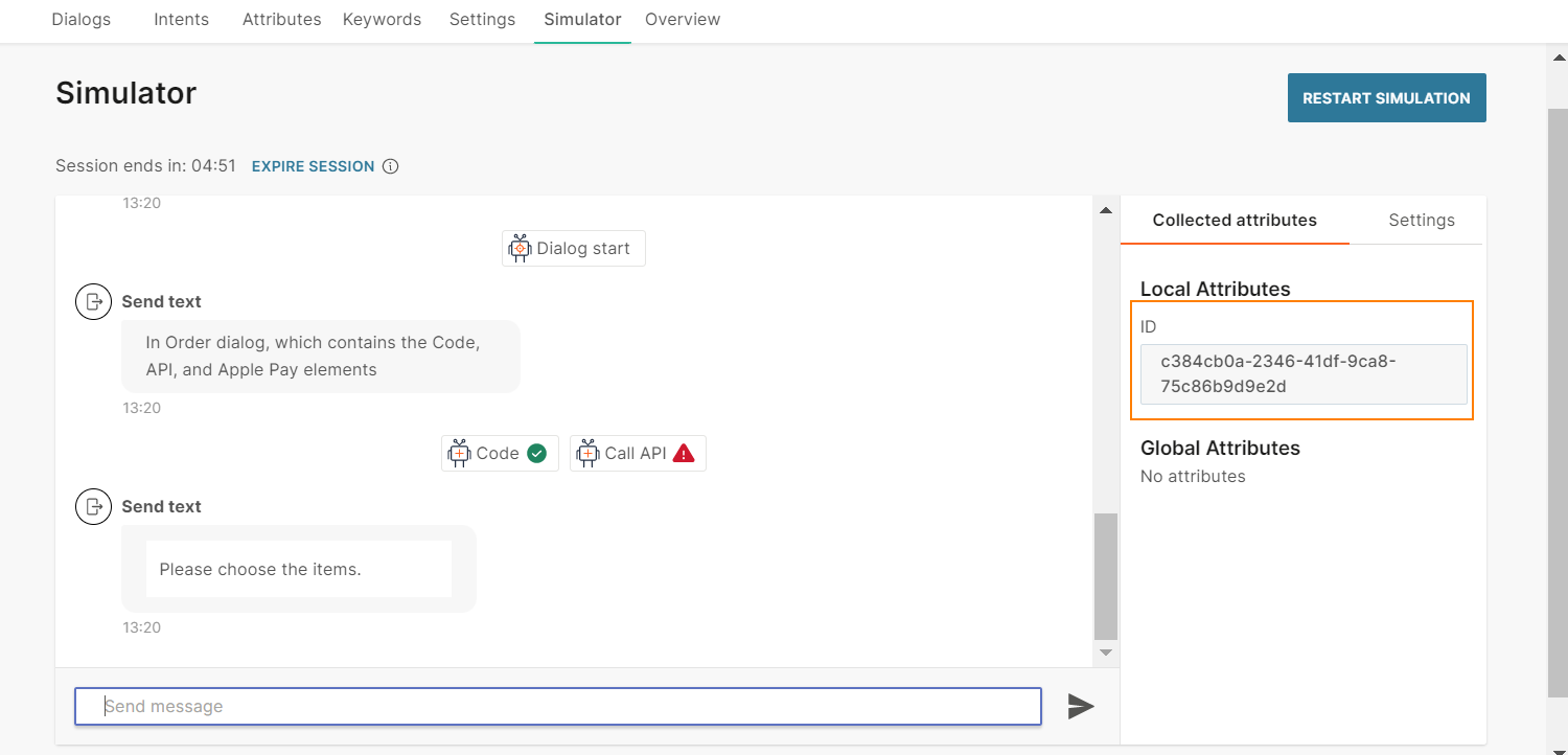
How to
Edit or delete a list item
To edit or delete an item or a shipping method, follow one of these ways:
- Select the three dots against the list item and choose an option.
- Select the list item.
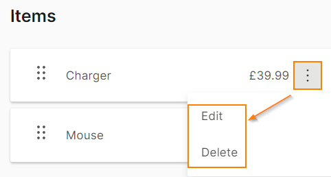
Reorder list items
To edit or delete items or shipping methods, use the six dots against a list item to drag the item.
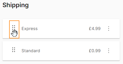
File
Send files and documents directly to end users either by uploading the file in the Answers editor or by providing a link to the file.
Supported file formats depend on the channel that your chatbot uses. Refer to the Message types section for the relevant channel.
For WhatsApp, you can either define the individual file types that the chatbot should handle or you can set to all.
Image
Send images to end users by either uploading the image in the Answers editor or by providing a direct open URL to the image. The link option also supports attributes if you need to customize the URL. Add an optional caption to your image.
Supported image formats depend on the channel that your chatbot uses. Refer to the Message types section for the relevant channel.
iMessage App
iMessages is a framework that enables you to create apps that contain additional functionality. Apps that are created by using the iMessages framework are called iMessage apps.
Each iMessage app must enable a single, specific task. Example: Choose a seat, view a flight’s progress on a map, or view in-store maps.
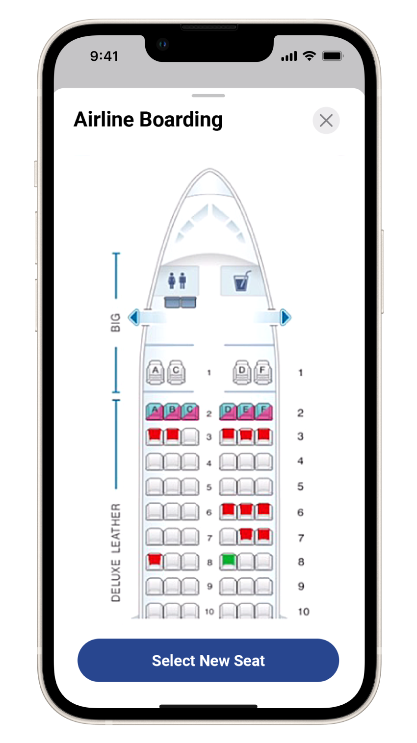
You can create the following types of iMessage apps:
- Standalone iMessage app: A standalone app redirects the customer to your iOS app, which resides outside the Messages app.
- iMessage app extension: An iMessage app extension is hosted inside your iOS app. The extension enables customers to interact with your app from within a Messages for Business conversation.
After you create the app, you can share it with end users through Answers.
To send the iMessage App to end users, in the chatbot editor, drag and drop the iMessage app element from Chatbot receives.
Received Message tab: The initial message that you send to the end user. The end user sees this message before they open your iMessages app. This tab contains the following elements:
- Title
- Message text: Can contain emojis and placeholders. Maximum of 512 characters
iMessage App tab:
-
Click Create Configuration to configure your iMessage App connection. This section contains information that is used to identify the selected app. Refer to the iMessage App configuration section
-
Save response to: Choose an attribute in which you want to store responses from the end user
-
Repeat: Set the number of times to repeat your message in cases where the end user provides an unrecognized response. You can repeat the message a maximum of three times
-
Fallback: Set the action to take if the end user exceeds the number of unrecognized responses that is set in the Repeat section. Available actions are:
- Go to a dialog. Choose the dialog
- Connect to agent: Applicable if you either have the Infobip Conversations solution enabled or integrate with an external contact center solution
(Optional) Provide a Fallback message to send to the end user. You can provide more than one message. Each message can contain a maximum of 1000 characters, including variables.
-
Timeout: Specify the time limit that the chatbot waits for the end user to respond. If there is no response within this time, the chatbot takes the action that you specify.
You can set a minimum timeout of 15 seconds and a maximum of 14400 seconds (240 minutes).
NoteThe timeout duration must be less than the session timeout duration.
For more information, refer to the Timeout section.
Reply Message tab: The message that you send to the end user after they send you a valid response. This tab contains the following elements:
- Title
- Message text: Can contain emojis and placeholders. Maximum of 512 characters
The next steps in your chatbot flow then follow.
For more information about iMessage App, refer to iMessage App documentation and the Apple support documentation (opens in a new tab).
List picker
Provide end users with a list of pre-defined choices from which they can select one or more options. Example: A list of items that they can purchase or a list of questions that directs them to the relevant support option. The chatbot can use the selection to route the end users to the next step.
There is no limit to the number of options that you can add to a list picker. Infobip recommends that you add a maximum of 7 options to avoid poor chatbot performance.
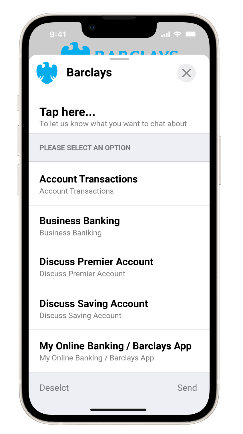
To add a list picker to your chatbot, in the chatbot editor, drag and drop the List Picker element from Chatbot receives.
List pickers contain the following mandatory fields:
- Received message: The message that you send to end users
- List: The list of items from which end users can select one or more options
- Reply message: The message that you send to end users after they choose items from the list
Received Message: Configure the message that the end user sees before the list of items. This tab contains the following fields:
- Title: Title of the message. The default title is “Select an option”. This field can contain a maximum of 512 characters including spaces. There can be only one line of text
- Message text (optional): Message that you send to the end user. This field can contain a maximum of 512 characters including spaces, new line, emojis, hyperlinks, and attributes
- Image (optional): Image to be displayed in the message. If you do not add an image, a default icon is used. Either upload the image or add the link to the image. Supported file types are .jpg and .png. To add the link to an image, in the Link tab, enter the public URL that contains the image.
- Image style: The style of the image. Example: icon, small, and large. The default value is icon.
List: Configure the list of items that you send to end users. You can categorize the list items into groups by using multiple sections with items in each section.
This tab contains the following fields:
- Section title: Title of the section. Can contain a maximum of 512 characters including spaces and attributes. There can be only one line of text
- Multiple item selection: Enable this option so that end users can choose more than one item from the list
- List items: Items in the list. You can add items either manually or from a list attribute.
To add an item manually, click Add item. Complete the following fields:
- Item Title: Name of the list item. Can contain a maximum of 512 characters including spaces and attributes. There can be only one line of text
- Item identifier (optional): A unique identifier for the item. Can contain spaces
- Image (optional): Image to be displayed for the item. Either upload the image or add the link to the image. Supported file types are .jpg and .png. To add the link to an image, in the Link tab, enter the public URL that contains the image.
- Item Subtitle (optional): Information about the list item. Example: description. Can contain a maximum of 512 characters including spaces, special characters, emojis, and attributes. There can be only one line of text.
To add an item from a list attribute, follow these steps:
-
In the Attributes tab > Attributes tab, click Add attribute.
-
In the Name field, enter a name. Example: list_items. In the Type field, choose List.
-
In the Dialogs tab, go to the dialog that contains the list picker that you created.
-
From the Chatbot actions section, drag and drop the Code element. Add it before the List Picker element in the editor.
-
In the Code element, create a list of items and set it to the attribute that you created. Add the following information for each list item:
-
Item Title: Name of the list item. Can contain a maximum of 512 characters including spaces and attributes. There can be only one line of text
-
Item identifier (optional): A unique identifier for the item. Can contain spaces
-
Image (optional): Image to be displayed for the item. Specify the public URL that contains the image
-
Item Subtitle (optional): Information about the list item. Example: description. Can contain a maximum of 512 characters including spaces, special characters, emojis, and attributes. There can be only one line of text.
The following example is for a list with two list items:
const items = [
{"title":"Answers", "identifier":"answers", "image":"https://cdn-www.infobip.com/wp-content/uploads/2021/03/08230929/answers-benefit-002-2x.png", "subtitle":"Chatbot-building platform"},
{"title":"Things", "identifier":"things", "image":"https://cdn-www.infobip.com/wp-content/uploads/2021/05/25141144/iot-header-2x.png", "subtitle":"Internet of things"}
];attributeApi.set('list_items', items);
where
items is the name of the list
title, identifier, image, and subtitle are the field names that you need to use in the List picker element in later steps
list_items is the attribute that you created
-
-
In the List Picker element that you created > List tab, click Add from list attribute.
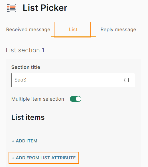
-
Complete the following fields:
- From attribute: Choose the list attribute that you created. Example: list_items.
- Iteration label: Enter a label. Example: it_label. This value is available as a placeholder in the Item title, Item identifier, Image, and Item Subtitle fields.
This field can contain a maximum of 100 characters, including underscores. There cannot be spaces or special characters. There can be only one line of text.- Item title: Add the iteration label and the relevant field name that you created in the Code element. Example: {{it_label.title}}
- Item identifier (optional): Add the iteration label and the relevant field name that you created in the Code element. Example: {{it_label.identifier}}. If you have not specified this field in the Code element, leave this field blank
- Image (optional): Add the iteration label and the relevant field name that you created in the Code element. Example: {{it_label.image}}. If you have not specified this field in the Code element, leave this field blank
- Item Subtitle (optional): Add the iteration label and the relevant field name that you created in the Code element. Example: {{it_label.subtitle}}. If you have not specified this field in the Code element, leave this field blank
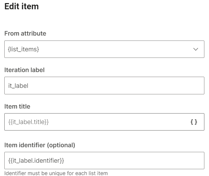
-
Add new list section: Add a list section
-
Save selection: Save the end user's selection to an attribute.
- Field to save: Choose the field to save. Example: item title, item identifier
- Save to attribute: The attribute to which you want to save the selection. You can either choose an existing attribute or create a new one
-
Repeat count: Choose the number of times to repeat the message in case you do not receive a valid response from the end user. The default value is No repeat. You can repeat the message a maximum of 3 times
-
Fallback: The action to take if the end user enters an invalid response or performs an unknown action. This section contains the following fields:
- Fallback action: You can either transfer the chat to an agent (Connect to agent) or send the end user to another dialog (Go to dialog).
- Dialog: If the Fallback action is Go to dialog, choose the relevant dialog. Example: You can go back to the default dialog or to the closing dialog. You can choose an existing dialog or create a new one.
- Fallback message (optional): The message to send to the end user. Can contain a maximum of 1,000 characters including spaces, special characters, new line, emojis, and attributes. You can add a maximum of 5 variations of the message. The end user receives one of these messages. To add a variation, click Add variation.
-
Timeout: Specify the time limit that the chatbot waits for the end user to respond. If there is no response within this time, the chatbot takes the action that you specify.
You can set a minimum timeout of 15 seconds and a maximum of 14400 seconds (240 minutes).
NoteThe timeout duration must be less than the session timeout duration.
For more information, refer to the Timeout section.
To edit or delete a list item, click the three dots against the list item and choose an option. You can also edit the list item by clicking on it.
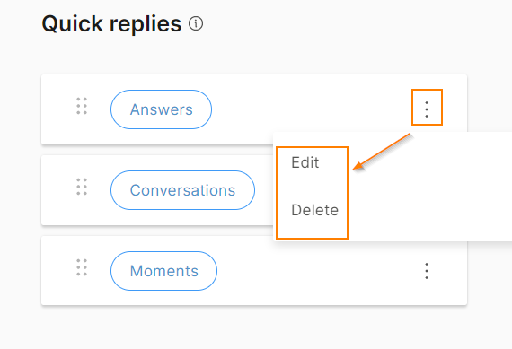
To reorder the list items, use the six dots against a list item to drag and drop the item.
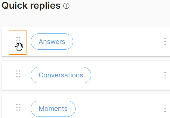
Reply Message: Configure the message that the end user sees after they choose items from the list. This tab contains the following fields:
- Title: Title of the message. Can contain a maximum of 512 characters including spaces. There can be only one line of text
- Message text (optional): Message that you send to the end user. Can contain a maximum of 512 characters including spaces, new line, emojis, hyperlinks, and attributes
- Image (optional): Image to be displayed in the message. Either upload the image or add the link to the image. Supported file types are .jpg and .png. To add the link to an image, in the Link tab, enter the public URL that contains the image.
If you add an image to the Received message, but not to the Reply message, the image from the Received message is used in the Reply message.
- Image style: The style of the image. Example: icon, small, and large. The default value is icon.
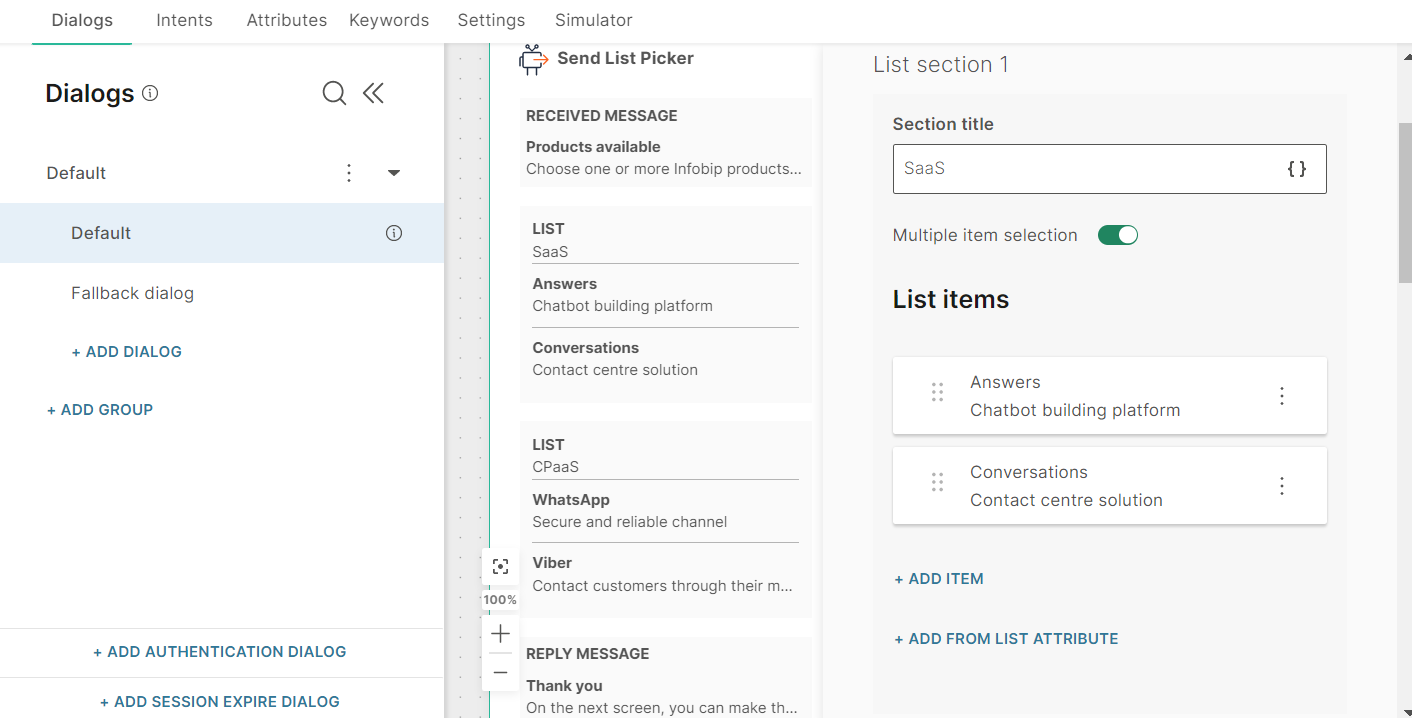
After you configure the chatbot, use the simulator to test the chatbot flow. In the simulator, follow these steps:
- Click the button.
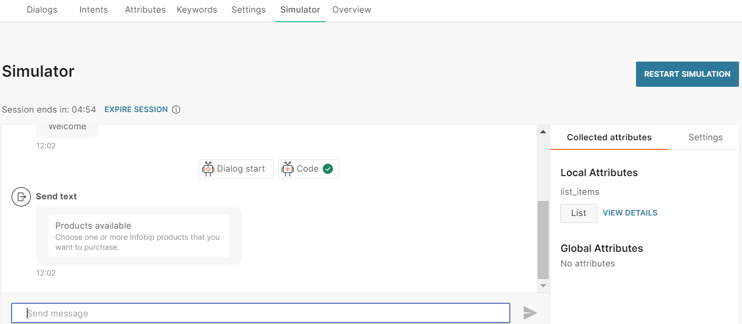
- Choose one or more items and click Send.
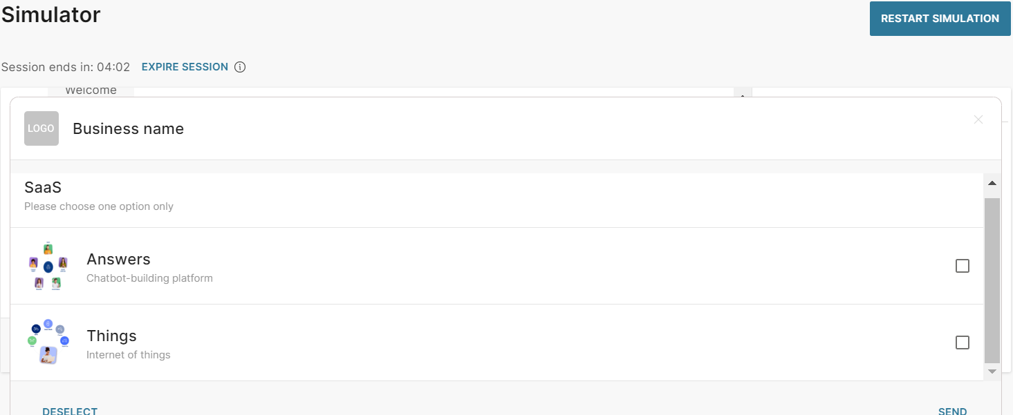
For more information about list pickers, refer to the Apple Messages for Business documentation.
Quick Reply
Quick reply buttons enable end users to choose from multiple options inline without leaving the conversation with your chatbot. Instead of typing a reply to your message, the end user can click one of these buttons to send you a predefined reply. The chatbot receives the postback value of that button. Thus, you can capture a specific response from the end user.
You can add 2–5 options. End users can choose only one of these options.
To add quick replies to your chatbot, in the chatbot editor, drag and drop the Quick Reply element from Chatbot sends.
Quick replies contain the following mandatory fields:
- Description text: The message that you send to end users after they choose a quick reply option
- Quick r eplies: The set of predefined options from which the end user can select one
Quick replies: You can add quick replies either manually or from a list attribute.
To add a quick reply manually, click Add quick reply. Complete the following fields:
- Item text: Text that is displayed on the quick reply button and is visible to the end user. Can contain a maximum of 512 characters including emojis, special characters, spaces, and attributes. There can be only one line of text.
- Postback: Data that is sent back to you when the end user clicks the button. Can contain special characters, spaces, and attributes. Example: If the quick reply button title is 'Send me more information', you can specify the postback value as 'send_information'
To add a quick reply from a list attribute, follow these steps:
- Add a quick reply manually. You must add at least one item manually for the validation to be successful. Example: To add 5 quick reply buttons, add 1 item manually and the other 4 items from a list attribute.
- In the Attributes tab > Attributes tab, click Add attribute.
- In the Name field, enter a name. Example: list_items. In the Type field, choose List.
- In the Dialogs tab, go to the dialog that contains the quick reply element that you created.
- From the Chatbot actions section, drag and drop the Code element. Add it before the Quick Reply element in the editor.
- In the Code element, create a list of quick reply items and set it to the attribute that you created. Add the following information for each quick reply item:
- Item text: Text that is displayed on the quick reply button and is visible to the end user. Can contain a maximum of 512 characters including emojis, special characters, spaces, and attributes. There can be only one line of text.
- Postback: Data that is sent back to you when the end user clicks the button. Can contain special characters, spaces, and attributes. Example: If the quick reply button title is 'Send me more information', you can specify the postback value as 'send_information' The following example is for a list with two quick reply buttons: const items = [ {"title":"Moments", "postback":"moments"}, {"title":"Conversations", "postback":"conversations"} ]; attributeApi.set('list_items', items); where items is the name of the list title and postback are the field names that you need to use in the Quick reply element in later steps list_items is the attribute that you created
- In the Quicky reply element that you created, click Add quick reply and add a list item manually. If you do not do so, the chatbot fails validation.
- Click Add quick replies from list attribute.
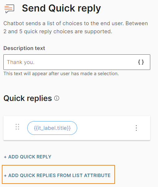
- Complete the following fields:
- From attribute: Choose the list attribute that you created. Example: list_items.
- Iteration label: Enter a label. Example: it_label. This value is available as a placeholder in the Item text and Postback fields.
This field can contain a maximum of 100 characters, including underscores. There cannot be spaces or special characters. There can be only one line of text.
- Item text: Add the iteration label and the relevant field name that you created in the Code element. Example: {{it_label.title}}
- Postback: Add the iteration label and the relevant field name that you created in the Code element. Example: {{it_label.identifier}}
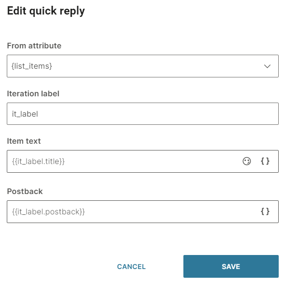
To edit or delete a quick reply button, click the three dots against the button and choose an option. You can also edit the button by clicking on it.
To reorder the quick reply buttons, use the six dots against a button to drag and drop the button.

To process the quick reply selection made by the end user, add User response as the next element.
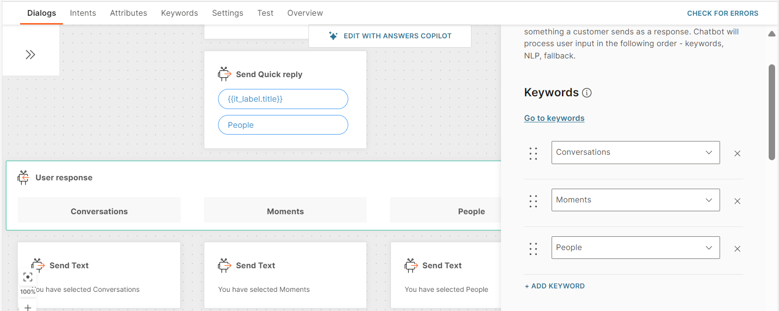
After you configure the chatbot, use the simulator to test the chatbot flow.
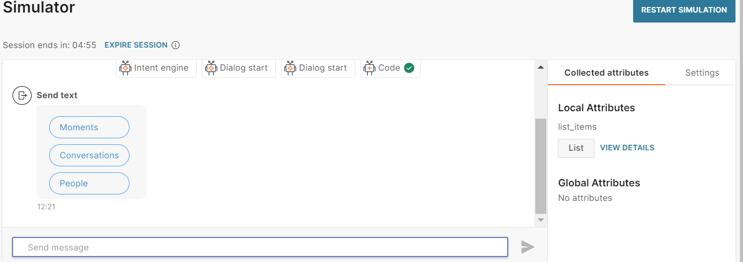
For more information about quick replies, refer to the Apple Messages for Business documentation.
Rich link
Use rich links to send URLs that are embedded within either an image or a video. When you use rich links, the end user can see a preview of the web page within the Messages app. Thus, end users can be assured that the link is for your web page and not for a fraudulent page. When the end user clicks the image or video, the link opens within the Messages app. After viewing the webpage, the end user can close the page and return to the chatbot conversation.
To add a rich link to your chatbot, in the chatbot editor, drag and drop the Rich link element from Chatbot sends.
You can embed the URL of the website in either an image or a video. To embed the URL in an image, click Image link. To embed the URL in a video, click Video link.
You can add the image or video to the message in one of the following ways:
- Upload the image or video: Use the Upload tab. Supported file format for images are .png and .jpg. Supported file format for video is .mp4.
- Add a link to the image or video: Use the Link tab. Enter the public URL that contains the image or video in the Image URL or Video URL field.
Enter the following information.
- Link title: A name for the URL
- Link URL: The URL of the website to which you want to direct the end user
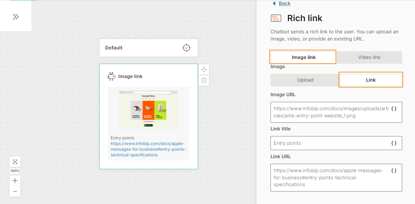
After you configure the rich link, use the simulator to test the link. When you click the image, the link opens.
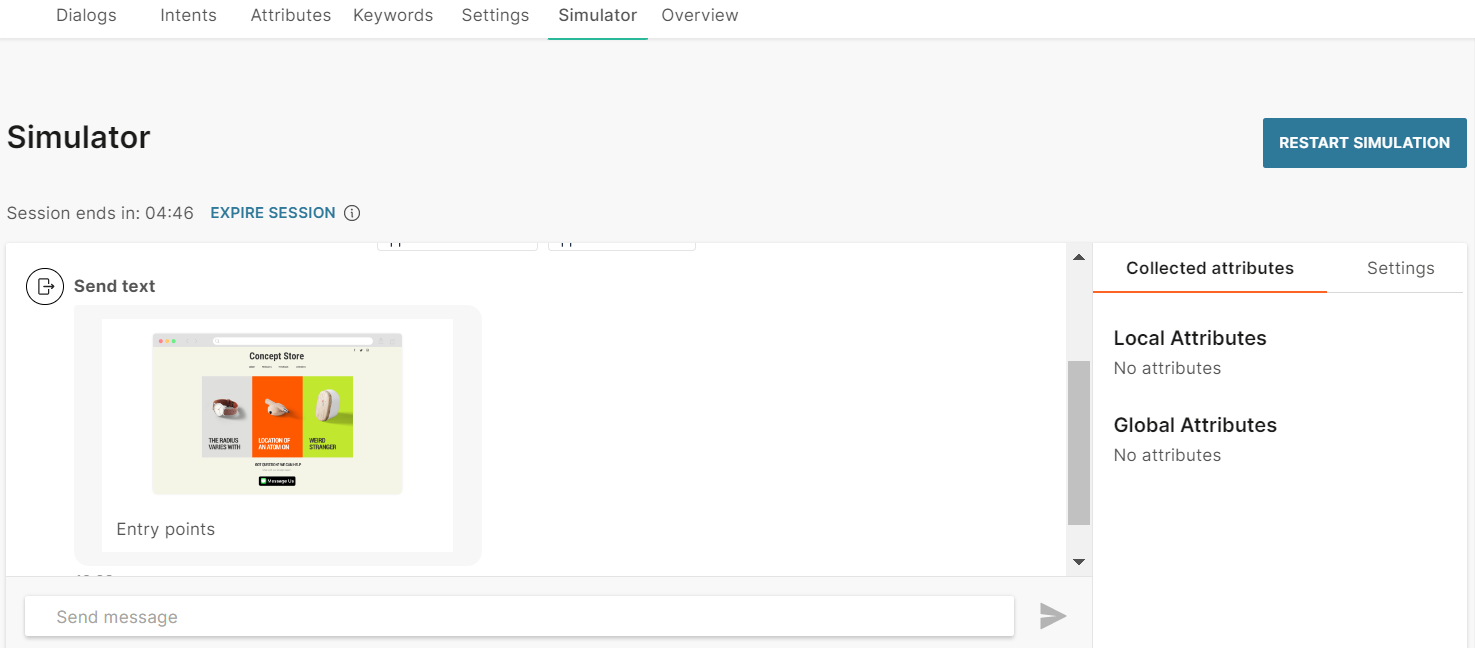
For more information about rich links, refer to the Apple Messages for Business documentation.
Text
Send text-only messages and use personalization options in conjunction with attributes, objects, links, and emojis. If you are using links, use the link preview option to auto-display previews in messages. Note however not all channels support this. This option is enabled by default.
Character limits differ depending on which channel your chatbot is using. Make sure to check out the relevant Message types sections for each channel type.
Time picker
Prompt end users to choose a time slot from a list of options. Example: schedule an appointment. Customers can view time pickers in calendar view, which helps them view any meeting conflicts. After choosing a time, end user can view their choice in the conversation to add the event to their calendar.
If you include information such as address or directions, end users can view this information in calendar applications and get directions in map applications. Time pickers also support push notifications to remind end users about upcoming appointments. You must obtain opt-in from customers to send them push notifications and provide an opt-out option.
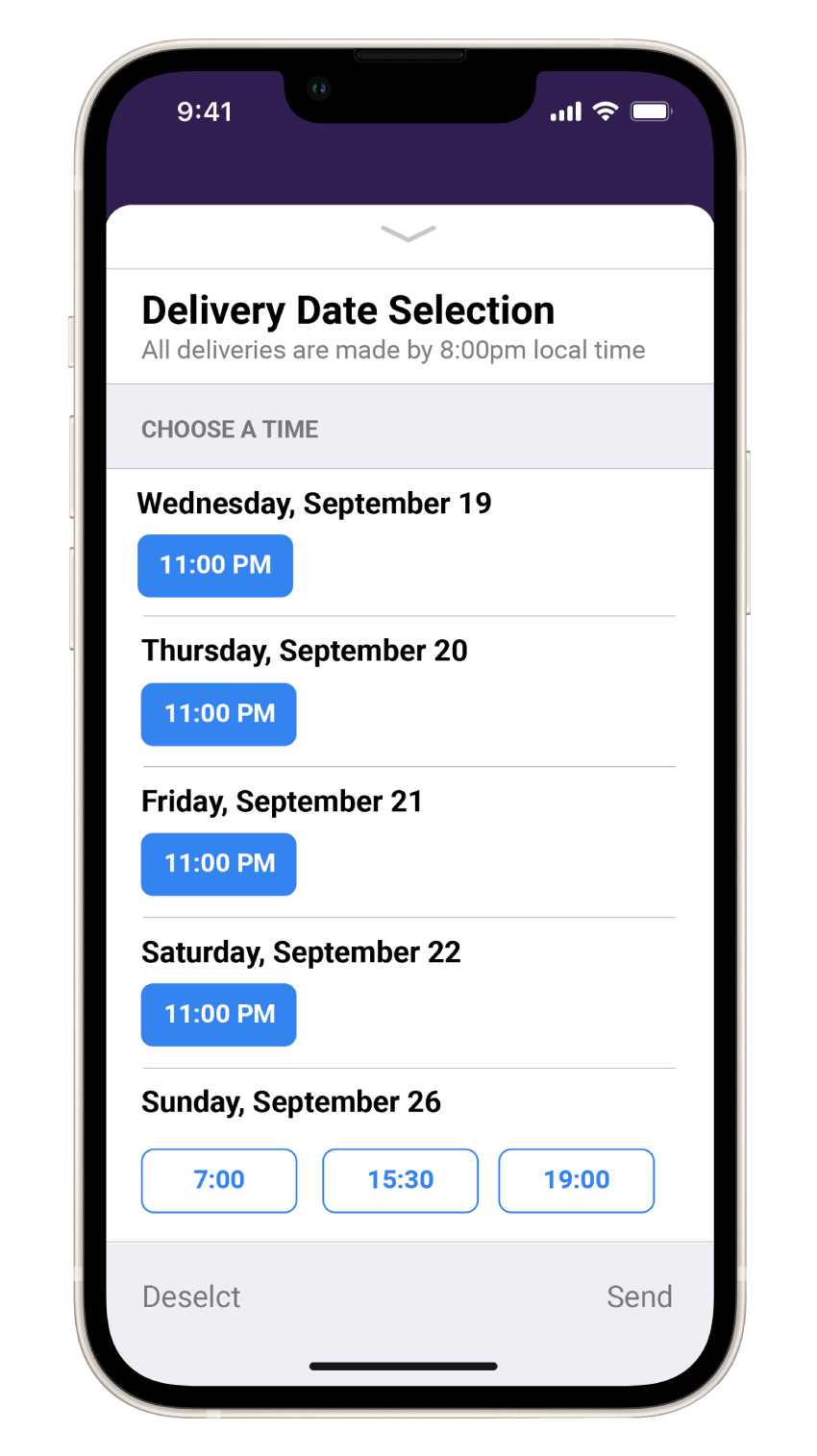
To add a time picker to your chatbot, in the chatbot editor, drag and drop the Time Picker element from Chatbot receives.
Time pickers contain the following mandatory fields:
- Received message: The message that you send to end users
- Time slots: The list of time slots from which end users can select an option
- Reply message: The message that you send to the end user after they choose a time slot from the list
Received Message: Configure the message that the end user sees before the list of time slots. This tab contains the following fields:
- Title: Title of the message. The default title is “Select an option”. This field can contain a maximum of 512 characters including spaces. There can be only one line of text.
- Message text (optional): Message that you send to the end user. This field can contain a maximum of 512 characters including spaces, new line, emojis, hyperlinks, and attributes
- Image (optional): Image to be displayed in the message. If you do not add an image, a default calendar icon is used. Either upload the image or add the link to the image. Supported file types are .jpg and .png. To add the link to an image, in the Link tab, enter the public URL that contains the image.
- Image style: The style of the image. Example: icon, small, and large. The default value is icon.
Time slots: Configure the set of time slots to send to the end user. In addition to time slots, you can add the location of the event.
This tab contains the following fields:
- Title: Title of the list of time slots. Can contain spaces and attributes. There can be only one line of text
- Time zone: Choose a time zone from the list. Time slots are adjusted based on the selected time zone
- Location details (Optional): Either manually enter the address for the location or choose the attribute in which you have saved the address. The attribute type must be Text.
- Latitude (Optional): Either manually enter the latitude for the location or choose the attribute in which you have saved the latitude. The format for the latitude is decimal degrees. Example: 13.067439. The attribute type must be Number.
- Longitude (Optional): Either enter the longitude for the location or choose the attribute in which you have saved the longitude. The format for the longitude is decimal degrees. Example: 80.237617. The attribute type must be Number.
- Time slots: List of time slots. You can add time slots either manually or from a list attribute. Available time slots can change because multiple end users would choose a time slot. So, Infobip recommends that you use a list attribute that contains the currently available time slots.
To add a time slot manually, click Add time slot. Complete the following fields:
- Slot type: Choose how you want to add the time slot. If you want to enter the start time manually, choose free form. If you want to pick a time slot, choose Picker.
- Start time: If the slot type is free form, enter the start time in the format yyyy-mm-ddThh:mm:ssZ. If the slot type is picker, choose the start date and start time.**
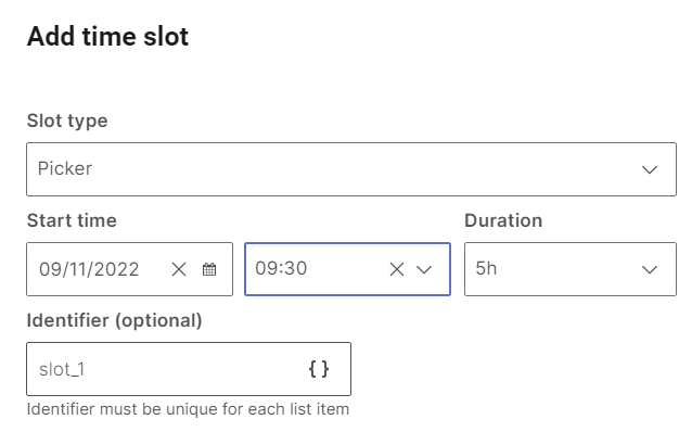
- Duration: Duration of the time slot. Minimum value is 1 hour, and maximum value is 24 hours. The duration is in whole hours.
- Identifier (optional): A unique identifier for the time slot. Can contain spaces
To add a time slot from a list attribute, follow these steps:
- In the Attributes tab > Attributes tab, click Add attribute.
- In the Name field, enter a name. Example: time_slots. In the Type field, choose List.
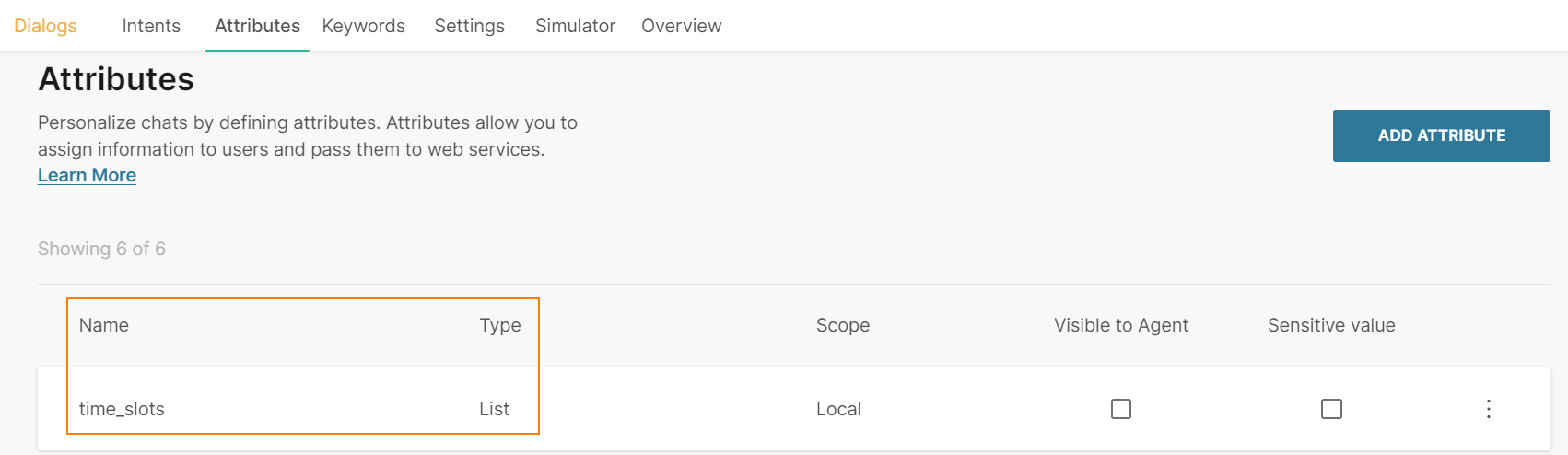
- In the Dialogs tab, go to the dialog that contains the time picker that you created.
- From the Chatbot actions section, drag and drop the Code element. Add it before the Time Picker element in the editor.
- In the Code element, create a list of time slots and set it to the attribute that you created. Add the following information for each time slot:
-
Start time: The start date and time for the time slot in the format yyyy-mm-ddThh:mm:ssZ
-
Identifier (optional): A unique identifier for the time slot. Can contain spaces
The following example is for a list with two time slots: const slots = [
{"start":"2023-11-15T15:00:00Z", "identifier":"slot_1"},
{"start":"2023-11-15T16:00:00Z", "identifier":"slot_2"},
];
attributeApi.set('time_slots', slots); where slots is the name of the list
start and identifier are the field names that you need to use in the Time Picker element in later steps
time_slots is the attribute that you created
-
- In the Time Picker element that you created > Time slots tab > Time slots section, click Add time slots from list attribute.
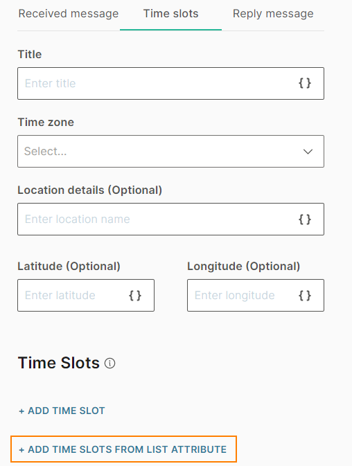
- Complete the following fields:
- From attribute: Choose the list attribute that you created. Example: time_slots.
- Iteration label: Enter a label. Example: it_label. This value is available as a placeholder in the Start time and Identifier fields.
This field can contain a maximum of 100 characters, including underscores. There cannot be spaces or special characters. There can be only one line of text.- Start time: Add the iteration label and the relevant field name that you created in the Code element. Example: {{it_label.identifier}}
- Duration: Choose the duration of the time slot. Minimum value is 1 hour, and maximum value is 24 hours. The duration is in whole hours.
- Identifier (optional): Add the iteration label and the relevant field name that you created in the Code element. Example: {{it_label.identifier}}. If you have not specified this field in the Code element, leave this field blank
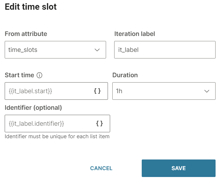
-
Save selection: Save the end user's selection to an attribute.
- Field to save: Choose the field to save. Example: time slot start time, time slot identifier
- Save to attribute: The attribute to which you want to save the selection. You can either choose an existing attribute or create a new one
-
Repeat count: Choose the number of times to repeat the message in case you do not receive a valid response from the end user. The default value is No repeat. You can repeat the message a maximum of 3 times
-
Fallback: The action to take if the end user enters an invalid response or performs an unknown action. This section contains the following fields:
- Fallback action: You can either transfer the chat to an agent (Connect to agent) or send the end user to another dialog (Go to dialog).
- Dialog: If the Fallback action is Go to dialog, choose the relevant dialog. Example: You can go back to the default dialog or to the closing dialog. You can choose an existing dialog or create a new one.
- Fallback message (optional): The message to send to the end user. Can contain a maximum of 1,000 characters including spaces, special characters, new line, emojis, and attributes. You can add a maximum of 5 variations of the message. The end user receives one of these messages. To add a variation, click Add variation.
-
Timeout: Specify the time limit that the chatbot waits for the end user to respond. If there is no response within this time, the chatbot takes the action that you specify.
You can set a minimum timeout of 15 seconds and a maximum of 14400 seconds (240 minutes).
NoteThe timeout duration must be less than the session timeout duration.
For more information, refer to the Timeout section.
To edit or delete a time slot, click the three dots against the time slot and choose an option. You can also edit the time slot by clicking on it.
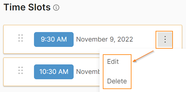
To reorder the time slots, use the six dots against a time slot to drag and drop the slot.
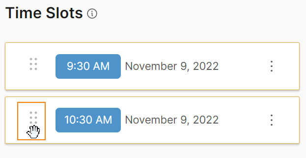
Reply Message: Configure the message that the end user sees after they choose a time slot from the list. This tab contains the following fields:
- Title: Title of the message. Can contain a maximum of 512 characters including spaces. There can be only one line of text
- Message text (optional): Message that you send to the end user. Can contain a maximum of 512 characters including spaces, new line, emojis, hyperlinks, and attributes
- Image (optional): Image to be displayed in the message. Either upload the image or add the link to the image. Supported file types are .jpg and .png. To add the link to an image, in the Link tab, enter the public URL that contains the image.
If you add an image to the Received message, but not to the Reply message, the image from the Received message is used in the Reply message.
- Image style: The style of the image. Example: icon, small, and large. The default value is icon.
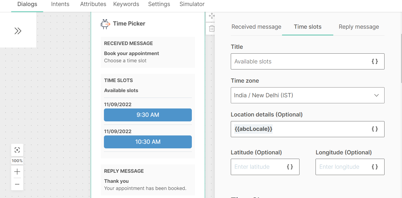
After you configure the chatbot, use the simulator to test the chatbot flow. In the simulator, follow these steps:
- Click the button.
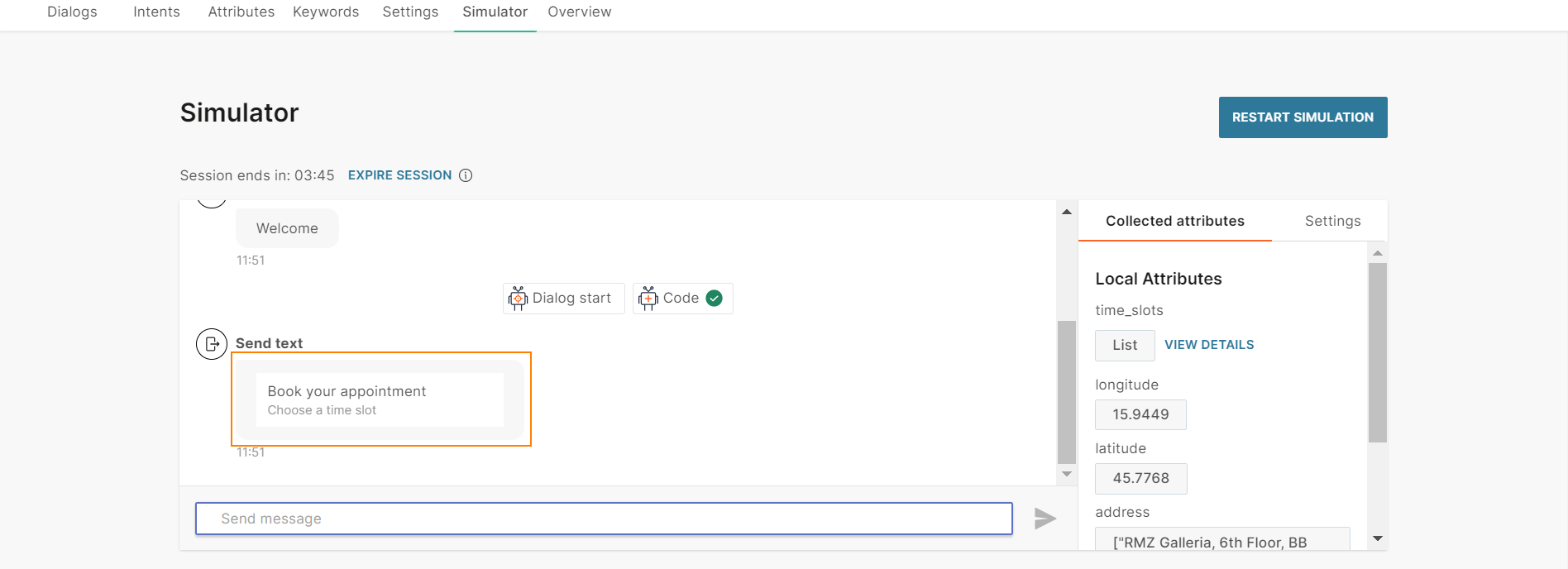
- Choose one of the time slots.
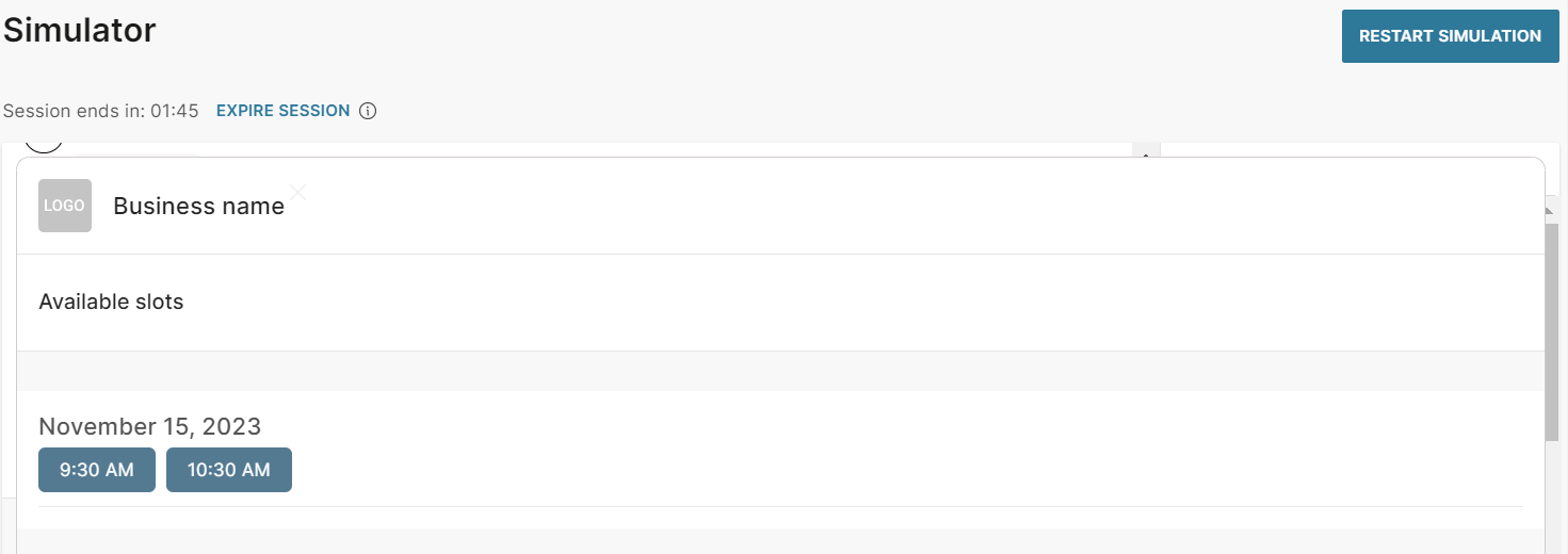
For more information about time pickers, refer to the Apple Messages for Business documentation.
Instagram Messaging
Instagram Messaging is a two-way messaging channel that helps businesses communicate with end users.
Instagram Messaging offers a variety of message types such as rich cards and carousels. Refer to the messaging limitations for each message type.
To use Instagram Messaging in Answers, you must enable this channel in your Infobip account.
Carousel
Carousel messages enable you to send multiple rich cards in a single message. In addition to text, you can include an image, a hyperlink, and buttons for each rich card. End users can use horizontal scroll to view the rich cards, compare the items, and take action for individual rich cards.
A carousel contains a minimum of 1 rich card and a maximum of 10 rich cards.
To add a carousel, drag and drop the Carousel element from Chatbot sends.
Cards: Add rich cards to the carousel. To add a rich card, click Add card.
Each rich card contains the following elements:
- Card title
- Subtitle (optional)
- Image (optional): Either upload an image or add the URL for the image. Supported file types are .jpg and .png.
- **Action URL:**Enter a URL that opens when the end user clicks the title or image in the rich card.
- Buttons: You can add a maximum of three buttons
Buttons: You can add buttons either manually or from a list attribute. To add a button manually, click Add button. To add a button from a list attribute, select Add button from list attribute.
Buttons contain the following elements:
- From attribute: The attribute used to create the button. Applicable if you create a button from a list attribute. If the list attribute contains more than three values, the message will not be sent
- Iteration label: Name of the attribute value placeholder. Applicable if you create a button from a list attribute
- Title: Enter the text that is displayed on the button.
- Type and value: Choose the button type. Depending on the type, specify the value
| Type | Description | Value |
|---|---|---|
| Postback | Instead of typing a reply to your message, customers can click these buttons to send you a predefined reply. This enables you to capture specific responses from end users. | Postback value |
| URL | Share a URL. When end users click the button, the link opens. | URL of the website |
For more information about carousels, refer to the Instagram documentation.
Image
Send images to end users.
In the chatbot editor, drag the Image element from Chatbot Sends. You can either upload the image or add the link to the image.
To add the link to an image, in the Link tab, enter the public URL that contains the image. You can use attributes to customize the URL.
Supported file types are .jpg and .png. Maximum supported file size is 10 MB, whether you use the upload or link option.
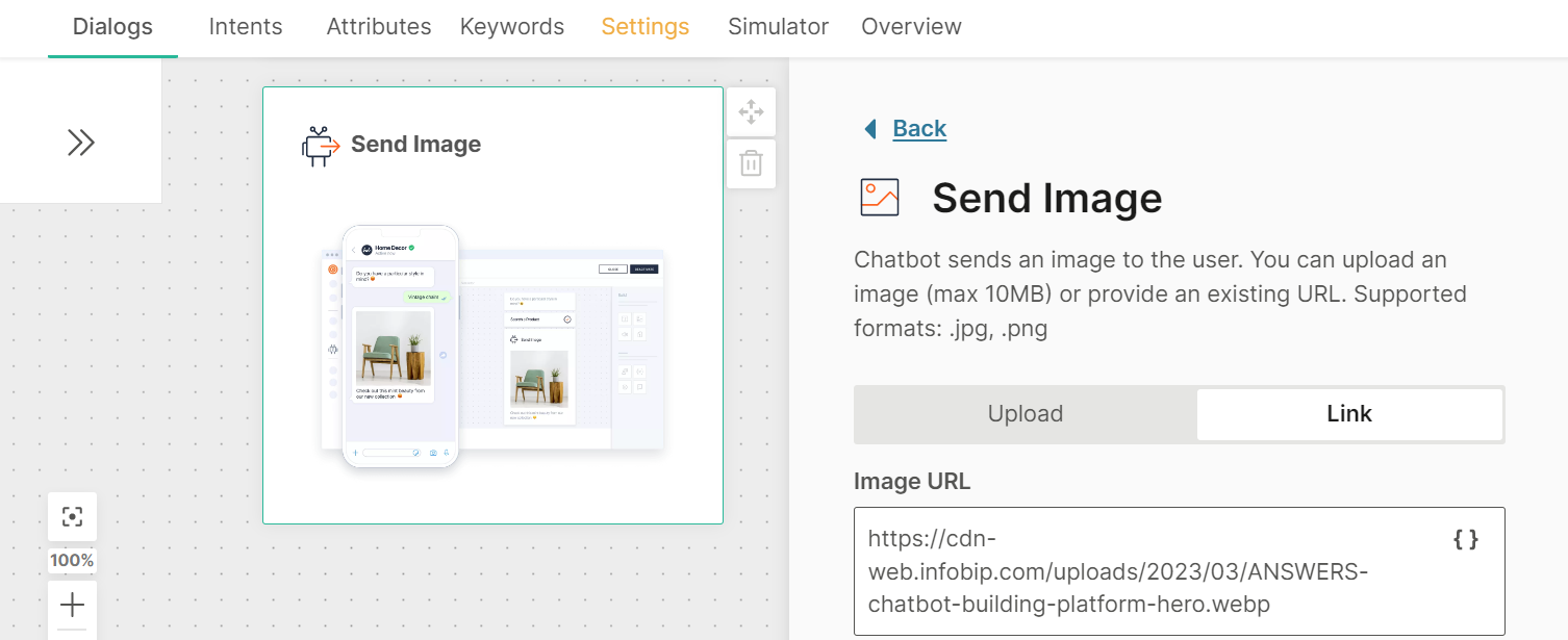
Rich card
Send templated rich card messages to users which allows them to quickly reply selecting one of the options provided in the message.
Rich card messages combine other simple message types all into one and allow you to add an image, text, a link, and buttons all in one.
If you are using the option to populate the values from a list attribute, bear in mind that only 3 values from the list can be populated as buttons, and use the Iteration label for the name you give to the attribute value placeholder.
As soon as you enter the Iteration label text, it appears as an item in the Personalize {} list and can be used as both the title and postback placeholder.
Use image ratio 1:1. The Suggested image size is 600x600 pixels and the maximum file size is 30MB.
Sticker
Send a sticker as a reaction to an end user's message. The sticker is sent as a separate message
In the chatbot editor, drag the Sticker element from Chatbot sends.
In the Sticker ID field, choose the sticker. Only the heart sticker is supported.
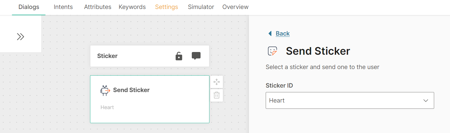
For more information about stickers, refer to Instagram Messaging documentation.
Text
Send text messages to end users. Text messages include text and optional quick replies.
In the chatbot editor, drag the Text element from Chatbot sends.
Each text element contains the following fields:
- Message
- (Optional) Quick replies
Message: Can contain a maximum of 4,096 characters including spaces, new line, emojis, special characters, hyperlinks, and attributes. If you add attributes, make sure that the message length does not exceed the limit after the attribute values are filled. If the message length exceeds the limit, the message may not be sent.
You can add variants of the message. When the chatbot sends the Text message, the end user receives one of these variants at random. Message variants add variety to the end user experience. You can add a maximum of 5 message variants.
To add a new message variant, click Add variation.
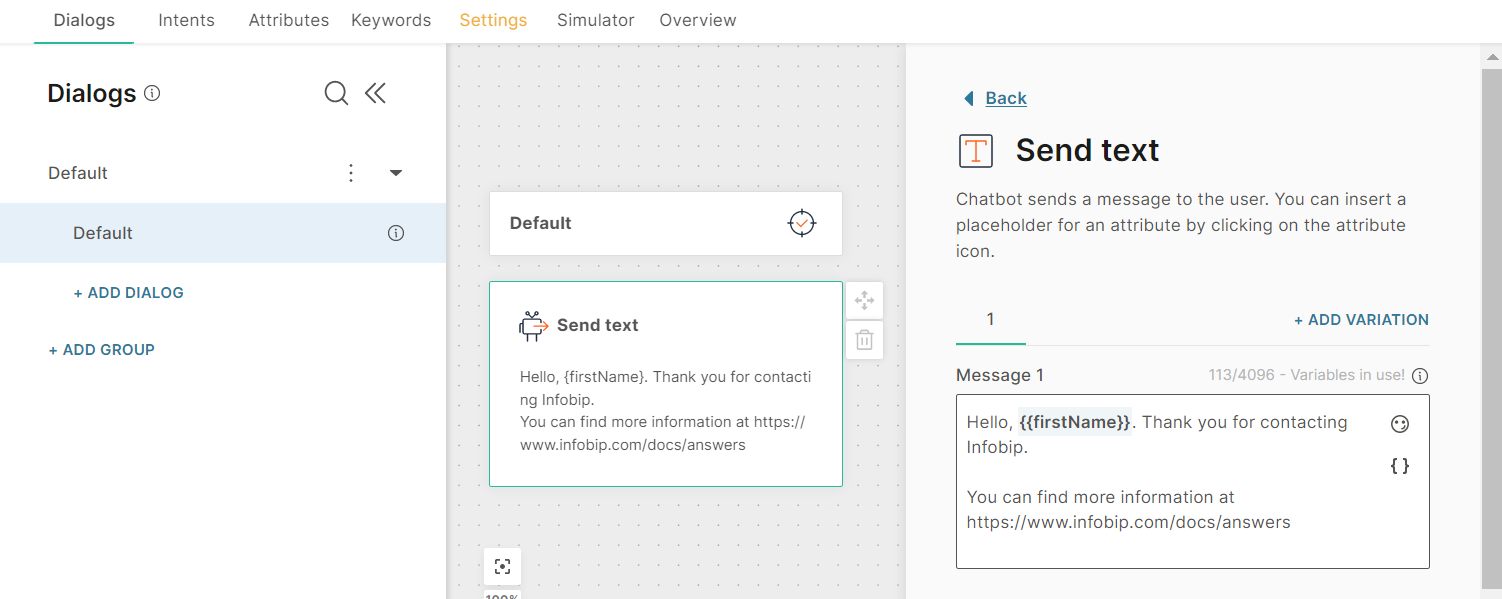
To remove a message variant, click the delete icon.
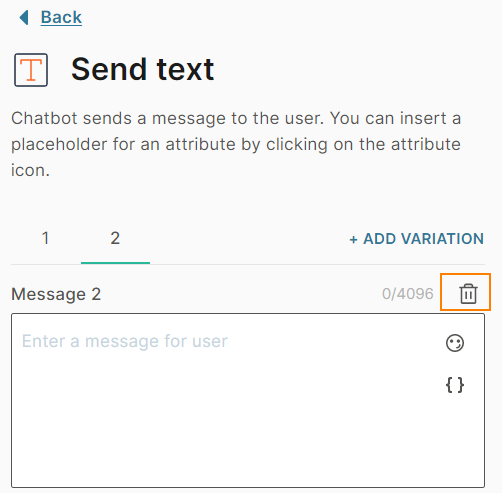
Quick replies (Optional): Include a set of quick reply buttons to obtain information from the end user. Instead of typing a reply to your message, the end user can click one of these buttons to send you a predefined reply.
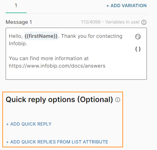
You can add a maximum of 13 quick reply buttons. You can add buttons in one or more of the following ways.
- Manually: Click Add quick reply to add each button one by one.
- Through a list attribute: Click Add quick replies from list attribute to add a set of buttons.
Configure the following for each button:
- Quick reply title: The text that is displayed on the button
- Postback: The value that the chatbot receives when the end user clicks the button. Use this value in other chatbot elements to direct the chatbot flow. Example: You can use this value in the Conditions element.
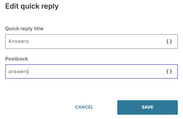
To edit or delete a quick reply button, click the three dots against the button and choose an option. You can also edit the button by clicking on it.
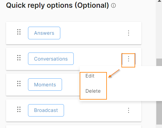
To reorder the buttons, use the six dots against a button to drag the button to the required position.
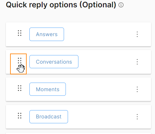
Open channel
EARLY ACCESS
The Open channel API enables you to exchange messages between your messaging platform and your Answers chatbot. You can build your own messaging application and connect it to the chatbot by using this API. For more information, refer to the Answers over API section and the API documentation.
To use the Open channel API with your chatbot, the chatbot must use the Open channel.
To configure the Open Channel sender and the webhook for receiving the response, contact your Infobip account manager.
JSON
Use JSON to send rich messages.
Configure the element
In the chatbot editor, drag the JSON element from Chatbot sends.
In the Code field, add the JSON code. You can also use an attribute that contains the JSON code.
Example
You want to send radio buttons Yes and No. Use the following JSON message.
{
  "title": "Would you like to receive product updates?",
  "type": "radiobuttons",
  "options": [
	{
	  "label": "Yes",
	  "value": "yes"
	},
	{
	  "label": "No",
	  "value": "no"
	}
  ]
}
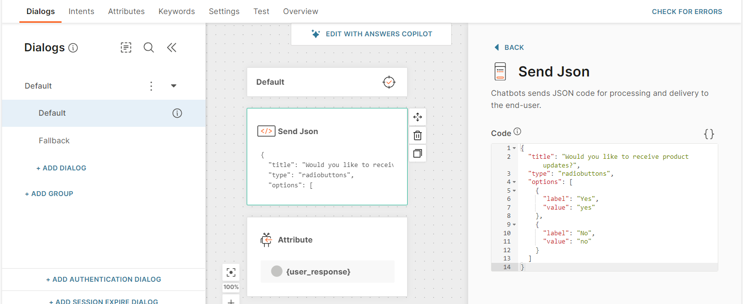
Text
Send text messages to end users.
In the chatbot editor, drag the Text element from Chatbot sends.
In the Message field, add the message content. This field can contain a maximum of 4,096 characters including spaces, new line, emojis, special characters, hyperlinks, and attributes.
If you add attributes, make sure that the message length does not exceed the limit after the attribute values are filled. If it exceeds the limit, the message may not be sent.
To add variations of the message, select Add variation.