Engineers often use the rubber duck approach when they are stuck, but why not draw for our little yellow friend instead?
If you don’t know how to start with the visualization, go back to your roots. And the root of all IT work is data. We can develop it for different purposes and make complex systems limited only by our imagination, but it is always about taking data from one place, transforming it when needed, and putting it in another place. Repeat.
So we start with the data flow diagram, or what happened to the data before we saw it on a page.
What happens to your data?
As a distributed systems engineer, I deal with a chain of services and need to figure out who does what. Systems are big and developed by several teams or even departments, so finding the root of a seemingly simple problem can be pretty complex.
Let’s imagine our client has a balance of $100001 and wants to know where the extra dollar came from. Opening the page with the balance data may make only one backend request for debit and credit numbers – balance is just the difference between debit and credit numbers. But the devil is always in details. God knows how many services work together to get billing data to that page. And who knows how many services update debit and credit for the balance data?
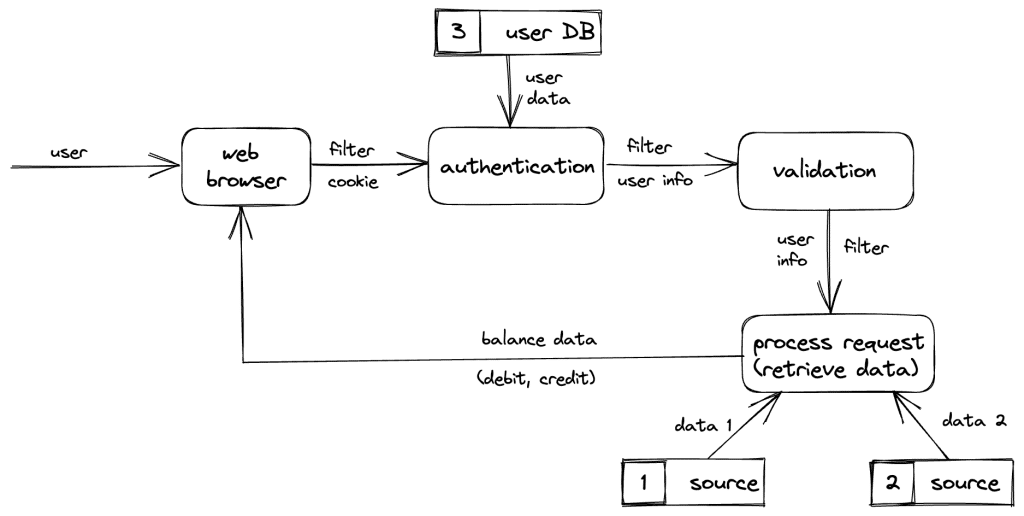
To understand it, we can draw a data flow diagram where squares are data processes. Arrows represent the transition of data (and actual data), and squares with numbers are data storage.

You can choose whatever type of diagram you like or make your own rules. You aim to understand what is happening and do what works best for you. But if you share your diagrams, make sure your colleagues understand your style and can easily read it without misinterpreting it.
I prefer a different kind of diagram where squares are actual data and arrows are a process of data.

This diagram may help you localize some data processes in particular services of your system.
From data to services
We haven’t found our answer yet, but now we understand which data processes our system performs.
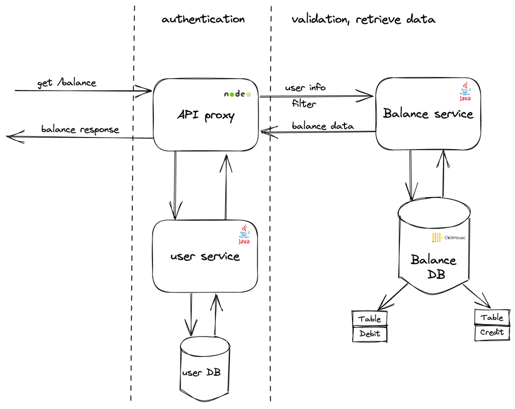
The next step is understanding which services or groups of services are responsible for a particular data process. Architecture diagrams can help you with that:

In the current example, I made it as simple as possible: squares are services, arrows are interactions between services, and I added extra marks for data processes. This diagram is very simple and suits a lot of cases, and a big bonus is that everybody understands it intuitively.
Drawing an architecture diagram helps us:
- Understand which service does what, and see how our data transfers between services in real life.
- Localize the problem, so we can check the service separately and try to find the wrong output for test input data.
- Understand which data storages are involved in the process, so we can check if the data in data storages is correct.
At that point checking data in storage showed everything was fine. The balancing service sends correct numbers for debits and credits, but the client still got an incorrect balance. Was something wrong with our API proxy? Let’s dig deeper.
Deep dive into the components
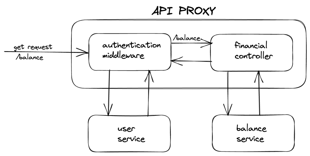
Based on the previous investigation of data flow, we now draw how data goes through the component of API proxy services.

According to the schema, no data transformation happens in the service. All the components add new information and work as proxies between a client and backends. So if a client gets the wrong numbers for debit and credit right after our proxy, something must be wrong with the data representation.
This means we have to double-check responses from balance services and what we have after the API proxy. The difference between debit and credit is 100000, and the balance service returns precisely what we need:
{

    debit: 9007199254840991,

    credit: 9007199254740991

}
Response from API proxy is.
{

    debit: 9007199254840992,

    credit: 9007199254740991

}
Responses are different; if we look at the numbers, the API proxy has the wrong debit. After our investigation, we know there is an API proxy issue.
Yet, we also know that it is a NodeJs service. Could our numbers be too big for JS? We have a Long data type which has Long.MAX_VALUE= 9,223,372,036,854,775,807, and JS has Number.MAX_SAFE_INTEGER = 9,007,199,254,740,991.
A debit number is bigger than the Max Integer Js number for 100000, which causes overflow, and as a result, we have the wrong number for debit and the wrong balance, which is bigger for 1$ = 100001.
9007199254840991 – 9007199254740991 = 100000
9007199254840992 – 9007199254740991 = 100001
So we sketched out the problem, found the issue, and we could get to work fixing it.
When drawing comes in handy
This drawing approach isn’t always necessary, and some would argue that it can be a waste of time, but it helps if:
- You are stuck with an issue;
- You are new to the product and need to learn about it as quickly as possible.
- Interactions and dependencies between services are very confusing and not obvious.
- The system is too big.
- You share complex information on a call – it’s better to see something once than to hear it ten times.
- You need to explain services/systems to somebody.
A cool side effect of visualization is that you document the system immediately and use all your findings as documentation.
Needless to say, the example used was made up (who in their right mind would use Long for financial information?), but it served our visualization purposes well. That said, if you use NodeJs services with big numbers, keep an eye on them.
*This article was created through the Infobip Advocate program and originally published on ShiftMag.
